This post contains affiliate links. As an Amazon Associate, I earn from qualifying purchases at no extra cost to you.
Are you looking for colorful living room ideas that feel joyful and collected (not chaotic or cluttered)? Do you want to try maximalist decor this summer, but you’re not sure how to mix bold colours and patterns without overwhelming your space?
I always start by choosing one “hero” colour story and then building layers around it—textiles, art, lighting, and little moments that make the room feel lived-in. In this post, I’m sharing my go-to strategies for creating a vibrant living room using summer color trends like cobalt, emerald, ochre, coral, and punchy citrus tones.
From my experience, this guide is perfect for anyone who loves bold home decor, thrifted finds, statement art, or simply wants their living room to feel more like them.
When I design this look, I rely on a few repeatable moves—pattern pairing that actually works, grounding “busy” colour with the right neutrals, and using lighting to make saturated shades feel warm and welcoming. I’ll also share easy upgrades (like pillow formulas and frame-mixing rules) that make a big impact fast.
Below are 25 Colorful Maximalist Living Room Decor that…
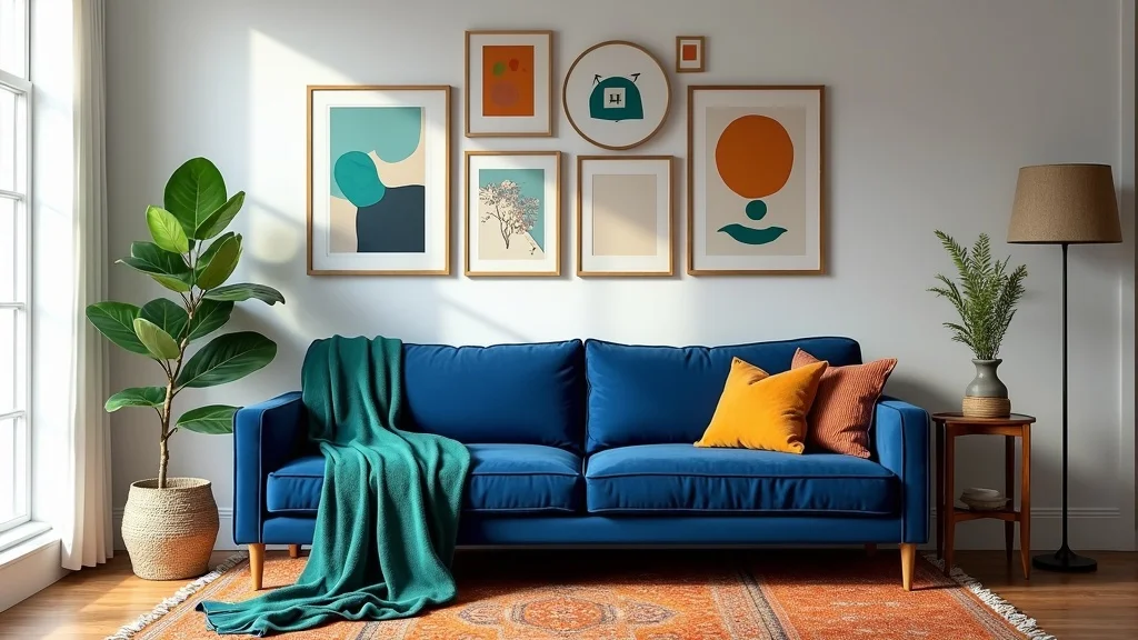
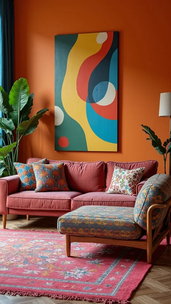
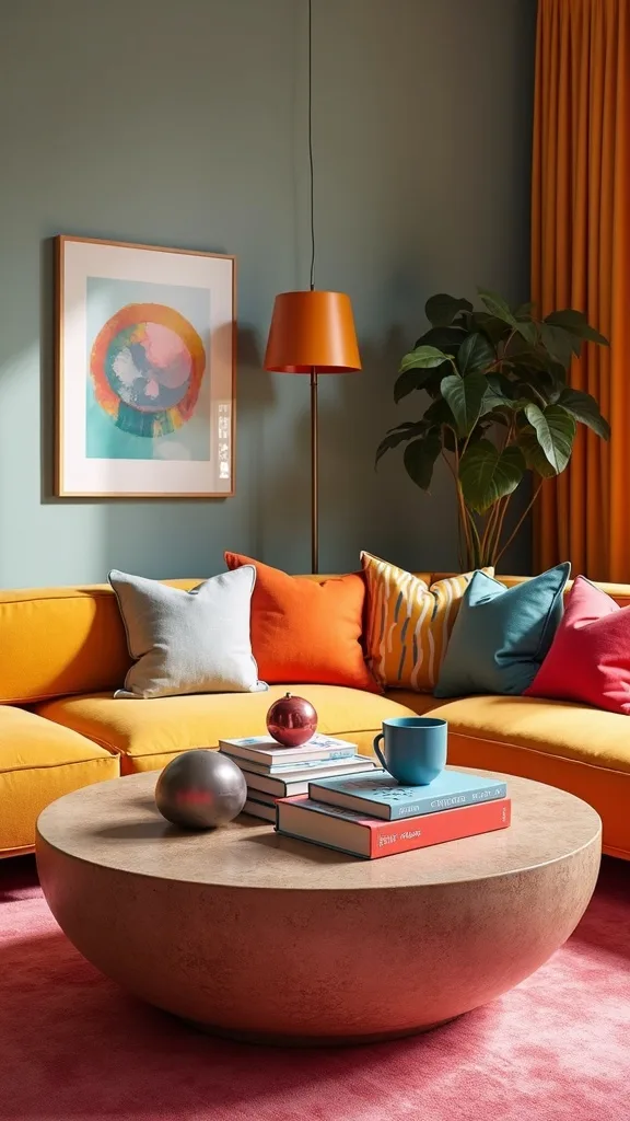
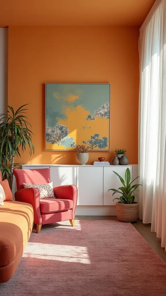
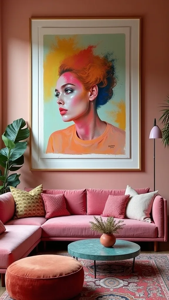
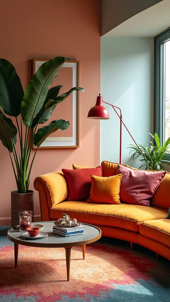
1. Build the room around a cobalt velvet sofa, emerald throw, ochre rug, and mixed-frame gallery wall
I find that maximalism feels easiest when I commit to one clear anchor vignette, and this combo—cobalt blue velvet sofa, emerald throw, an ochre rug, and a mixed-frame gallery wall—does the heavy lifting instantly. It works because the colours sit far apart on the wheel, so the contrast feels energetic, while the velvet and woven rug add softness.
I always start by placing the sofa first, then I layer the ochre rug so it extends at least 8–12 inches beyond the sofa front legs for a grounded “zone.” Next, I drape the emerald throw casually (not folded perfectly) and add two pillows that echo the gallery wall colours.
For frames, I mix black, brass, and natural wood, and I repeat one mat colour (white or cream) to keep it cohesive. One of my favourite approaches is to add a tiny pop—like a coral candle—so the palette feels intentional.
Pro tip: hang the gallery wall so the bottom row sits 6–8 inches above the sofa back, and you’ll get that collected, confident look that makes bold colour feel effortless.
2. Use the “60/30/10” rule—then break it on purpose
In my opinion, the fastest way to make bold home decor feel designer-approved is to start with the 60/30/10 colour ratio, then intentionally bend it. It works because your eye gets a clear hierarchy, even when you’re using saturated shades.
I always start by choosing 60% of one grounding tone (often warm white walls or a neutral curtain), then 30% of a strong supporting colour (like cobalt or emerald), and 10% for the spicy accents (coral, chartreuse, hot pink). After that, I “break” the rule by sprinkling a few extra 10% pops across the room—one on the coffee table, one in the art, one in a pillow—so it feels playful.
Materials matter here: velvet, linen, and woven textures make colour feel richer and more livable. For products, I look for textured solids and small accessories in glossy ceramics or lacquer.
Pro tip: repeat your accent colour at least three times at different heights (floor, seating, wall) and your vibrant living room will feel balanced and intentional.
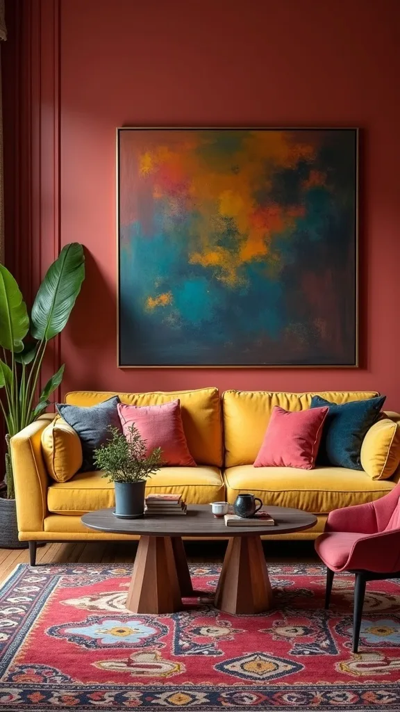
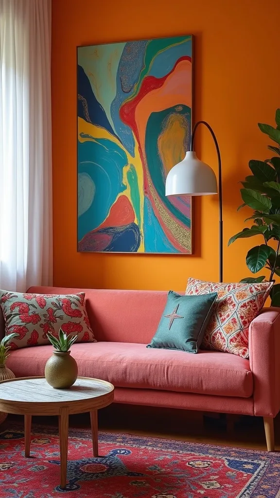
3. Pick a summer trend palette: cobalt + citrus + sunbaked neutrals
When I design this look for summer, I lean into palettes that feel like sunshine and ocean air—cobalt blue paired with citrus tones (lemon, tangerine) and sunbaked neutrals (sand, camel). It works because the warm/cool contrast keeps the room lively without feeling random.
I always start by choosing two “loud” colours (cobalt + tangerine) and one “quiet” neutral (sand or warm white). Then I assign each one a job: cobalt for the biggest upholstery moment, citrus for smaller accents like pillows and art, and neutrals for the background—curtains, walls, or a larger rug border.
From my experience, the easiest materials for this palette are linen curtains, a flatweave rug with warm undertones, and glossy ceramic accessories that bounce light around.
Pro tip: if your citrus accents start to feel too loud, I always recommend adding one grounding piece in walnut or black to give your eye a “rest,” and the whole room will feel effortlessly curated.
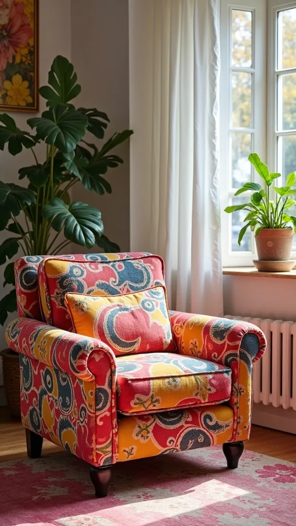
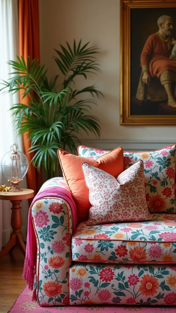
4. Try pattern mixing with one “boss” print and two supporting prints
I find that pattern mixing home projects go wrong when every print screams at the same volume. The fix is simple: I choose one “boss” pattern (like a big floral or bold geometric) and then two quieter supporting patterns (a stripe and a small-scale dot, for example).
I always start by putting the boss print on something you can swap—pillows, a throw, or an ottoman—so you can adjust without regret. Then I bring in a stripe that shares one colour with the boss print, and I finish with a tiny pattern that reads as texture from across the room. This creates layers without visual chaos.
For colours, I like to repeat two shades across all prints (cobalt + cream, or emerald + ochre). In terms of products, I look for hand-block style textiles, woven checks, and classic ticking stripes.
Pro tip: vary scale on purpose—large, medium, small—and your maximalist decor will feel collected like a well-styled wardrobe.
5. Layer rugs: a neutral base plus an ochre statement topper
From my experience, rug layering is the secret weapon for a vibrant living room because it adds depth without needing more furniture. It works especially well in rentals where you can’t change floors or wall colour.
I always start by laying down a large, simple base rug (jute, sisal-look, or a low-pile neutral) that fits the seating area. Then I angle or center a smaller ochre or patterned rug on top to create that “designed” focal zone right under the coffee table. The top rug can be vintage-style, kilim-inspired, or even a bold modern graphic.
Materials I love: a flatweave topper for easy vacuuming and a textured neutral underneath for warmth. Colour-wise, ochre plays beautifully with cobalt and emerald because it’s warm and grounding.
Pro tip: use a non-slip pad between layers so nothing creeps, and you’ll get that plush, layered look that makes maximalism feel cozy instead of cluttered.
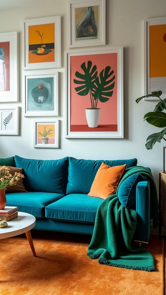
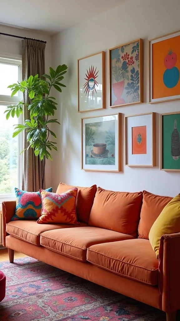
6. Create a gallery wall that looks collected, not copied
I always recommend a gallery wall for bold home decor because art is where you can go maximalist without committing to permanent changes. It works because the wall becomes a “story,” and the rest of the room can simply echo its colours.
I always start by gathering more pieces than I need—at least 1.5x—then I edit. I lay everything on the floor, mix frame finishes (black, brass, wood), and repeat one unifying element like white mats or a shared accent colour. Then I hang from the center outward, keeping spacing consistent (about 2–3 inches between frames) so it feels intentional.
For content, I mix photography, abstract prints, a small textile piece, and one quirky element like a vintage postcard. I find that mixed-frame art looks best when I include at least one oversized piece to anchor the whole arrangement.
Pro tip: add a picture light above the gallery in warm white light (2700K–3000K — the cosy, yellowish tone you see in most homes) and your art will glow like a mini museum.
7. Use velvet + linen + cane to make bright colours feel livable
In my opinion, colour isn’t what overwhelms a room—flat texture is. When I mix velvet, linen, and a touch of cane or rattan, bright shades instantly feel warmer and more “home” than “showroom.”
I always start by choosing one plush texture (like a velvet sofa or velvet pillows), then I balance it with breathable linen curtains or a linen-blend slipcover. After that, I add one natural woven element—cane cabinet doors, a rattan side chair, or a basket—so the palette has an earthy backbone.
Colour-wise, velvet makes jewel tones like cobalt and emerald look deeper, while linen softens high-energy accents like coral or chartreuse. For products, I look for stonewashed linen and woven pieces with a matte finish so they don’t compete with glossy ceramics.
Pro tip: if your room feels too intense, swap one bright pillow for a textured neutral—same pattern scale, calmer colour—and you’ll keep the maximalist spirit while gaining instant calm.
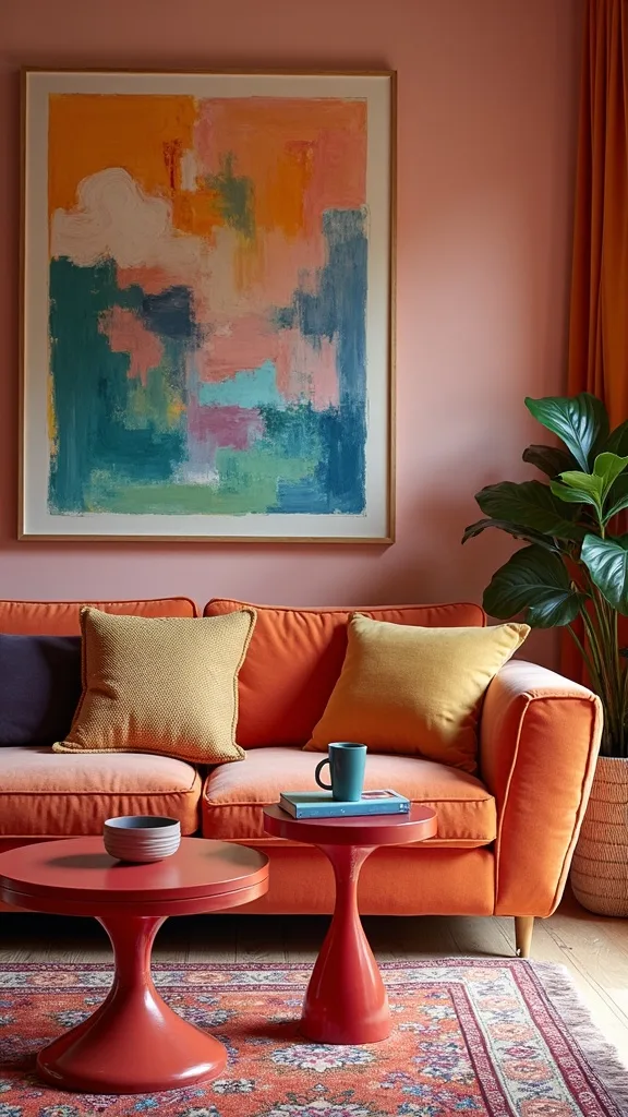
8. Add a bold coffee table moment with books, lacquer, and one sculptural piece
I find that a maximalist living room needs a strong “center of gravity,” and the coffee table is where I like to build it. It works because the table is seen from every seat, so a curated cluster makes the whole room feel styled.
I always start by stacking 2–3 oversized coffee table books (art, travel, interiors), then I add a tray to corral smaller items. On top, I place one sculptural object—like a ceramic knot, a chunky candle, or a vintage brass piece—and I finish with something organic like a small plant or a bowl of citrus in summer.
For colour, I repeat the room’s palette: cobalt book spine, emerald glass, ochre-toned wood. I also love high-gloss lacquer in small doses because it reads modern against vintage frames.
Pro tip: keep one section intentionally empty so you can actually set down a drink—maximalist decor should still feel welcoming and usable.
9. Choose one “wild card” accent colour and sprinkle it three times
One of my favourite approaches is to pick a wild card colour that nobody expects—like fuchsia, chartreuse, or tomato red—and use it sparingly. It works because the surprise colour adds personality, but repetition keeps it from looking accidental.
I always start by deciding where the wild card will live: one soft item (pillow or throw), one hard item (vase, lamp base, tray), and one piece of art. That “three times” rule is my safety net for any bold choice. If the room already has cobalt and emerald, I find that a punch of coral or pink feels especially summery and fresh.
Materials I like for wild cards: glazed ceramics, tinted glass, and small textiles with a bit of sheen. These reflect light and keep the accent from feeling heavy.
Pro tip: if you’re nervous, choose the wild card in removable pieces first; once you see how it energizes the space, you’ll feel confident adding one more little pop.
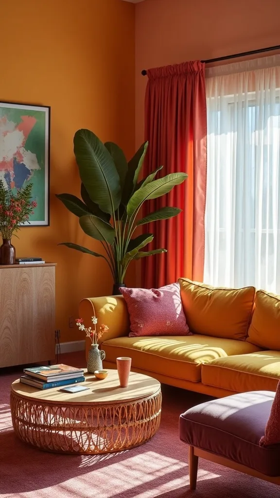
10. Make your lighting warm so saturated colours don’t turn harsh at night
From my experience, the difference between “bold” and “too much” often comes down to lighting. Saturated colours can look harsh under cool bulbs, so I always recommend warm white light (2700K–3000K — the cosy, yellowish tone you see in most homes) to make jewel tones feel rich and inviting.
I always start by layering light sources: a floor lamp near the sofa, a table lamp on a side table, and optional wall lighting for the gallery wall. Then I choose bulbs with comfortable brightness (measured in lumens) so the room feels glowy rather than spotlight-bright. If you entertain, dimmable bulbs are a game-changer because you can soften everything instantly.
For shades, I like linen or parchment because they warm up the light and complement ochre and emerald tones. Brass or black lamp bases look especially good in maximalist decor because they add contrast.
Pro tip: aim for at least two lamps in the living room, and your vibrant palette will feel cozy and intentional from daytime through movie night.
11. Use curtains as a colour block: warm white fabric with a bold trim
I find that curtains are the most overlooked opportunity for bold home decor, especially in summer when sunlight makes colour sing. A warm white curtain with a cobalt, emerald, or ochre trim works because it reads airy from a distance but delivers personality up close.
I always start by keeping the main curtain fabric simple—linen-look or cotton—then I add contrast with trim: grosgrain ribbon, patterned tape, or even a stitched border. If you don’t sew, iron-on hem tape plus trim can still get you a polished look. I like to hang curtains high and wide so the window feels larger and the room feels more expansive.
For colours, I match the trim to one “hero” element (like the cobalt sofa) and repeat it again somewhere else (a frame or pillow) so it ties in. Texture-wise, matte fabric balances shiny ceramics and velvet.
Pro tip: add trim to just the leading edges for a tailored feel, and you’ll get that custom, high-end look without needing custom pricing.
12. Bring in a vintage-inspired side chair to add shape and contrast
When I design maximalist decor, I like at least one piece that feels like a “find,” not a matching set. A vintage-inspired side chair works because it adds a new silhouette and keeps the room from looking like it came from one catalog.
I always start by choosing a chair shape that contrasts the sofa—if the sofa is boxy, I pick something curved; if the sofa is sleek, I choose something with turned legs or a cane back. Then I upholster (or cushion) it in a pattern that borrows one colour from the main palette, like emerald in a floral that also includes cream and a hint of cobalt.
Materials I love: cane, walnut, and textured upholstery like bouclé or linen blends. For colour, ochre and brass details make the chair feel warm and summery.
Pro tip: place a small pillow on the chair that matches the sofa pillows, and you’ll create a visual “conversation” across the room that feels collected and confident.
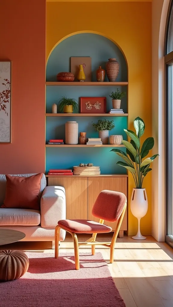
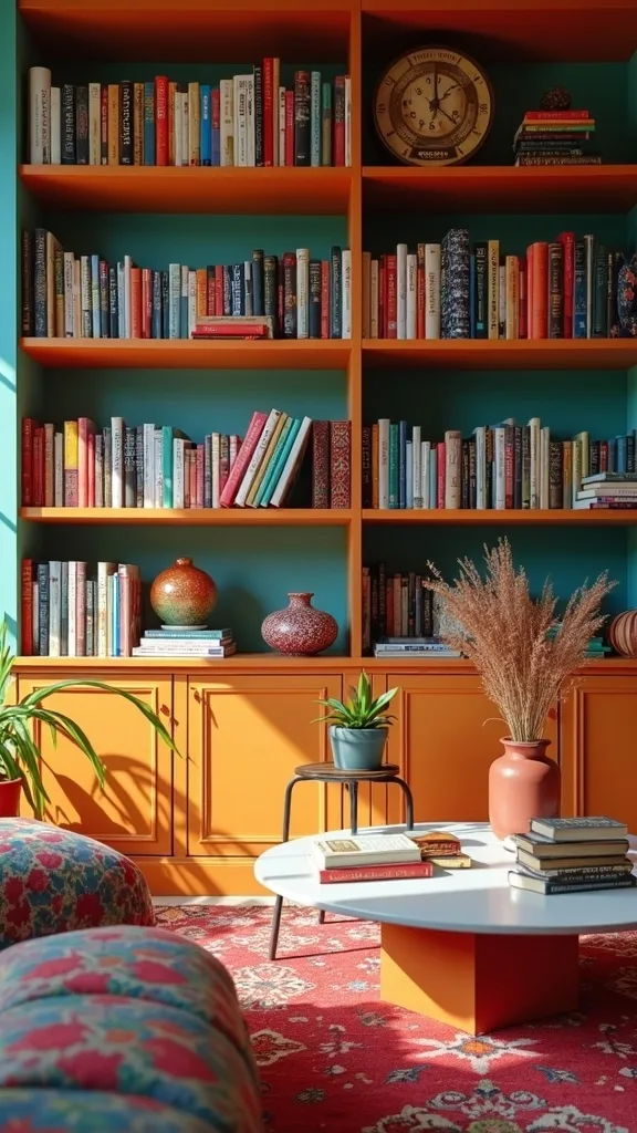
13. Style shelves with the “rainbow + negative space” method
I find that open shelving can either look amazing in a vibrant living room or feel like visual noise—so I use a simple method: rainbow grouping plus intentional empty space. It works because colour becomes the organizing system, and the gaps give your eye a break.
I always start by pulling everything off the shelves and grouping items by colour family (blues, greens, warms, neutrals). Then I restyle in loose gradients—cobalt books near blue ceramics, emerald glass near green spines—while leaving 20–30% of the shelf empty. I also vary height: a tall vase, a medium stack, a small object.
For materials, I mix matte (books, pottery) with reflective (glass, brass) so the shelf has movement. I like adding one natural element—woven basket or driftwood—to keep it grounded.
Pro tip: if a shelf feels busy, remove one item and add one “boring” neutral; maximalist decor looks best when it has rhythm, not constant volume.
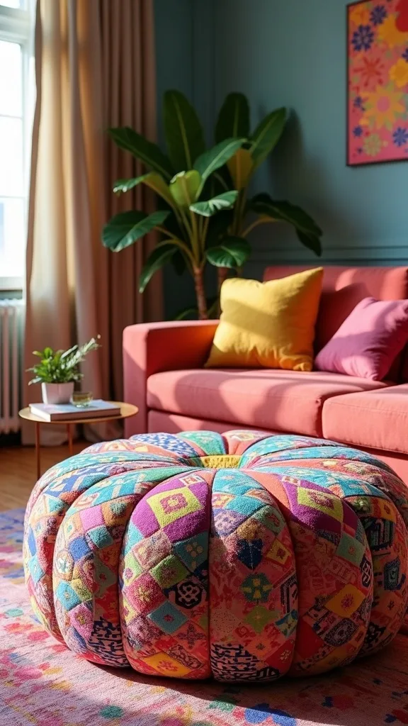
14. Use a statement ottoman as your pattern playground
From my experience, an ottoman is the safest place to take a big pattern risk because it’s low, movable, and visually playful. It works as a pattern playground while still being practical—extra seating, a footrest, or a soft coffee table with a tray.
I always start by choosing an ottoman size that fits the seating area without blocking walkways. Then I pick a pattern that echoes at least one existing colour (cobalt, emerald, or ochre) and introduces one new accent. If you’re testing maximalist decor, I recommend a removable slipcover or a reupholstery project so you can change your mind later.
For fabrics, I like durable weaves or performance fabric (easy-clean in plain English) because ottomans get used. Patterns I love: oversized florals, ikat, or bold stripes.
Pro tip: top it with a tray in brass or lacquer so you can set down drinks—this is how I keep bold home decor functional and family-friendly.
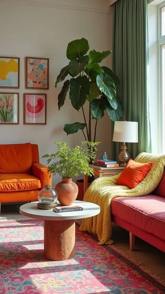
15. Add greenery that matches the palette (yes, that’s a thing)
I always recommend plants in a maximalist living room, but I don’t choose them randomly—I pick greenery that supports the colour story. It works because leaf shape and pot colour act like another layer of pattern and texture.
I always start by selecting one tall plant for height (like a fiddle-leaf fig or dracaena), then one trailing plant for softness (pothos or philodendron), and one small tabletop plant for detail. Next, I choose planters that echo the palette: cobalt ceramic, emerald glazed pots, or warm terracotta that ties into an ochre rug.
From my experience, glossy planters feel modern while woven baskets feel boho, and mixing the two adds that collected vibe. If you don’t have great light, high-quality faux stems can still give you the shape and colour without the stress.
Pro tip: group plants in odd numbers and vary heights; the result feels lush and intentional—like summer moved right into your living room.
16. Anchor bold walls with a warm neutral paint (or removable wallpaper)
In my opinion, maximalist decor doesn’t require bright paint everywhere—sometimes the smartest move is a warm neutral backdrop that lets your colour layers shine. It works because your furniture, art, and textiles become the stars without fighting the walls.
I always start by testing a few warm whites or light greiges on the wall and observing them morning to night. If I want pattern without commitment, I use removable wallpaper on one accent wall behind the sofa or in a reading nook corner. I like prints that include a touch of my hero colours—cobalt or emerald—so everything ties together.
Materials to consider: peel-and-stick wallpaper for rentals, or traditional wallpaper if you’re ready for a long-term look. Patterns that play nicely with gallery walls include subtle geometrics, tiny florals, or tone-on-tone stripes.
Pro tip: keep the wallpaper pattern smaller if your art is large; that balance lets you go bold in layers while still feeling calm and curated.
17. Mix metals: brass for warmth, black for contrast, chrome for sparkle
I find that mixing metals is one of the easiest ways to make a vibrant living room feel intentional rather than themed. It works because each metal brings a different “temperature” and mood—brass warms, black grounds, and chrome adds a crisp sparkle.
I always start by choosing a dominant metal (usually brass in a maximalist space), then I add black in small structural places like frames, lamp bases, or curtain rods. Finally, I sprinkle chrome or polished nickel in tiny accents—like a tray handle or a vase—so the room catches light in a modern way.
For products, I look for antique brass finishes (they feel softer than super-shiny gold) and matte black that doesn’t show fingerprints easily. I keep the mix consistent by repeating each finish at least twice.
Pro tip: if your room already has lots of pattern, let metals be the “quiet” layer—simple shapes, clean lines—and they’ll elevate everything without adding more visual noise.
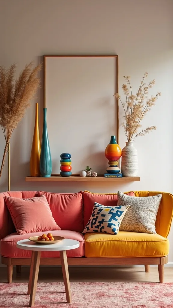
18. Use books as colour blocks (and actually read them later)
One of my favourite approaches is decorating with books as intentional colour blocks—because it’s personal, affordable, and endlessly adjustable. It works especially well in maximalist decor where you want layers that feel meaningful, not just purchased.
I always start by sorting books by spine colour into a few stacks: blues, greens, warms, neutrals. Then I place them in clusters around the room—on shelves, under a side table, or stacked on the coffee table—so each stack echoes the palette. I like to mix vertical and horizontal arrangements so it looks relaxed rather than overly styled.
For extra impact, I add one book with a bold spine (hot pink or orange) as the wild card, and I repeat that colour elsewhere in a small accessory. Hardcovers with textured jackets look especially rich next to velvet.
Pro tip: top a stack with a small object that matches your metal finish, and you’ll get that layered, editorial look while still keeping your living room functional and personal.
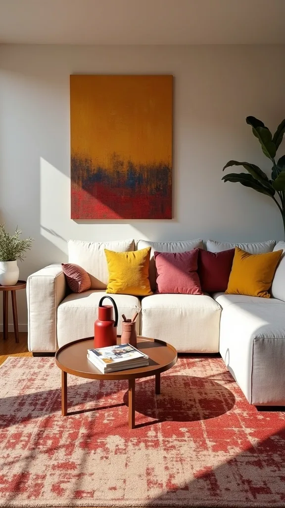
19. Create a “pillow formula” that makes pattern mixing easy
I always recommend using a pillow formula because it removes the guesswork from pattern mixing home styling. It works because you’re repeating a proven structure, even when the patterns change seasonally.
I always start with five pillows on a standard sofa: two solids in your hero colour (cobalt), two patterns that share at least one colour (a floral with cobalt + emerald, and a stripe with cobalt + cream), and one texture pillow (bouclé, velvet, or a nubby weave) in a warm neutral. Then I swap the center pillow seasonally—coral for summer, burgundy for fall—without redoing everything.
Materials I love: velvet for depth, linen for breathability, and woven textures for that collected feel. I also like mixing square and lumbar shapes for comfort and visual variety.
Pro tip: if you’re stuck, remove one pattern and replace it with a textured solid; you’ll keep the maximalist vibe while making the arrangement feel instantly calmer and more expensive.
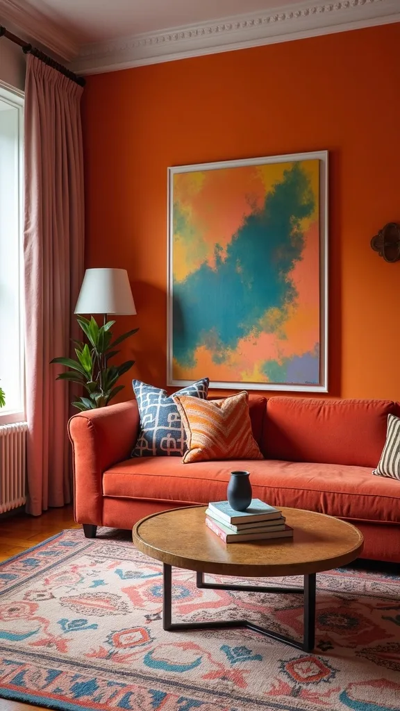
20. Add one oversized art piece to calm down a busy gallery wall
From my experience, the quickest way to make a gallery wall look intentional is to include one oversized piece. It works because the large art acts like a visual anchor, giving your eye a place to land amid smaller frames.
I always start by choosing a large print or canvas that includes two of my main colours—cobalt and ochre, or emerald and cream. Then I build the smaller pieces around it like satellites, mixing frame finishes but keeping spacing consistent. If you already have a full gallery wall, you can still add an oversized piece by swapping out 2–3 small frames for one big statement.
For materials, I like thick mats, simple frames, and art with bold shapes rather than tiny details (it reads better across the room). If your decor is already very patterned, abstract art is a great “breathing space.”
Pro tip: hang the oversized piece slightly off-center if your furniture layout calls for it—maximalist decor looks best when it feels lived-in, not overly symmetrical.
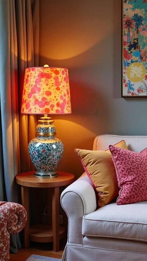
21. Use a bold lamp shade to introduce pattern without changing furniture
I find that lamp shades are the most underrated way to try bold home decor without a big commitment. It works because a shade is small, inexpensive compared to furniture, and it adds colour at eye level—exactly where rooms need it.
I always start by keeping the lamp base simple (brass, black, or ceramic) and letting the shade do the talking. Then I choose a pattern that ties into the room: a cobalt stripe, an emerald floral, or a geometric that includes ochre. If you have a gallery wall, I like shades that echo one colour from your art so everything feels connected.
Materials to consider: linen shades for a soft glow, or printed cotton for crisp pattern. I also love pleated shades because they add texture and a subtle vintage vibe.
Pro tip: pair your statement shade with warm white light (2700K–3000K — the cosy, yellowish tone you see in most homes) and you’ll get that golden, inviting glow that makes saturated colours feel luxurious.
22. Balance busy colour with one “quiet” zone (reading corner or console)
In my opinion, the secret to successful maximalist decor is giving your eyes a place to rest. A “quiet zone” works because it creates contrast—your bold areas feel bolder, and the room feels calmer overall.
I always start by choosing one small area—like a reading corner or a console wall—and keeping it simpler than the rest. That might mean a neutral chair with one patterned pillow, a small side table, and a single piece of art instead of a full gallery. I keep the palette consistent but reduce the number of patterns in that zone.
For materials, I like light woods, creamy ceramics, and a soft throw in a solid colour. If the main seating area is cobalt/emerald/ochre, the quiet zone might lean cream with just a hint of cobalt in a book spine or vase.
Pro tip: add a cozy floor lamp and a small basket for throws; this “pause” space makes the whole vibrant living room feel more intentional and more livable.
23. Style a console table with tall-short-tall symmetry (but varied objects)
I always start by using a console table as a styling “bridge” between bold furniture and bold art. This approach works because the table creates a structured moment in a maximalist room, even when the objects are eclectic.
I set up a tall-short-tall rhythm: a tall lamp or vase on one end, a lower cluster (books + bowl) in the middle, and another tall element on the other end (like a plant or sculptural candlestick). Then I vary the objects so it doesn’t feel matchy—maybe brass on one side, ceramic on the other, and a stack of colourful books in the center.
For colours, I repeat the room’s hero shades in small doses: a cobalt vase, an emerald glass piece, and an ochre-toned framed photo. I find that adding one natural element (wood tray or woven basket) keeps it grounded.
Pro tip: lean one framed piece against the wall instead of hanging everything—this relaxed layer makes bold home decor feel collected over time.
24. Use scent and sound as part of the “maximalist” experience
From my experience, a vibrant living room isn’t just visual—it’s a whole mood. Scent and sound work because they make the space feel immersive, like you’ve stepped into your own curated world.
I always start by choosing one summer scent profile—citrus, fig, or fresh linen—and sticking to it so it doesn’t clash. Then I add a candle on the coffee table and a reed diffuser on a console, keeping the packaging colours aligned with the room (cobalt glass, amber bottle, or creamy ceramic). For sound, I like a small speaker or a turntable moment that feels intentional rather than techy.
Materials to consider: soy blend candles in ceramic vessels, matches in a bold colour, and a tray to corral everything. I find that these little details support maximalist decor without adding more visual clutter.
Pro tip: treat these sensory layers like accessories—small, repeatable, and personal—and your bold home decor will feel welcoming the second someone walks in.
25. Edit with intention: keep the colour, reduce the duplicates
I find that the biggest misconception about maximalist decor is that it means “add everything.” In reality, it works best when I keep the colour and personality but remove duplicates—too many similar vases, too many small frames, too many competing patterns.
I always start by doing a quick sweep: I group similar items together (all candles, all small art, all throw blankets) and choose the best one or two in each category. Then I redistribute what remains so each surface has a clear purpose—coffee table for books + one sculptural piece, side table for lamp + coaster, shelves for colour-blocked styling. This keeps the room energetic but not messy.
For colours, I keep the hero palette consistent—cobalt, emerald, ochre—and I let accent colours come and go seasonally. I also like adding one or two neutral “reset” pieces like a cream pillow or a simple vase.
Pro tip: if you’re unsure what to remove, take a photo—your camera will instantly show what’s competing, and you’ll end up with a vibrant living room that feels confident and calm.
Final Thoughts
I love how summer color trends give me permission to go bolder—cobalt, emerald, and ochre feel sunny and energized, but still grown-up when I ground them with texture and a few calm neutrals. If you take only one thing from these colorful living room ideas, I hope it’s this: I always start by choosing an anchor (sofa, rug, or art), and then I layer the rest with intention.
From my experience, maximalist decor looks its best when it’s personal—your art, your books, your weird little treasures—so don’t worry about making everything match. I find that repeating colours, varying pattern scale, and using warm lighting are the three moves that make a vibrant living room feel welcoming instead of overwhelming.
If you try one of these ideas this week, I’d start with the pillow formula or a mixed-frame gallery wall—quick wins that instantly shift the whole room. And once you see how good bold home decor can feel, you’ll never want to go back to playing it safe.
Products I Recommend for This Project
Here are some of my favourite products to help you bring these ideas to life:
- Rivet Revolve Modern Upholstered Velvet Sofa — I love this for getting that cobalt-velvet statement without custom upholstery.
- Safavieh Adirondack Collection Area Rug (Ivory/Gold) — This is an easy way to bring in an ochre tone that grounds bold colours.
- Command Picture Hanging Strips (Variety Pack) — I always use these to plan and hang a mixed-frame gallery wall with less wall damage.
- Govee Smart Light Bulbs (A19, Dimmable) — These help me set warm white light (2700K–3000K — the cosy, yellowish tone you see in most homes) so saturated colours look rich at night.
- Umbra Prisma Picture Frames (Set) — I like these for mixing modern geometry into a gallery wall while still keeping it cohesive.