This post contains affiliate links. As an Amazon Associate, I earn from qualifying purchases at no extra cost to you.
That late-summer living room can feel oddly cold the moment evenings turn crisp. The blue pillows that looked breezy in July start reading watery in September. The room doesn’t need pumpkins. It needs weight, warmth, and a little shadow.
This guide is a fall preview home playbook for the in-between weeks. It starts with the bones—your sofa, rug, and main wood tones—then builds into textiles, lighting, and the finishing objects that make an earth tone interior feel collected. Every idea is designed to hold through Thanksgiving without feeling like a temporary costume.
This is perfect for anyone who wants an earthy living room but refuses to store six bins of seasonal decor.
Inside you’ll find the exact pillow color swaps that make a beige sofa look richer, the candle and lamp moves that shift the mood by 6 p.m., and a few quiet upgrades—like wood, leather, and dried stems—that signal early fall without shouting.
Below are 25 Fall Transition Decor & Earthy Tone Living Room that build a calm, layered space using transitional fall decor, warm tones decor, and grounded texture.
Products I Recommend for This Project
Here are some of my favourite products to help you bring these ideas to life:
- MIULEE Rust Velvet Throw Pillow Covers (Set of 2) — An easy, affordable way to replace summer blues with richer rust tone and soft texture.
- Topfinel Corduroy Lumbar Pillow Cover (Amber/Camel) — Adds that warm amber note with a subtle ribbed texture that looks tailored in lamplight.
- Bedsure Chunky Knit Throw Blanket (50″ x 60″) — Gives the sofa instant weight and cozy stitch definition for early fall.
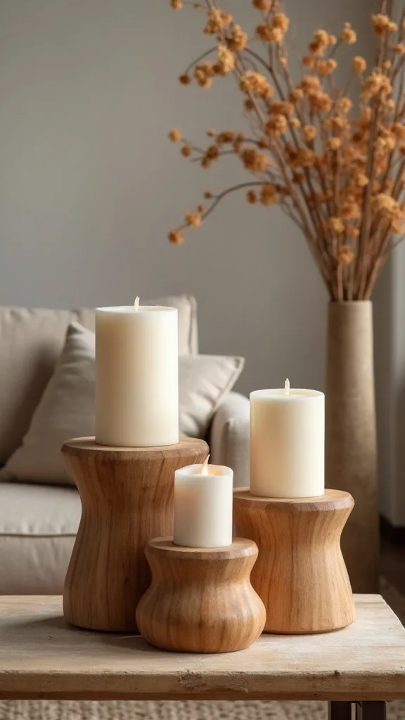
- Creative Co-Op Paulownia Wood Candle Holders (Set of 2) — Brings in real wood grain and height variation without looking seasonal or themed.
- GE Relax LED Light Bulbs (Warm White 2700K) — Softens the entire room’s color so rust, amber, and wood tones look expensive at night.
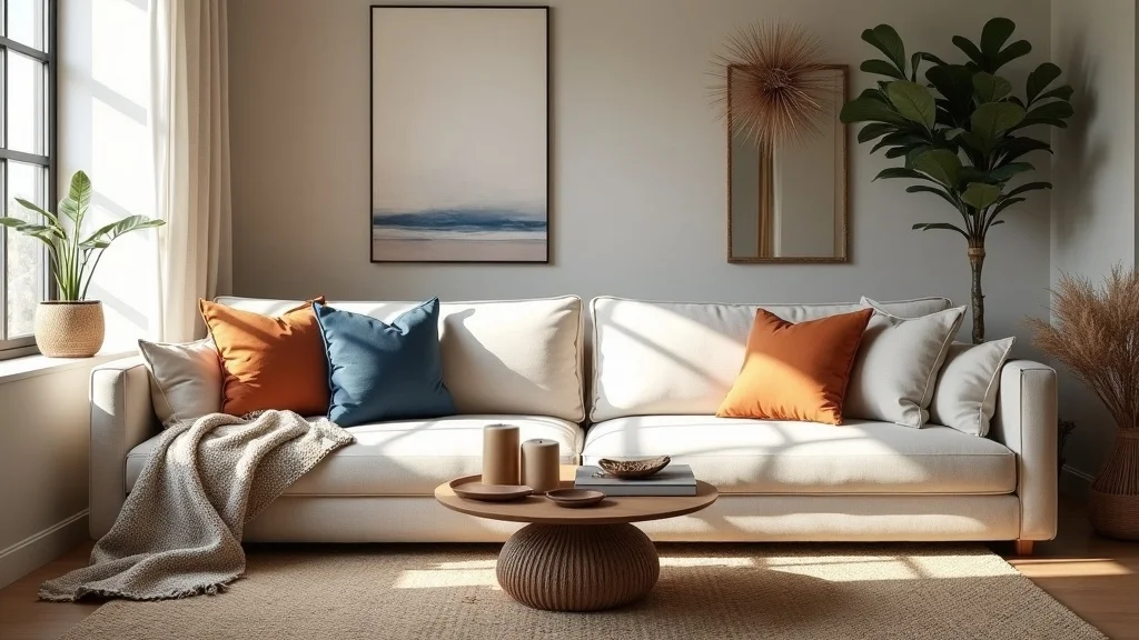
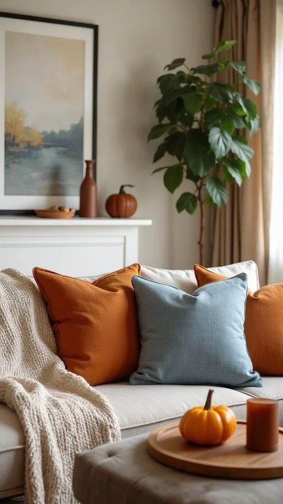
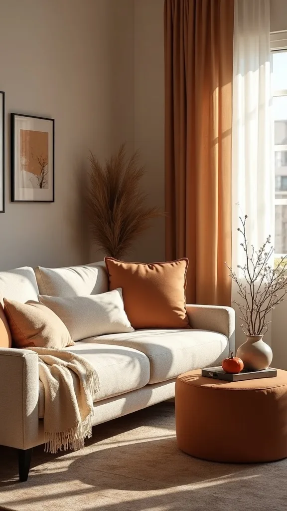
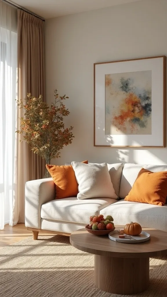
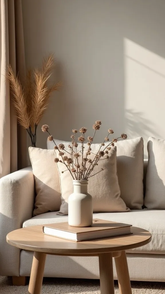
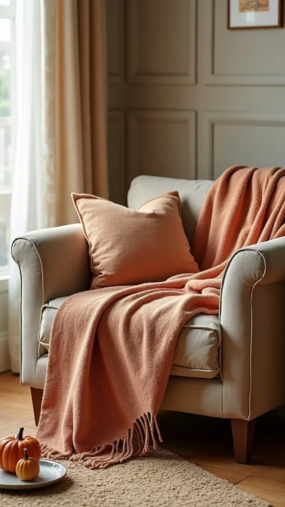
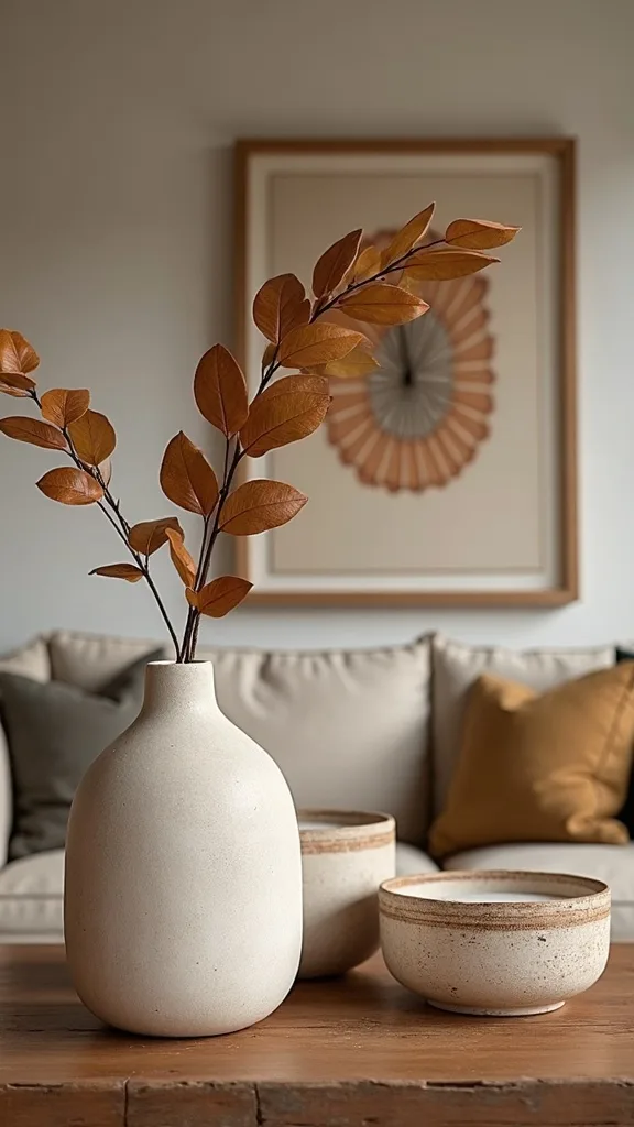
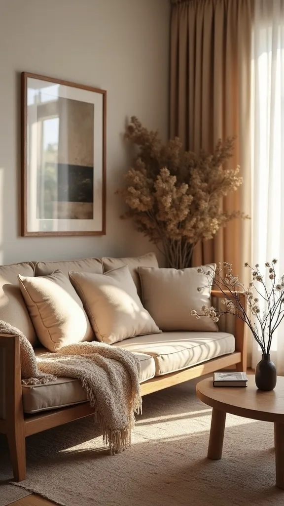
1. Swap summer blue pillows for rust and amber, then anchor with a knit throw and wooden candle holders
This is the fastest early-fall shift because it changes the room at eye level. Rust and amber instantly warm a sofa, while a knit throw and wood candle holders add the weight summer textiles lack.
Start with two 22-inch pillow covers in rust and one lumbar in amber or caramel; keep one light neutral pillow so the mix feels intentional. Drape a chunky knit throw over the sofa arm, not the back, so it reads like a styling choice instead of storage. Place two wooden candle holders on the coffee table and keep the candles ivory for a clean, edited look.
Look for rust velvet, amber woven, and a throw in oatmeal, camel, or deep tan. Choose candle holders in walnut or oak—real wood grain matters here.
Pro tip: repeat the amber once more across the room (a small vase or book spine) so the color feels rooted, and the whole space settles into a calm autumn rhythm.
2. How do you choose a base palette that looks like an earth tone interior, not a fall theme?
A strong base palette makes transitional decorating look permanent. The goal is an earth tone interior that reads like design, not seasonal signage.
Pick one dominant neutral (warm ivory, greige, or camel), one wood tone (walnut, oak, or blackened wood), and one accent color (rust, olive, or clay). Keep the accent to about 10–15% of what you see—pillows, a throw, one piece of art—so the room stays breathable. If your walls are cool white, warm them up with textiles first rather than repainting.
For materials, favor linen, cotton, wool, leather, and wood over shiny ceramics and bright glass. These textures absorb light and create depth even on a cloudy day.
Pro tip: avoid adding more than two “fall” colors at once. A disciplined palette makes the room feel expensive, and the warmth reads as quiet confidence.
3. What’s the simplest way to make a beige or gray sofa feel warmer for early fall?
A neutral sofa becomes a fall piece when you change what touches it. The right layers turn flat upholstery into a grounded, earthy living room focal point.
Use one high-contrast pillow (rust or deep olive), one medium (camel, cognac, or warm taupe), and one light (ivory or oatmeal). Add a throw with visible stitch—waffle, cable knit, or brushed weave—so the texture does the work even when the color is subtle. Keep pillow inserts full; a 22-inch cover looks best with a 24-inch insert for that tailored, upright shape.
Choose fabrics that look good in lamplight: velvet, slub linen, and nubby bouclé. Skip slick satin—its shine can make warm tones look brassy.
Pro tip: fold the throw into a clean rectangle and place it under one pillow. That one crisp move makes the whole sofa read styled, not messy.
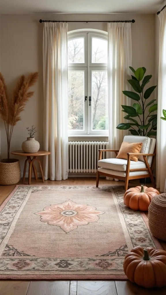
4. How do you layer a rug for fall without replacing your main rug?
Rug layering is a quiet seasonal trick because it changes the room’s temperature without changing the room. A small layer adds softness underfoot and deepens the palette for warm tones decor.
Keep your main rug in place, then add a 2′ x 3′ or 3′ x 5′ accent rug near the sofa or under the coffee table edge. Choose something with a muted pattern—vintage-inspired terracotta, tobacco, or olive—so it reads collected. Make sure at least the front legs of the coffee table sit on the top layer so it doesn’t look like a bath mat dropped in the middle.
Materials that work: flatweave kilim, low-pile printed rugs, or a small jute layer. Avoid high-pile shag on top of another rug; it shifts and looks bulky.
Pro tip: echo one rug color in your pillow mix. That tie-in makes the layer look planned, and the room instantly feels more intentional.
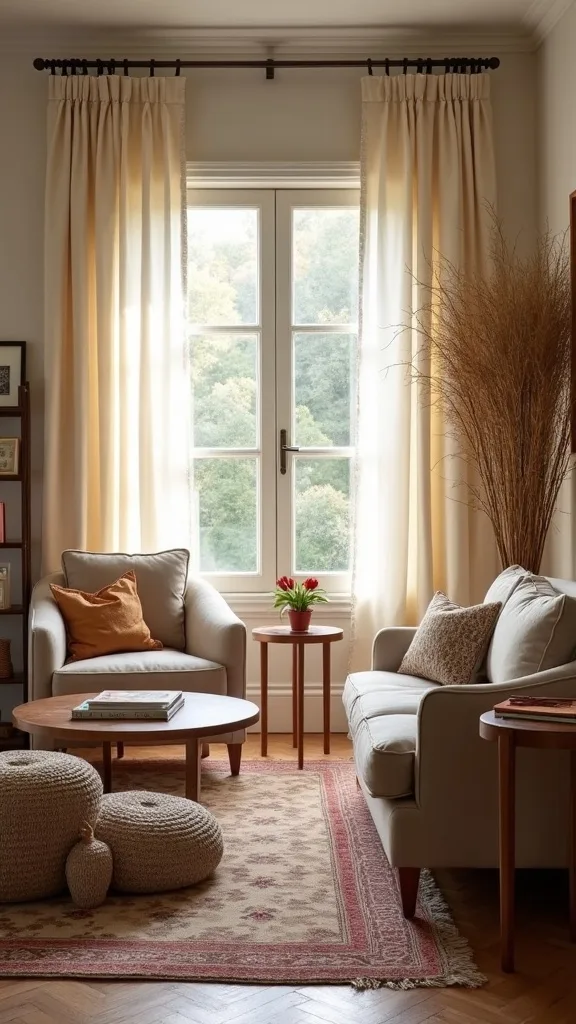
5. What window treatment swap makes a living room feel cozier by 6 p.m.?
Early fall is about the light changing earlier, not the temperature. Softer window treatments catch lamplight and make the room feel finished when the sun drops.
Swap sheer white curtains for linen-look panels in warm ivory, flax, or camel. Hang them high—2 to 3 inches below the ceiling—and let them kiss the floor for a tailored line. If replacing panels isn’t in the budget, add a second layer: keep sheers and add one heavier panel on each side to frame the window.
Choose matte hardware in black or antique brass. The finish should match one other metal in the room so it doesn’t feel random. Avoid overly grommeted tops; they read casual and can fight a transitional look.
Pro tip: steam the panels the day you hang them. Crisp, straight fabric is an instant upgrade that makes the whole room look professionally styled.
6. How can lighting create that early-fall glow without buying new fixtures?
Lighting is the fastest mood shift because it changes the color of everything you already own. The right bulbs make wood look richer and textiles look softer, which is the heart of transitional fall decor.
Use warm white light (2700K–3000K — the cosy, yellowish tone you see in most homes) in every lamp in the living room. Add one small table lamp where you normally rely on overhead lighting, even if it’s on a console or bookshelf. Aim for a layered glow: one lamp near the sofa, one across the room, and a candle cluster in the middle.
Choose lampshades in linen or parchment tones, not bright white plastic. Avoid daylight bulbs; they make rust and amber look harsh and slightly orange.
Pro tip: put lamps on a timer for 5:30 p.m. A room that “turns on” by itself feels welcoming, and the habit makes seasonal transitions effortless.
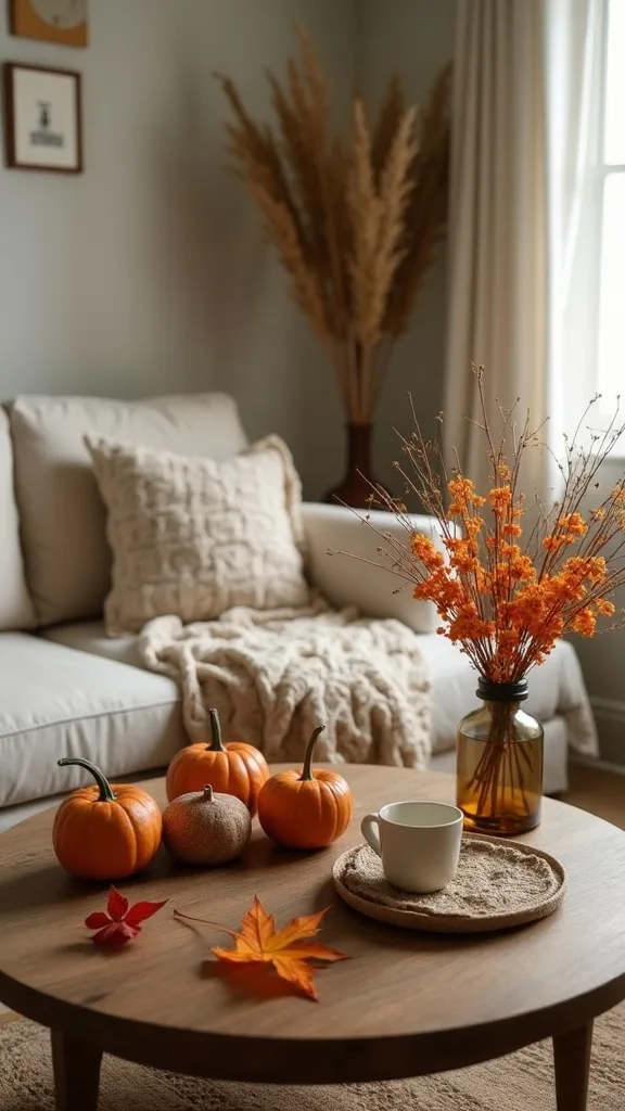
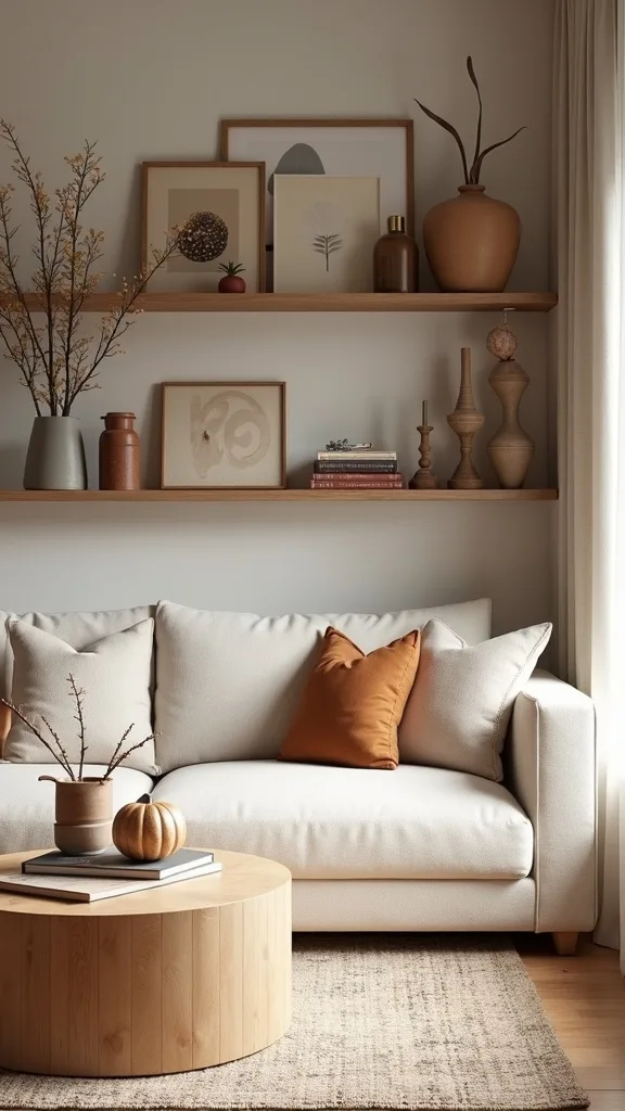
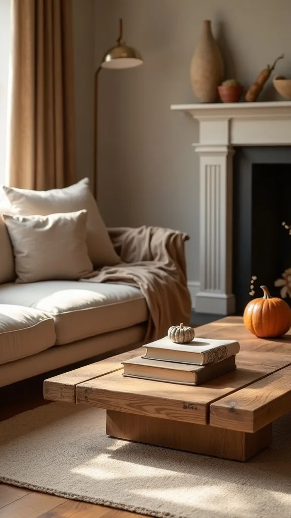
7. What coffee table styling reads fall, but still works through Thanksgiving?
A coffee table should look like you live there, not like a store display. A restrained arrangement gives you that fall preview home feeling without clutter.
Build a three-piece foundation: a tray, a candle moment, and one organic element. Use a wood or matte black tray, add two candles at different heights, and finish with a small bowl of walnuts or a simple branch in a low vase. Keep the center of the table clear enough for a mug and a book.
Materials to prioritize: wood, stone, and ceramic in cream, taupe, or terracotta. Avoid glittery fillers and tiny scattered objects; they read messy fast.
Pro tip: choose one “hero” object with weight—like a stone bowl—and let it do the talking. When the table has one strong anchor, everything else can stay quiet and timeless.
8. How do you use wooden candle holders so they look elevated, not craft-store seasonal?
Wooden candle holders feel classic when they’re treated like sculpture. The wood grain brings in nature, which is the backbone of an earthy living room.
Choose holders in two heights—around 8 inches and 12 inches—and keep the silhouettes simple. Place them slightly off-center on a tray or stack of books, then add one small ceramic piece beside them to break up the wood. Use unscented taper candles in ivory or warm white so the palette stays calm.
Look for real wood, not glossy faux finishes. Oak and walnut read warm; blackened wood adds depth when your room already leans beige. Avoid overly themed shapes (pumpkins, leaves, cutouts).
Pro tip: trim taper candles so the top line is even when grouped. That crisp detail makes the arrangement look curated, and the room instantly feels more designer.
Cost & Materials Estimate
A strong early-fall living room transition typically lands between a few targeted swaps and one anchor piece, depending on what you already own.
| Item | Estimated Cost | Where to Buy |
|---|---|---|
| Set of 3 pillow covers (rust/amber/neutral) | $28–$55 | Amazon |
| Chunky knit throw (50″ x 60″ or similar) | $32–$75 | Wayfair |
| Wooden candle holders (set of 2) | $22–$48 | Amazon |
| Warm white light bulbs (2700K–3000K) multi-pack | $12–$22 | Home Depot |
| Oversized ceramic floor vase + branches | $45–$120 | IKEA |
Total estimated cost: $139–$340 Save by reusing existing inserts and books; splurge on the vase or the throw because they carry the whole seasonal mood.
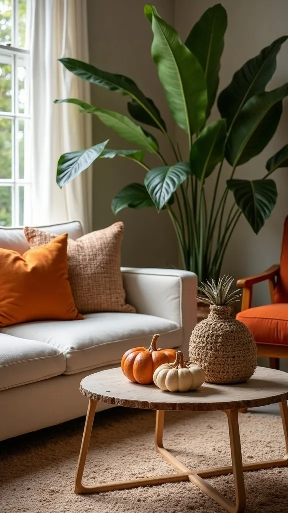
9. What should you avoid when switching into warm tones decor?
The biggest mistake is adding warmth by adding more stuff. Too many small fall items create visual noise and make a room feel smaller.
Avoid bright orange plastic decor, word art, and anything that only makes sense for a few weeks. Skip mixing five competing warm shades—mustard, pumpkin, cranberry, and neon rust—because they fight each other in lamplight. Instead, edit first: remove one summer accessory before you add one fall piece.
Choose warm tones with brown or clay undertones: rust, terracotta, amber, cognac, and olive. Pair them with quiet neutrals like oatmeal and warm ivory.
Pro tip: if an item looks best only next to a pumpkin, it doesn’t belong in a transitional room. Pick pieces that still look right in January, and your seasonal styling becomes effortless.
10. How do you make open shelving look cozy for fall without restyling everything?
Shelves can carry the season with minimal change because they already hold your everyday objects. A small tonal shift makes the whole wall feel warmer.
Swap in two to three items in clay, wood, or amber glass and remove the same number of bright or glossy pieces. Stack books horizontally and top them with one heavy object—a small stone, a wood box, or a ceramic vase. Leave negative space; breathing room reads high-end.
Colors that work: warm white ceramics, tan book spines, dark wood frames, and olive accents. Avoid tiny figurines lined in a row; they look like a collection, not styling.
Pro tip: repeat one material three times across the shelves—wood, for example—so it feels intentional. That repetition creates calm, and calm is what makes an early-fall room feel luxurious.
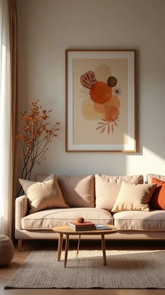
11. How can artwork help a transitional living room feel grounded for fall?
Art sets the room’s emotional temperature. One grounded piece can pull a space into an earth tone interior without touching furniture.
Look for landscapes, abstracts, or line art with warm neutrals—sand, umber, clay, and muted green. If you already own art you love, change the frame: a thin black frame or medium wood frame instantly warms the presentation. Keep the scale generous; in most living rooms, 24″ x 36″ is the minimum that reads intentional over a sofa.
Materials: wood frame, linen mat, matte print finish. Avoid overly glossy poster prints; glare fights the cozy mood.
Pro tip: tie the art to your textiles by matching one color note—an amber brushstroke echoed in a pillow. That one link makes the room feel designed from the start.
12. What’s the best way to add fall texture if your room is already neutral?
When the palette is already calm, texture becomes the season. You want touchable layers that make the room feel warmer even before the heat turns on.
Add one nubby element, one knit element, and one smooth element. Think bouclé pillow, chunky knit throw, and a leather tray. Spread them across the room—sofa, chair, coffee table—so the texture doesn’t clump in one spot.
Colors should stay within warm neutrals: oatmeal, camel, tobacco, and soft brown. Avoid piling on faux fur everywhere; it can tip the room into cabin mode fast.
Pro tip: choose texture with a visible weave. If you can see the thread from across the room, the space reads layered, and the early-fall mood lands without any seasonal icons.
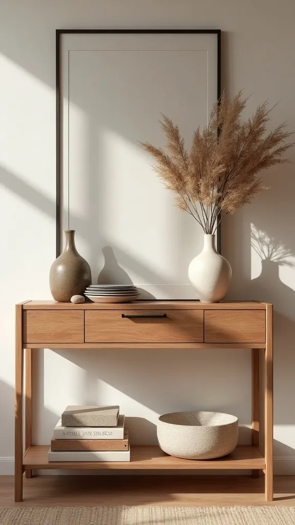
13. How do you style a console table for a subtle fall preview home moment?
A console table is the perfect place for a controlled seasonal signal. It’s a vignette that guests notice, but it doesn’t take over the room.
Start with a lamp on one end for glow, then add a tall vase with branches on the other for height. In the middle, place a shallow bowl or tray for keys, then one small object with weight—like a wood box or stone sphere. Keep the surface 30–40% clear so it still functions.
Use branches like eucalyptus, olive, or dried maple stems in muted tones. Avoid glitter picks and overly dyed florals; they read artificial and cheap.
Pro tip: angle one framed photo or artwork slightly behind the vase. That layered backdrop makes the console feel like a styled corner of a boutique hotel lobby.
14. What greenery looks right with rust and amber accents in early fall?
Greenery keeps warm palettes from feeling heavy. The right greens make rust and amber look richer, which is the secret to a balanced earthy living room.
Use deep, dusty greens: olive branches, seeded eucalyptus, or magnolia leaves. Keep arrangements loose and asymmetrical, like you clipped them from the yard. One tall arrangement (18–24 inches) on a console and one small one on a coffee table is enough.
Choose matte ceramic vases in cream, taupe, or terracotta. Avoid neon green faux stems; they instantly break the natural mood.
Pro tip: strip the lower leaves so the stems show in the vase. Visible stems look fresh and intentional, and that small detail makes faux greenery look far more convincing.
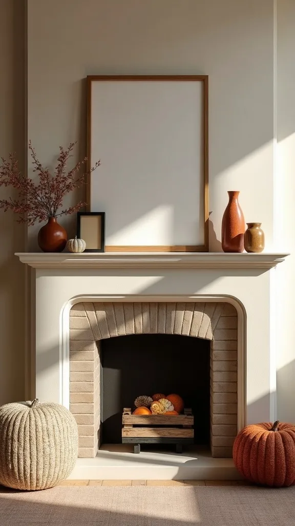
15. How do you make a fireplace mantel feel autumnal without pumpkins?
A mantel should feel architectural first, seasonal second. When you keep the lines clean, the fall layer looks timeless.
Anchor the mantel with one large piece—an oversized mirror or framed art—then flank with asymmetry: a tall candlestick on one side, a low stack of books and a small vase on the other. Add one garland-like element using real branches or dried grasses, kept thin so it doesn’t hide the mantel edge.
Stick to wood, stone, and ceramic. Avoid thick faux leaf garlands that scream craft-store aisle.
Pro tip: leave at least 6 inches of empty mantel on one end. That breathing space makes the arrangement look curated, and the fireplace becomes a calm focal point for the whole season.
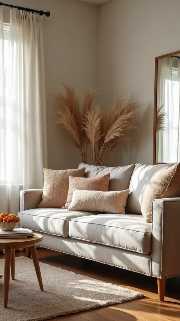
16. What throw blanket color makes the room feel warmer without going dark?
The throw is a color bridge. It can warm the space without turning the room into a brown cave.
Choose mid-tone neutrals: camel, warm taupe, oatmeal, or a muted rust that looks like clay. If your sofa is dark, go lighter with the throw; if your sofa is light, go slightly deeper. Drape it with one clean fold and let the fringe (if any) hang straight for a tailored look.
Materials that read cozy: cotton knit for everyday use, wool blend for a richer look. Avoid overly bright mustard; it can look sharp against amber lighting.
Pro tip: keep one “movie night” throw and one “styled” throw. The styled one stays crisp on the sofa, and the room always looks ready even when life is busy.
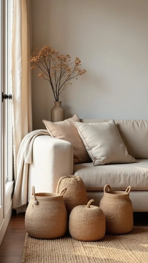
17. How can you use baskets to add warmth and still keep the living room tidy?
Baskets are decor that earns its keep. They add natural texture while hiding the stuff that makes a room feel chaotic.
Place one large lidded basket or a tall handled basket near the sofa for throws, magazines, and kids’ items. Choose a size that looks proportional—around 18–22 inches tall beside a standard sofa. If you have open shelving, use two matching baskets on the bottom shelf to ground the whole unit.
Look for seagrass, rattan, or water hyacinth in warm honey tones. Avoid bright white plastic bins; they fight the organic palette.
Pro tip: line the basket with a neutral fabric so the contents don’t visually spill out. That hidden layer keeps the room calm, and calm is the real luxury in early fall.
18. What’s the easiest way to bring in wood tones if your furniture is mostly painted or metal?
Wood is the shortcut to warmth because it reads natural and permanent. Even small wood notes can shift the room toward a grounded, transitional look.
Add wood in three touchpoints: a tray on the coffee table, a set of wooden candle holders, and one frame or small stool. If your room has black metal accents, choose walnut or medium oak to soften the contrast. Keep finishes matte; glossy wood can feel dated.
Good options: acacia trays, mango wood bowls, oak picture frames. Avoid overly orange wood stains; they can clash with rust textiles and look brassy.
Pro tip: repeat the same wood tone twice in the same sightline. When your eye sees that repetition, the room feels cohesive, and the seasonal layer looks built-in.
19. How do you style books so they support warm tones decor instead of cluttering the room?
Books can be color, height, and structure all at once. Styled well, they make a room feel lived-in in the best way.
Pull 8–12 books with neutral or warm spines—tan, cream, brown, muted green—and remove the loudest glossy jackets. Stack two horizontal piles with 3–5 books each, then add one object on top: a candle, small bowl, or wood bead strand. Keep one vertical row to create a clean stop.
Choose objects that echo your palette: stone, wood, ceramic. Avoid tiny knickknacks sprinkled between every book; it reads fussy.
Pro tip: turn one book around so the pages face out. That soft, creamy edge looks warm in lamplight, and it makes the whole stack feel quietly elevated.
20. How can scent be part of transitional fall decor without overpowering the room?
Scent is the invisible layer that makes a space feel seasonal the moment you walk in. It should whisper, not announce itself.
Use one scent source per main room: a soy candle on the coffee table or a reed diffuser on a console. Choose notes like cedar, amber, sandalwood, fig, or a light spiced vanilla. Light the candle for 30–60 minutes, then blow it out and let the residual scent linger.
Avoid competing fragrances—pumpkin spice plus apple plus cinnamon turns into a headache fast. Also skip heavily dyed wax candles; they can look cheap against an earthy palette.
Pro tip: keep the vessel neutral—amber glass or matte ceramic—so it works year-round. When the container looks timeless, the scent becomes a seasonal detail instead of a seasonal object.
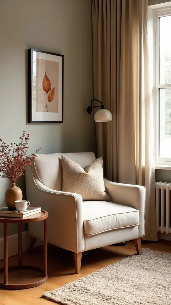
21. What chair and side-table combo creates a cozy reading corner for early fall?
A reading corner is a functional way to make the room feel cozier. It adds purpose, and purpose is what makes a space feel finished.
Place a chair at a slight angle to the sofa, then add a small side table within 8–10 inches so a mug feels secure. Layer a lumbar pillow in a warm neutral and add a small throw draped over the chair back. Finish with a floor lamp positioned just behind the chair for a soft pool of light.
Choose wood or black metal for the table, and a linen or boucle pillow for texture. Avoid a tiny table that can’t hold a book and a drink; it will frustrate you daily.
Pro tip: add one slim basket beside the chair for current reads. A corner that functions beautifully becomes the coziest spot in the house the first cool evening.
22. How do you make a TV wall feel warmer and less stark for fall?
A TV wall can flatten a room if it’s all black rectangle and blank space. Warmth comes from surrounding it with texture and balanced shapes.
Add a long console in wood or wood-look, then style it with low, wide objects: a shallow bowl, a stack of books, and one small lamp if outlets allow. On the wall, add two pieces of art or sconces flanking the TV to widen the composition. Keep the palette tight—warm neutrals, black accents, and one rust note.
Avoid tiny decor lined up like soldiers. Also avoid overly bright LEDs behind the TV; they can feel cold and futuristic.
Pro tip: use a single large ceramic vase on the floor beside the console with branches. That vertical organic shape softens the screen and makes the whole wall feel designed.

23. What’s a quick entry-to-living-room bridge so the whole space feels cohesive?
Transitions work best when the first thing you see matches the room beyond it. A small bridge moment makes your living room feel intentionally styled from the doorway.
Place a narrow tray on the entry table (or a small stool if you have no table) with one amber glass piece, one small dish, and a simple candle. Repeat one textile note—like a camel runner or a small woven mat—that echoes the living room throw. Keep it spare; it’s a cue, not a display.
Choose materials that match: wood, ceramic, and warm metal. Avoid seasonal signage and mini pumpkins at the entry; they can feel like a theme park gate.
Pro tip: carry one exact color from the living room to the entry—rust, for example—so your eye reads the home as one continuous story.
24. How do you keep transitional fall decor looking clean if you have kids or pets?
Real homes need decor that survives real afternoons. The secret is choosing warm layers that are forgiving and easy to reset.
Use washable pillow covers and darker mid-tones—camel, tobacco, rust—where paws and hands land most. Keep one lidded basket for quick pickups and one tray on the coffee table to corral small items fast. Choose flameless candles if you have climbers, and keep breakables higher on shelves.
Materials that hold up: cotton canvas, performance velvet, and woven throws. Avoid pale boucle on the main seat if you have a shedding pet; it will show everything.
Pro tip: create a two-minute nightly reset—pillows upright, throw folded, tray cleared. That tiny ritual keeps the room photo-ready, and the warmth feels effortless instead of fragile.
25. What single change makes the whole room feel professionally styled for fall?
Scale makes or breaks a living room. One larger, heavier element instantly elevates every smaller seasonal swap around it.
Add an oversized vase (at least 16–20 inches tall) in matte ceramic or textured stoneware and fill it with long branches that reach 8–12 inches above the rim. Place it on the hearth, beside the console, or in a corner where the room needs height. Keep the stems muted—olive, eucalyptus, or dried branches—and let the negative space show between them.
Colors that work: warm white, sand, taupe, and clay. Avoid tiny arrangements with dense faux flowers; they look busy and dated.
Pro tip: choose branches with gentle movement, not stiff sticks. That soft line brings life to the room, and suddenly every rust pillow and wooden candle holder looks like part of a designed, timeless whole.
Final Thoughts
Early fall decorating looks best when it’s not trying too hard. Keep the room’s bones steady—your rug, your main furniture, your core metals—then shift the mood with textiles, wood, and warmer light. Rust and amber do the heavy lifting. Knit and grain finish the story.
If one corner still feels stuck in summer, it’s usually a single cold note: a bright blue pillow, a stark white shade, a daylight bulb, a glossy accessory. Remove that one thing, then replace it with one grounded material like wood, linen, or stone. The room will start to feel like an earthy living room instead of a collection of seasonal objects.
Do this today: set a timer for 20 minutes, pull every blue pillow off the sofa, and restyle with one rust cover, one amber cover, and one warm neutral—then add your knit throw and two wooden candle holders in one clean cluster.
What I’d Do Differently
When I first tried this, I treated early fall like a hard switch instead of a gentle edit. I pulled out every orange-and-burgundy item I owned, lined them up on the mantel, and swapped my airy summer blues for three different reds. The room felt louder, not warmer. Worse, the new colors didn’t connect to my rug or my wood tones, so everything looked like it came from different houses. The fix was simple: I stopped chasing “fall colors” and started building an earth tone interior—one rust, one amber, plenty of warm neutrals, and real texture like knit and wood. The moment I limited myself to a tight palette, the space finally looked intentional.
I also wish I’d known how much lighting mattered. I kept one daylight bulb in a corner lamp, and it made the rust pillows look harsh and cheap every night. Now I standardize warm white light (2700K–3000K — the cosy, yellowish tone you see in most homes) across the whole room, then I add candles for depth. Pick your palette, change your bulbs, and start with one sofa swap today.