
This post contains affiliate links. As an Amazon Associate, I earn from qualifying purchases at no extra cost to you.
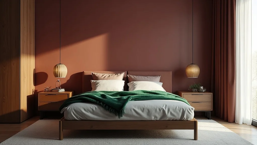
Fall hits and suddenly the bedroom feels too bright, too bare, too “summer rental.” The fix is not more décor. The fix is depth.
This guide breaks the moody fall bedroom aesthetic into decisions you can actually make: the wall color that holds the room, the dark wood that grounds it, the textiles that soften it, and the lighting that makes it all feel intentional. You’ll get specific ways to build a dark bedroom aesthetic without making the space look smaller or gloomy.
This is perfect for anyone who wants a grown-up, hotel-level bedroom that still reads cozy on a regular Tuesday night.
Inside, you’ll see dusty burgundy walls paired with dark oak furniture, amber lamps that flatter skin, and a forest-green velvet throw that looks expensive even when it’s tossed on casually. You’ll also get a few “don’t do this” calls that save you from the most common dark-room mistakes.
Below are 25 Moody Fall Bedroom Aesthetic & Dark Design that sharpen your fall bedroom colors, elevate your warm bedroom lighting, and land that cozy dark bedroom feeling on purpose.
Products I Recommend for This Project
Here are some of my favourite products to help you bring these ideas to life:
- Philips LED Soft White A19 Dimmable Bulbs (2700K) — Reliable warm light that keeps burgundy and oak looking rich at night.
- GE Relax HD LED Warm White A19 Bulbs (2700K) — A great budget-friendly warm bulb option for bedside lamps.
- STONE & BEAM Velvet Throw Blanket (Forest Green) — Adds instant depth and that luxe velvet texture at the foot of the bed.
- SAFAVIEH Vintage Hamadan Collection Area Rug (8′ x 10′) — Brings in faded fall tones and pattern that hides lint and wear.
- Umbra Trigg Wall Display (Small) — A clean, modern way to add one low-light plant without cluttering surfaces.
1. Start with the signature palette: dusty burgundy, dark oak, amber light, forest-green velvet
This is the backbone of a moody fall bedroom because every finish has weight and every color has warmth. Dusty burgundy reads rich without shouting, and dark oak keeps the room grounded instead of busy.
Paint the wall behind the bed in dusty burgundy and keep the other walls a soft warm neutral so the room still breathes. Anchor the space with dark oak nightstands or a low dresser, then place two amber bedside lamps at equal height so the bed feels centered and calm. Drape a forest-green velvet throw diagonally across the foot of the bed so it catches light and shows texture.
Look for a burgundy with brown undertones, not purple, and choose oak with a matte finish rather than high gloss. Add amber glass shades or warm-toned linen lamp shades to keep the glow flattering.
Pro tip: repeat the green once more—one pillow or a small vase—so the velvet throw looks like a deliberate color story, not a lone accent.
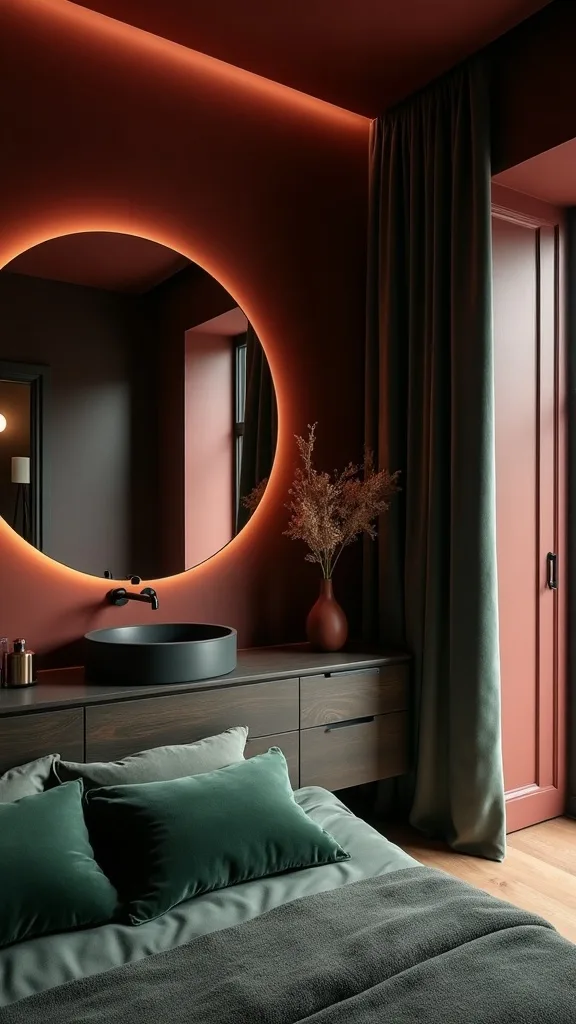
2. Which fall bedroom colors look luxe in low light?
Fall bedroom colors look most luxe in low light when they lean earthy and slightly muted. Think dried leaves, spiced wine, and worn leather rather than bright pumpkin or cherry red.
Choose one dominant deep tone for the room—burgundy, tobacco, or espresso—and let it lead. Then layer two supporting colors: a warm neutral (oat, mushroom, or ivory) and a dark green or inky blue for contrast. Keep patterns subtle so the colors feel like a wash, not visual noise.
For bedding, a warm ivory duvet with a cocoa or charcoal quilt reads expensive and never seasonal in a gimmicky way. Add one forest green accent and one rust or cognac detail in a pillow or lumbar.
Pro tip: avoid pairing deep burgundy with cool gray. Gray kills the warmth and makes the room feel flat, especially at night.
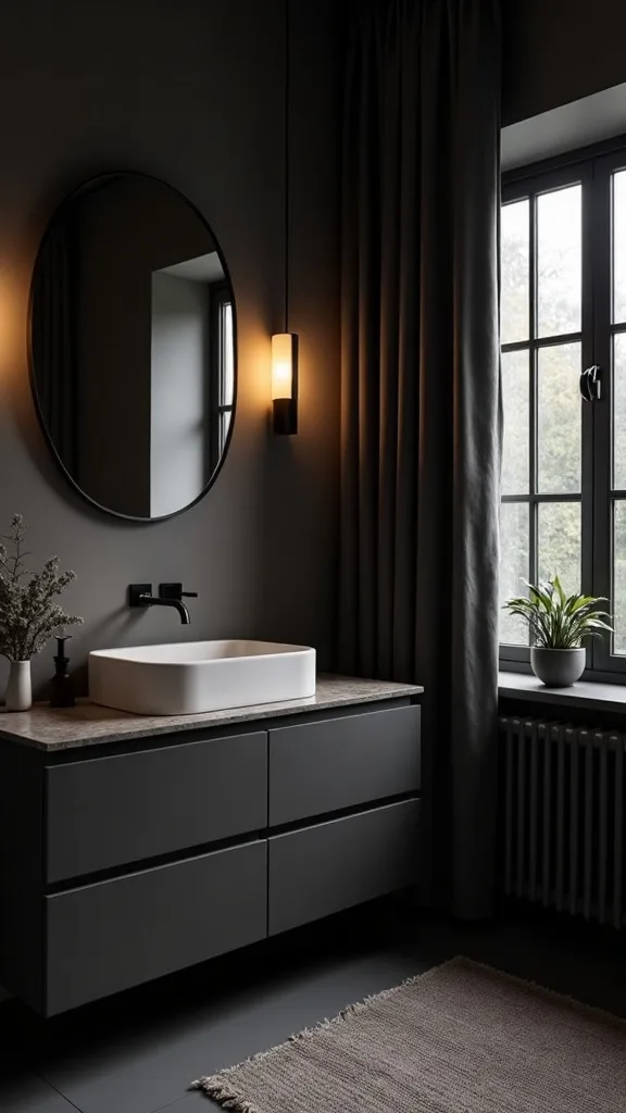
3. How do you choose a dark paint color that won’t make the bedroom feel smaller?
A dark paint color won’t make a bedroom feel smaller when the finish and placement are controlled. Darkness feels intentional when it’s framed by lighter elements and clean lines.
Paint one wall—usually the headboard wall—rather than the entire room if you’re unsure. Use a matte or eggshell finish so the color looks like velvet, not plastic. Keep trim and ceiling in a warm white so the edges stay crisp and the room keeps its shape.
Dusty burgundy, deep umber, and smoked olive work better than blue-black for fall because they hold warmth. Pair the wall with light bedding and simple art so the contrast reads tailored.
Pro tip: avoid painting the ceiling the same dark color unless you have 9-foot ceilings or higher. In an average-height room, it can press the space down and make lighting harder to get right.
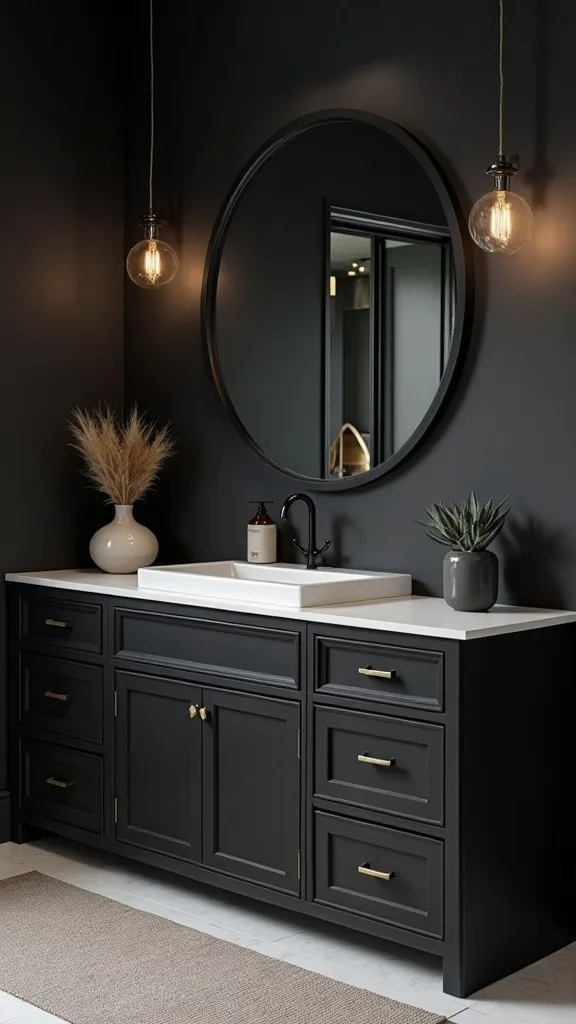
4. What’s the best way to style dark oak furniture so it doesn’t feel heavy?
Dark oak furniture looks refined when it’s given breathing room. The goal is grounded, not bulky.
Choose fewer pieces and let them be substantial: two nightstands and one dresser is enough in most bedrooms. Keep the tops mostly clear, then group objects in threes—lamp, small tray, one vertical element like a book or bud vase. If your bed frame is dark wood too, lighten the bedding and add a pale rug to lift the floor.
Mix dark oak with brushed brass or aged bronze hardware for a soft glow. Add linen textures and matte ceramics to keep the wood from feeling overly formal.
Pro tip: avoid matching every wood tone exactly. A slight variation—oak nightstands with a walnut picture frame—adds depth and keeps the room from looking like a showroom set.
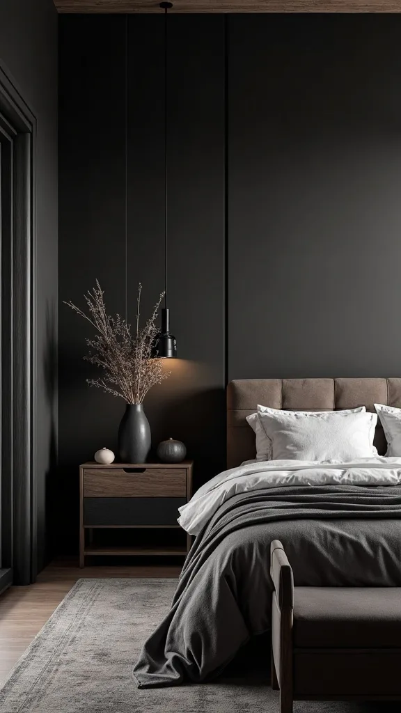
5. How do you layer bedding for a cozy dark bedroom without clutter?
A cozy dark bedroom depends on crisp layering, not piles of extra fabric. The bed should look inviting and edited.
Start with smooth cotton sheets in warm white or oatmeal. Add a quilt or coverlet in charcoal, cocoa, or deep olive, then fold it back halfway so the lighter sheet color shows. Finish with one textured throw—forest-green velvet is ideal—and place it at the foot with a clean diagonal fold.
Keep pillows simple: two sleeping pillows, two shams, and one lumbar. Choose tone-on-tone patterns like a subtle stripe or herringbone so the texture shows in low light.
Pro tip: avoid oversized faux-fur throws in a dark palette. They read bulky fast and can make the bed look messy instead of intentional.
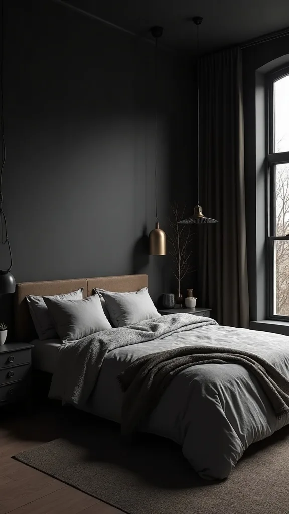
6. What window treatments make a dark bedroom aesthetic feel finished?
Window treatments finish a dark bedroom aesthetic because they control contrast. Bare windows look harsh against deep walls, especially at night when the glass turns into a black mirror.
Hang curtain rods 4–6 inches above the window frame and extend them 6–10 inches past each side so the fabric stacks off the glass. Choose lined linen-look panels in warm ivory or toasted flax for softness, or go deep with chocolate velvet if you want full drama. If you need privacy, add a simple woven shade underneath.
Stick with matte hardware in black or aged brass. Avoid shiny chrome, which feels cold against fall tones.
Pro tip: avoid short curtains that stop at the sill. Floor-length panels make the room feel taller and instantly more considered.
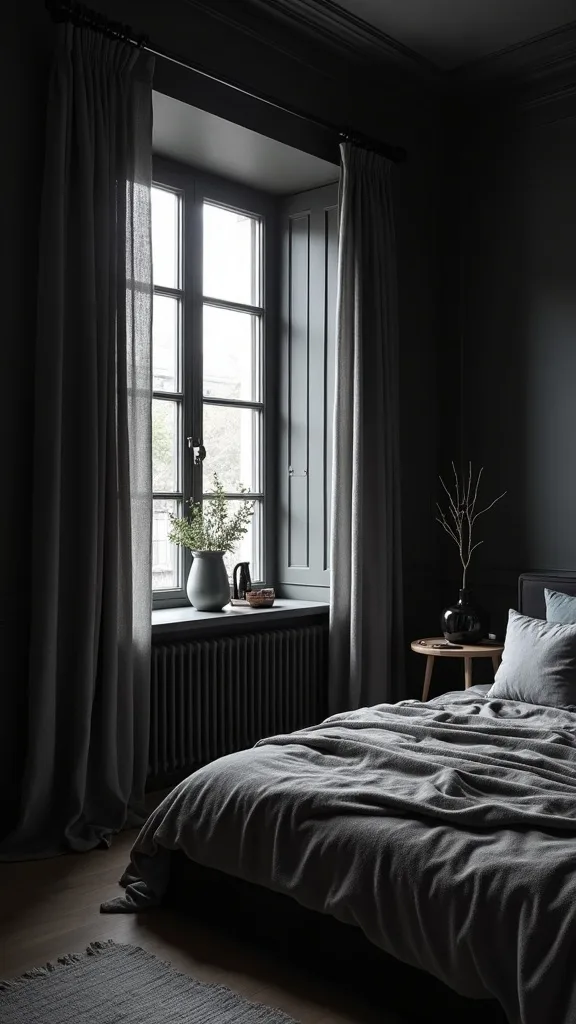
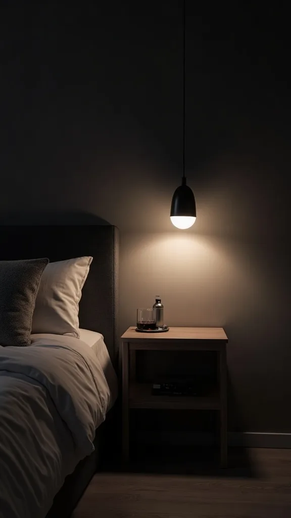
7. How do you get warm bedroom lighting that flatters everything?
Warm bedroom lighting is the difference between moody and murky. It should make skin look good, wood look rich, and paint look intentional.
Use bulbs labeled warm white light (2700K–3000K — the cosy, yellowish tone you see in most homes). Aim for three light sources: bedside lamps, a ceiling or pendant fixture on a dimmer, and one low glow like a plug-in sconce or small table lamp on a dresser. Keep brightness (measured in lumens) moderate and rely on multiple lamps rather than one blazing overhead.
Amber glass shades, linen shades, and warm metals amplify the glow. Choose dimmable bulbs and soft-shade lamps so the room transitions from day to night smoothly.
Pro tip: avoid cool “daylight” bulbs in a dark room. They turn burgundy walls grayish and make the whole palette feel off.
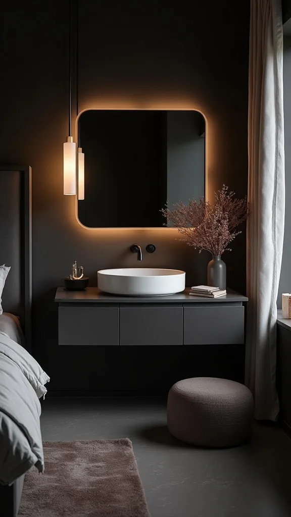
8. Where should bedside lamps sit for the most comfortable reading light?
Bedside lamps feel comfortable when the light lands on the book, not in your eyes. Placement is everything.
Choose lamps where the bottom of the shade sits around shoulder height when you’re seated in bed. A common sweet spot is a lamp height around 24–28 inches on a standard nightstand, but your headboard height matters more than the number. Place each lamp 2–3 inches in from the back edge of the nightstand so cords disappear and the glow washes the wall.
Amber glass bases add warmth even when the lamp is off, and a drum linen shade keeps light soft. If you’re short on surface space, use a wall-mounted sconce with a shade.
Pro tip: avoid tiny lamps with exposed bulbs. They cast harsh shadows on dark walls and make the room feel unfinished.
Cost & Materials Estimate
A realistic refresh toward a moody fall bedroom aesthetic typically lands between $180 and $1,050 depending on whether you paint and replace lighting.
| Item | Estimated Cost | Where to Buy |
|---|---|---|
| Interior paint (1 gallon) in dusty burgundy + supplies | $65–$110 | Home Depot |
| Pair of amber bedside lamps | $80–$220 | Wayfair |
| Warm white dimmable LED bulbs (4-pack) | $12–$28 | Amazon |
| Forest-green velvet throw blanket | $25–$70 | Amazon |
| 8′ x 10′ vintage-style area rug | $120–$620 | IKEA |
Total estimated cost: $302–$1,048 Save money by keeping your existing furniture; splurge on lighting and the rug because they change the mood the fastest.
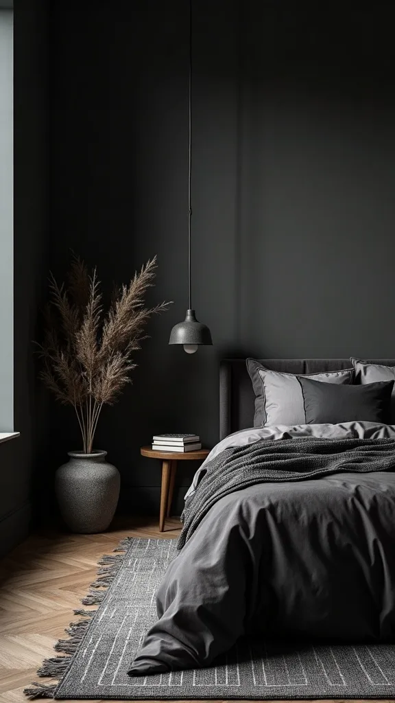
9. How can you add depth with a rug in a dark, fall-toned bedroom?
A rug adds depth by breaking up dark floors and anchoring the bed. In a moody palette, it’s the soft “breathing layer” under everything else.
Use a rug that extends at least 18–24 inches beyond the sides and foot of the bed so your feet land on softness. If you can, size up—an 8′ x 10′ under a queen bed is a classic move that makes the room feel generous. Choose low-pile wool or a vintage-style printed rug in faded rust, burgundy, and cream.
Look for muted pattern and warm undertones so the rug doesn’t fight the wall color. Avoid icy whites that look stark against dark oak.
Pro tip: avoid a solid dark rug in a dark room. It can swallow the floor and make furniture legs disappear.
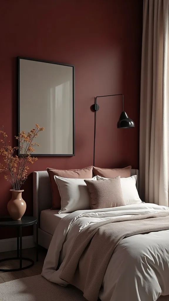
10. What art looks right against dusty burgundy walls?
Art looks right on dusty burgundy when it adds contrast and calm. The wall is already doing the dramatic work, so the art should feel curated, not loud.
Choose one oversized piece over the bed or a tight pair of medium pieces rather than a scattered gallery. Black frames sharpen the look; warm wood frames soften it. Keep the artwork palette limited—creams, warm grays, charcoal lines, or a small echo of green.
Photography with deep shadows, simple abstracts, and vintage botanical prints all read timeless. Add wide matting to give the art space and make it feel more expensive.
Pro tip: avoid art with bright primary colors. They clash with fall tones and pull the room back into a playful look that fights the moody direction.
11. How do you style the nightstand so it feels calm, not crowded?
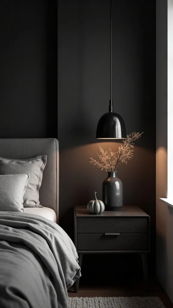
A calm nightstand is a small composition. It should support the routine of the room: light, water, book, and one beautiful object.
Start with the lamp as the anchor. Add a low tray to corral essentials like hand cream and a watch, then stack one book with a darker cover to echo the palette. Finish with one vertical element—matches in a glass jar, a bud vase, or a slim candle.
Use dark ceramic, aged brass, and warm woods so everything feels cohesive. Keep labels minimal and packaging hidden.
Pro tip: avoid leaving charging cords visible. Use a cord clip or route the cord behind the nightstand so the surface reads intentional.
12. What’s the best way to add mirrors in a dark bedroom aesthetic?
Mirrors in a dark bedroom aesthetic should reflect light sources, not clutter. Done right, they double the glow and make deep colors feel luminous.
Place a mirror opposite a lamp or near a window so it catches warm highlights. A tall leaning mirror works well on a dresser wall; a round mirror above a small console softens all the straight lines of dark oak. Choose a frame in black, antique brass, or dark wood.
A slightly antiqued mirror finish can look gorgeous with fall tones because it adds softness. Keep the frame thin and tailored so it doesn’t compete with the wall color.
Pro tip: avoid placing a mirror directly facing the bed if it bothers your sleep. Put it on a side wall so you get the light benefit without the nighttime reflection.
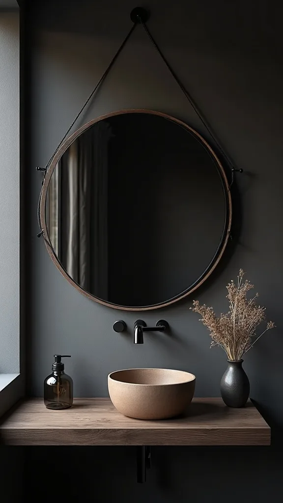
13. How do you use forest green without making the room feel Christmasy?
Forest green looks sophisticated when it’s treated like a neutral. The key is keeping it deep, earthy, and paired with warm tones.
Use green in one hero textile, like a velvet throw or a pair of euro shams. Then echo it once in a smaller object—an olive-toned vase or a framed print with a green note. Keep the rest of the palette in burgundy, cream, and dark wood so the green feels grounded.
Choose muted evergreen rather than bright emerald. Pair it with aged brass and warm white light so it reads autumnal.
Pro tip: avoid adding bright red accents with forest green. Burgundy is fine, but true red flips the mood into holiday territory fast.
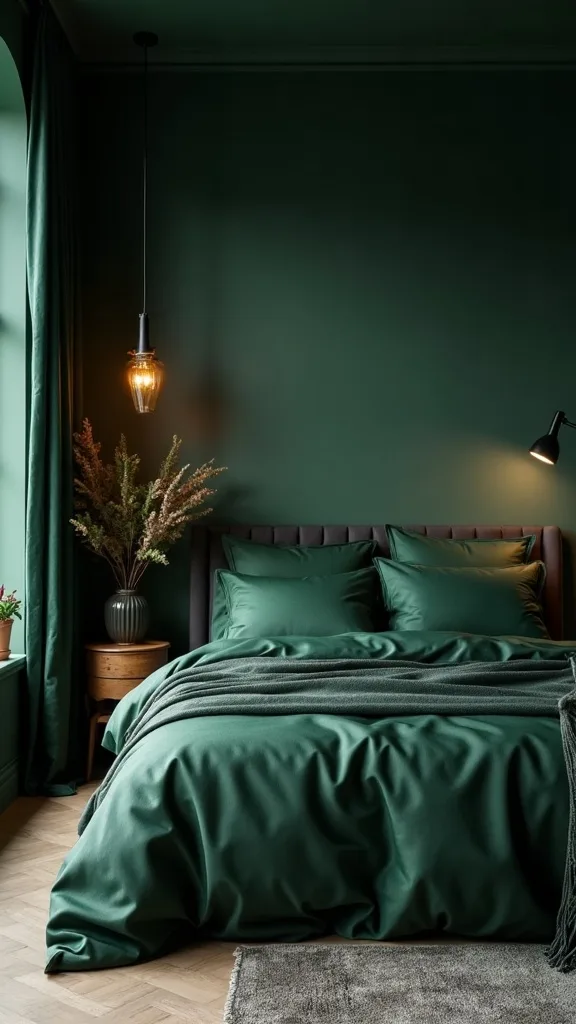
14. Which textures make a cozy dark bedroom feel expensive?
Expensive-looking texture is quiet and layered. It shows up when you move through the room and when the lamp turns on at night.
Combine one smooth base (cotton percale sheets), one matte soft layer (linen duvet or coverlet), and one plush accent (velvet throw or mohair pillow). Add a woven basket for extra blankets and a ceramic lamp base with a subtle glaze. Keep the texture changes intentional rather than random.
Stick to natural fibers where you can, and choose neutral trims instead of contrast piping. A dark oak room loves matte finishes.
Pro tip: avoid shiny satin bedding in a dark palette. It reflects light unevenly and can make the bed look slippery instead of cozy.
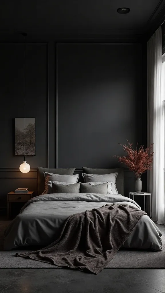
15. How do you create a reading corner that matches a moody bedroom?
A reading corner matches a moody bedroom when it feels like a small retreat, not an extra chair shoved in. It should echo the room’s materials and light.
Choose one comfortable chair in a dark neutral—charcoal, espresso, or deep olive—and add a small oak side table. Place a floor lamp with a linen shade beside it, angled slightly toward the chair. Finish with one pillow that repeats burgundy or green.
A vintage-style rug under the chair helps define the zone. Add a throw basket and a single candle for ritual.
Pro tip: avoid a bright white accent chair in this palette. It steals focus and breaks the room’s slow, warm mood.
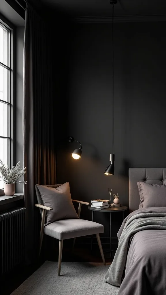
16. What greenery actually works in low light bedrooms?
Greenery works in low light when it’s chosen for real conditions, not wishful thinking. A dark room can still hold life, but the plant has to be the right one.
Pick a snake plant, ZZ plant, or pothos and place it where it sees indirect light from a window. Use a deep terracotta or matte black pot so it blends with dark oak and burgundy walls. Keep the foliage silhouette strong—upright leaves or trailing vines look especially good against a dark backdrop.
Add one larger plant rather than several small ones. It reads calmer and more editorial.
Pro tip: avoid fussy flowering plants in the bedroom. They drop petals, demand more light, and rarely look good for long in a moody space.
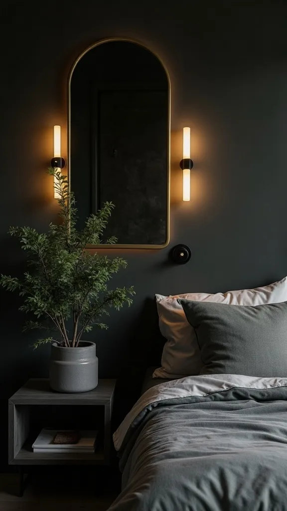
17. How can you style the dresser top without it turning into storage?
A dresser top becomes styling when it’s treated like a vignette, not a landing pad. The room feels instantly more adult when this surface is controlled.
Start with a catchall tray for daily items and commit to keeping everything else inside drawers. Add a lamp or a small sculpture for height, then place a framed photo or art leaning against the wall for softness. Keep one bowl or lidded box for jewelry.
Choose dark glass, ceramic, and a warm metal accent to echo the bedside setup. If you add a candle, keep the label minimal.
Pro tip: avoid lining up tiny objects across the whole surface. Group them tightly so the dresser still reads as a clean plane of dark oak.
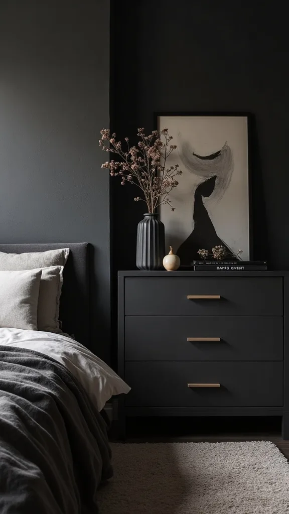
18. How do you mix metals in a dark bedroom aesthetic?
Mixing metals looks intentional when one metal leads and the other supports. In a dark bedroom, warm metals keep the palette from feeling cold.
Choose aged brass or antique gold as your primary for lamps and hardware. Use black metal as the secondary for curtain rods, picture frames, or a bed frame detail. Keep finishes matte or softly brushed so they don’t flash under warm lighting.
A little bronze also works beautifully with burgundy walls. Aim for two metals, not four.
Pro tip: avoid bright polished chrome. It reads blue in warm light and fights every fall tone you’re trying to build.
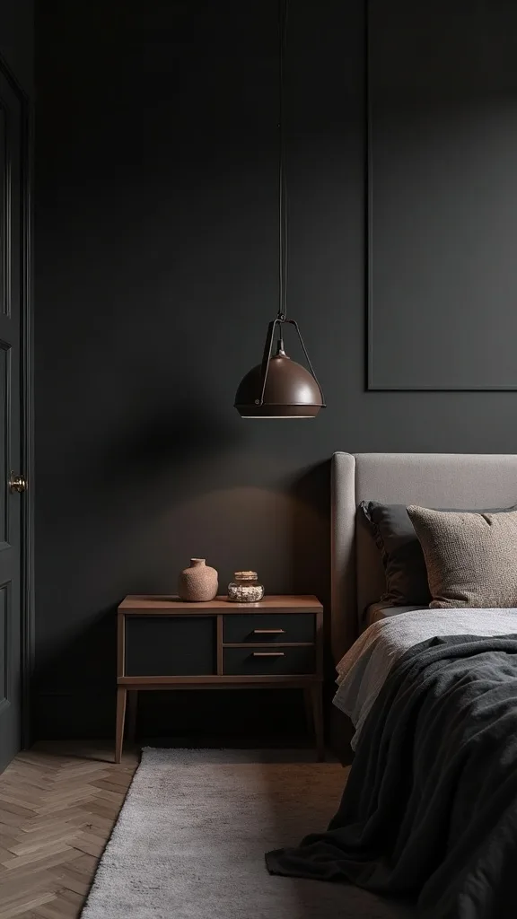
19. What’s the simplest way to make a dark room feel cleaner and calmer?
A dark room feels cleaner when the lines are crisp. Deep colors magnify visual clutter, so editing matters more than adding.
Use matching hangers and keep closets closed with a door or curtain. Choose bedside tables with drawers so you can hide small items. Limit wall décor to a few larger pieces and keep surfaces mostly clear.
Stick to closed storage and repeat shapes—two matching lamps, two matching frames—so the room feels settled.
Pro tip: avoid open shelving in a bedroom with dark walls unless you’re committed to styling it weekly. One messy shelf can make the whole space feel chaotic.
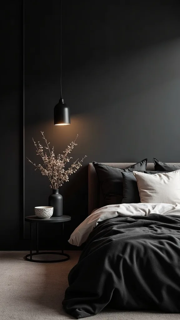
20. How do you add scent and sound to deepen the fall mood?
Atmosphere is a design layer. Scent and sound make the room feel finished the moment you walk in.
Choose one candle scent profile—smoke, cedar, amber, or clove—and keep it consistent. Use a candle on the dresser and a small match holder on the nightstand so the ritual feels easy. For sound, add a small speaker and keep a low playlist ready for evenings.
Look for amber jar candles and wood-toned accessories that blend into the palette. Keep packaging minimal.
Pro tip: avoid overly sweet “bakery” scents in a dark room. They can feel heavy and artificial against a refined fall color scheme.
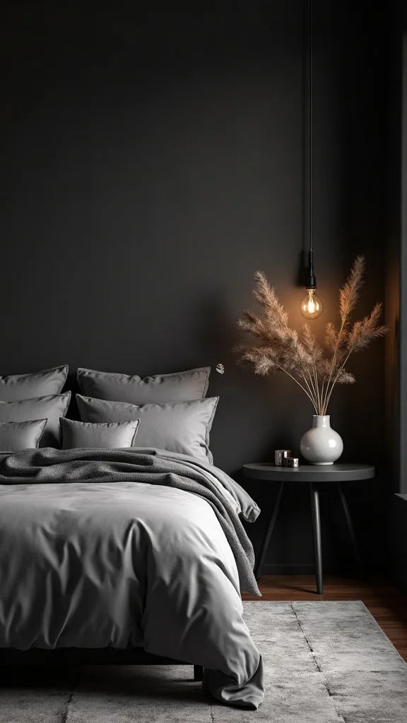
21. How can you make a rental bedroom moody without painting?
You can get a moody look without paint by concentrating color in large textiles and one oversized backdrop. The room needs one dominant dark plane.
Use a tall headboard in dark fabric or wood, or hang a large tapestry or curtain panel behind the bed as a faux accent wall. Choose bedding in warm neutrals, then add a burgundy quilt folded at the foot and a forest-green velvet throw. Bring in dark oak through a nightstand, a tray, or even peel-and-stick drawer fronts.
Choose removable hooks and command curtain rod brackets for damage-free installs. Add amber lighting to seal the mood.
Pro tip: avoid tiny dark accents scattered everywhere. Concentrate the darkness in fewer, larger moves so it looks intentional.
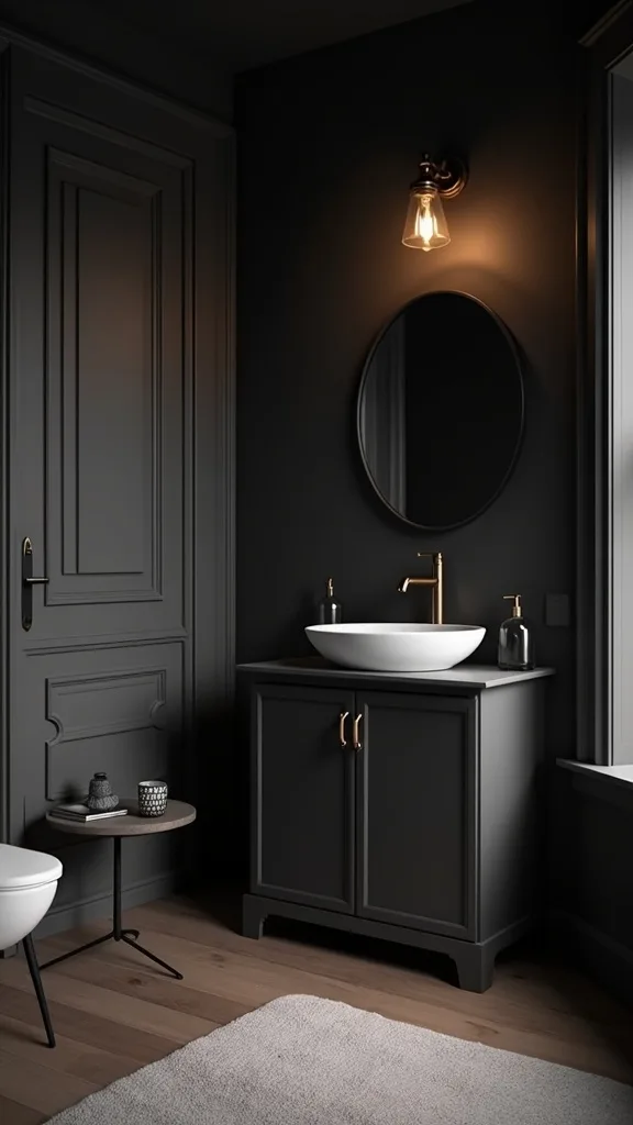
22. What should you avoid when creating a cozy dark bedroom?
The fastest way to ruin a cozy dark bedroom is to chase darkness without warmth. A room can be dark and still feel sterile if the undertones are wrong.
Avoid cool grays, bright white LEDs, and shiny finishes that reflect harshly. Skip stark black bedding unless you balance it with warm creams and textured layers. Don’t add five competing patterns; pick one subtle pattern and let solids do the heavy lifting.
Commit to warm undertones and soft lighting so the palette stays inviting. Use natural textures to keep the space human.
Pro tip: avoid buying everything at once. Build the room in layers so each piece earns its spot and the final look feels collected.
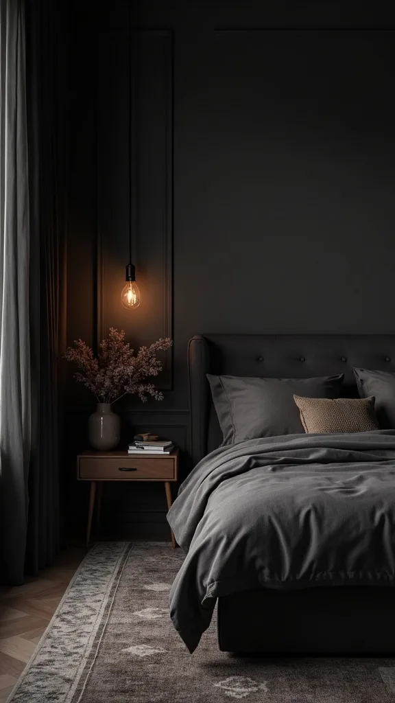
23. How do you balance dark walls with white bedding the right way?
White bedding against dark walls looks striking when it’s warm and textured. The contrast should feel plush, not clinical.
Choose an ivory or cream duvet rather than bright optic white. Add texture—matelassé, linen, or a lightly quilted cover—so it holds its own against burgundy. Bring in a darker quilt or throw at the foot to bridge the gap between wall and bed.
Use warm white bedding with earthy accents like cognac leather, forest green, or charcoal. Keep pillowcases in the same family.
Pro tip: avoid bright white sheets with cool blue undertones. They can make burgundy walls look muddier and the room feel less relaxing at night.
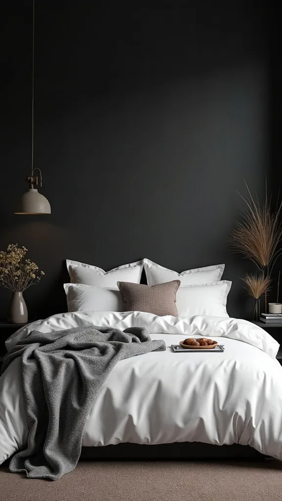
24. How can you add vintage character without making the room feel themed?
Vintage character works when it’s one or two pieces with real presence. The room stays timeless when the vintage items feel functional, not costume.
Add a vintage-style brass picture light over art, a thrifted wooden bench at the foot of the bed, or an antique-looking mirror with a thin frame. Keep the shapes simple and the finishes worn-in. Pair vintage with clean modern bedding so it feels balanced.
Look for aged brass and dark wood patina that harmonizes with oak furniture. Avoid overly ornate pieces that demand attention.
Pro tip: avoid matching “vintage sets.” One great piece looks collected; a full matching suite looks like a themed hotel room.
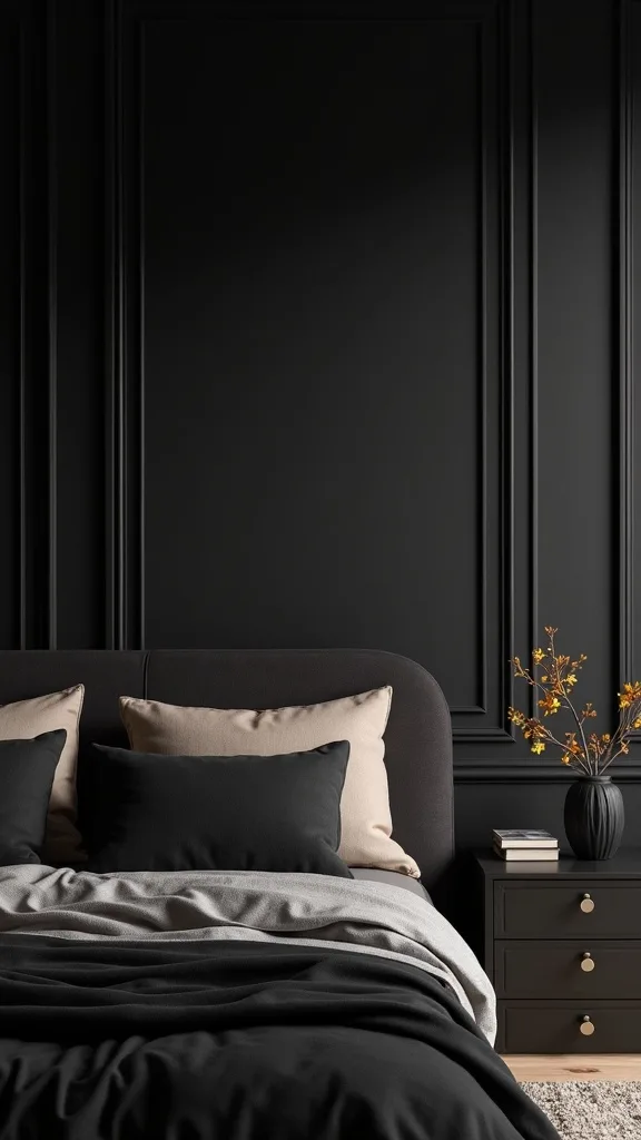
25. What single styling move makes the whole room look intentional?
The single move is repetition. A room looks designed when the same tone shows up at least three times in different materials.
Pick your hero fall tone—dusty burgundy—and repeat it in paint, one textile, and one small object. Then repeat your secondary—forest green—in the velvet throw, a plant pot, and a book spine. Repeat your warm metal in the lamp base, a frame, and a small tray. This creates a quiet rhythm that makes everything feel connected.
Use three-point color repetition and mixed texture to keep it from feeling flat. Keep the repeats subtle.
Pro tip: end with one dark, sculptural object on a dresser or nightstand. It adds a final note of weight, like punctuation on a sentence.
Final Thoughts
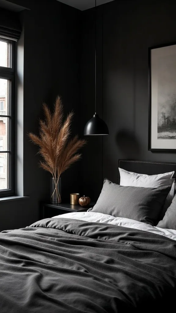
Dark design works in a bedroom because it removes visual noise. Dusty burgundy walls hold the space like a backdrop in a portrait, and dark oak furniture gives the room a steady base. The rest is just layering—soft textiles, warm light, and one or two living elements to keep it from feeling staged.
Keep the decisions big and the accessories few. Choose one deep fall color, one supporting neutral, and one accent that shows up in velvet or foliage. Let warm bedroom lighting do the heavy lifting at night, and you’ll get that calm, cocooned look without sacrificing comfort.
Do this today: swap every bulb in your bedroom lamps to warm white light (2700K–3000K — the cosy, yellowish tone you see in most homes), then turn off the overhead light for one evening and adjust your lamp placement until the bed feels like the clear focal point.
What I’d Do Differently
When I first tried this, I went all-in on “dark” and forgot about warmth. I painted the room deep, bought black-ish bedding, and kept the same cool bulbs that were already in my lamps. At night, the walls looked flat and the bed looked like a shadow. The room felt smaller, not cozier. The fix was simple: I swapped the bulbs to warm white light (2700K–3000K — the cosy, yellowish tone you see in most homes), added amber shades, and brought in one warm neutral layer on the bed. Suddenly the burgundy read like velvet instead of maroon paint, and the wood looked richer.
I also wish I’d started with one strong accent wall instead of committing to the whole room on day one. Dark color is powerful, and it’s easier to correct when you’re working in one zone. Pick your wall, pick your lamps, pick one hero textile, and start this weekend.