This post contains affiliate links. As an Amazon Associate, I earn from qualifying purchases at no extra cost to you.
Late summer has a particular kind of light—soft, slanted, forgiving. It’s also when your kitchen starts to feel a little… loud. The counters are busy, the cabinets are scuffed, and the overhead fixture is giving “break room” when you wanted “coastal rental in a good way.”
This is a practical list for a budget kitchen remodel that doesn’t spiral. We’re leaning into peel-and-stick texture, contact paper that actually looks like stone from three feet away, hardware that feels cool in your hand, and lighting that makes weeknight cooking feel less like a chore.
It’s perfect for renters (with permission), first-time homeowners, and anyone who wants a cheap kitchen makeover without pulling a single cabinet off the wall.
Inside you’ll find the moves that photograph well but matter more in real life: a backsplash that wipes clean, under-cabinet glow, a faucet that stops dripping, and a couple vintage-style finds that make the room feel collected—not “just updated.”
Below are 25 Budget Kitchen Remodel Ideas Under $500 that land big on vibe, function, and everyday ease—without turning your late-summer weekends into a renovation saga.
Products I Recommend for This Project
Here are some of my favourite products to help you bring these ideas to life:
- Art3d Peel and Stick Backsplash Tiles (Subway Tile) — Thick, textured sheets that look more like real tile and wipe clean easily.
- d-c-fix Self-Adhesive Vinyl Countertop Film (Marble) — A reliable, thicker contact paper option that’s beginner-friendly and surprisingly convincing.
- Amerock Cabinet Pulls (Satin Nickel) — Solid, comfortable pulls that instantly make cabinets feel more “finished.”
- GE Relax LED Light Bulbs (Warm White 2700K) — An easy bulb swap to get that cozy, homey glow without touching wiring.
- Govee Under Cabinet LED Light Strips (with diffuser-style look) — Adds that built-in under-cabinet glow for prep zones and evening ambiance.
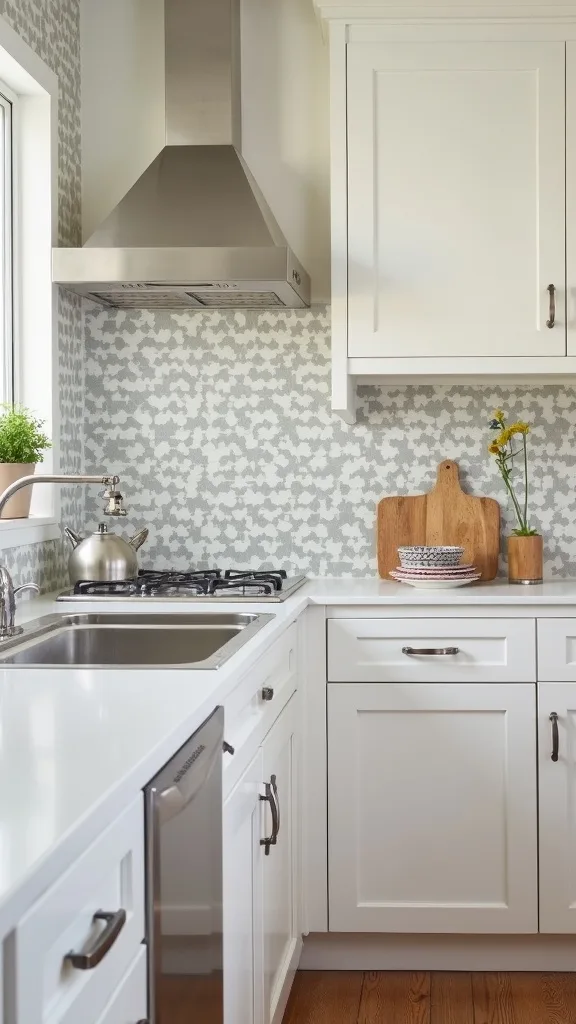
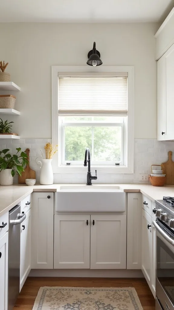
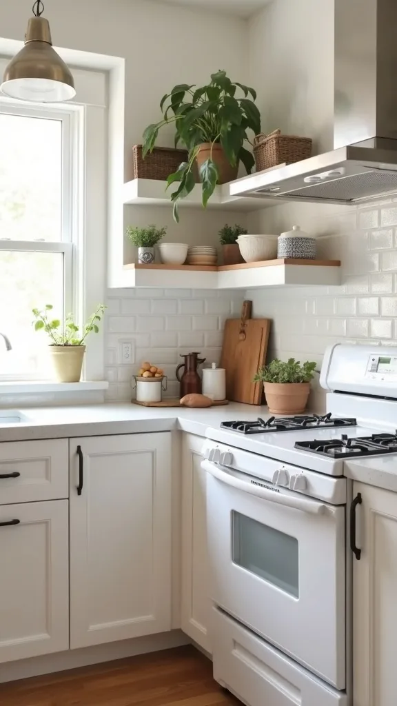
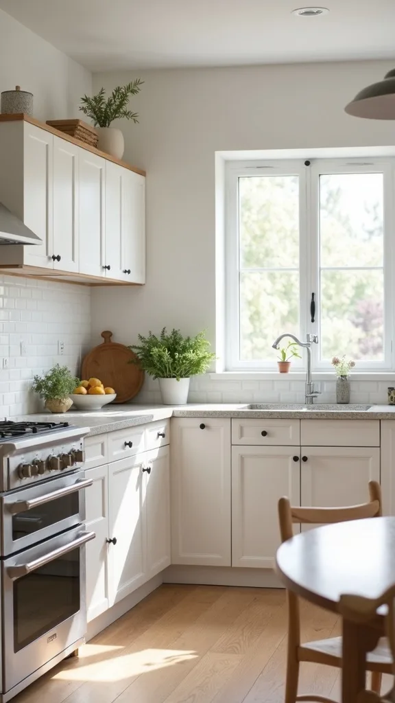
1. Start with the “Big Four” combo: backsplash + counters + hardware + lighting
This is the fastest way to get a real before-and-after without touching layout: peel-and-stick backsplash, contact paper counters, new hardware, and strategic lighting. It works because you’re changing what you see at eye level, what you touch daily, and how the whole room glows.
Pick one weekend. Do backsplash first (so you’re not leaning on fresh counter film), then counters, then swap pulls/knobs, then lighting. Keep a microfiber cloth and a plastic squeegee nearby—air bubbles are the only thing that will betray you.
Go for a matte backsplash tile (it hides fingerprints) and a slightly warm marble-look counter film. Finish with brushed brass or satin nickel hardware—both age nicely and don’t scream for attention.
Pro tip: commit to one metal finish across the room, then add contrast with a single vintage-style piece (like a schoolhouse ceiling shade) so the whole thing feels intentional, not just “updated.”
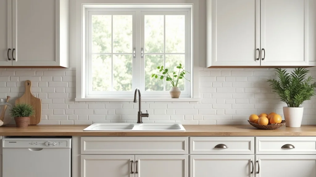
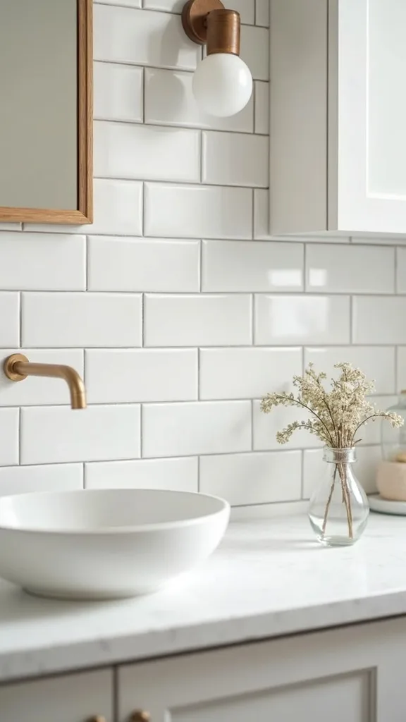
2. Which peel-and-stick backsplash looks real (and doesn’t peel off)?
The peel-and-stick backsplash that looks most real is the kind with a little thickness and texture—think faux ceramic or stone, not flat printed plastic. It works because your eye reads shadow lines and grout-like seams as “actual tile.”
Clean the wall with a degreaser, then wipe with plain water and let it dry fully. Start from the most visible corner and work out, pressing firmly with a squeegee as you go. If you have outlets, loosen the cover plates first so the tile can tuck under for a finished edge.
White zellige-style sheets are forgiving, but soft grey “subway” can look surprisingly high-end under warm light. If you want mood, try a muted green that nods vintage without going full diner.
Pro tip: avoid installing directly behind a high-heat gas range unless the product is heat-rated—put your money into a small stainless splatter guard instead and keep the peel-and-stick where it can live a long, clean life.
3. How do you redo countertops cheaply with contact paper that lasts?
Contact paper countertops are the ultimate affordable kitchen update when your existing surface is solid but ugly. It works because you’re covering the largest “visual slab” in the room—your brain instantly recalibrates the whole space.
Measure depth and length, then cut the film with 1–2 inches extra on all sides. Apply slowly, peeling the backing as you smooth forward. Use a hair dryer on low to soften the film around corners so it wraps like a tailored hem, not a bandage.
Look for thick, waterproof vinyl in a matte finish—glossy reads cheaper and shows every crumb. Marble-look is classic, but concrete grey hides coffee drips like a champ.
Pro tip: don’t wrap the front edge with one long piece if you’re new to it—do the top first, then add a separate edge strip. That seam, tucked underneath, disappears… and your confidence stays intact.
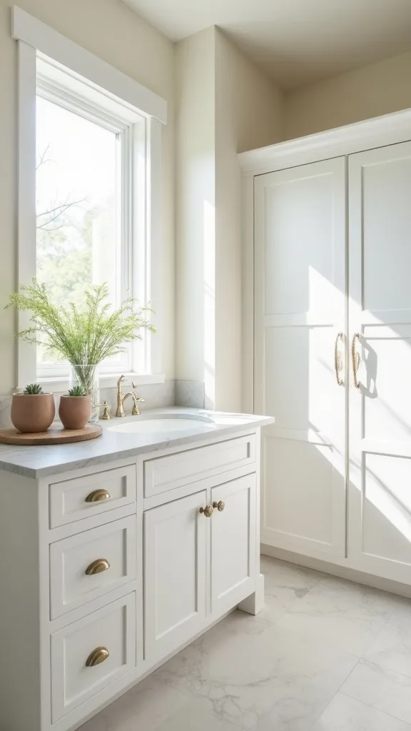
4. What cabinet hardware upgrade feels most expensive for the least money?
New hardware is the smallest thing that makes your kitchen feel like it got dressed properly. It works because your hands touch it constantly—cool metal, smooth edges, and a solid weight read “quality” even if the cabinets are basic.
Count your doors and drawers, then order 10% extra so you’re not stuck waiting on one missing pull. If your current holes don’t match standard sizing, use a cabinet hardware jig (or a printed template) so everything lines up clean and calm.
For a modern-but-soft look, go satin nickel. For a little vintage glow, brushed brass. Black can be sharp, but it shows flour dust and fingerprints faster than you’d think.
Pro tip: avoid mixing knob styles “just because”—it can look accidental. If you want variety, do knobs on doors and pulls on drawers in the same finish so it feels curated, not chaotic.
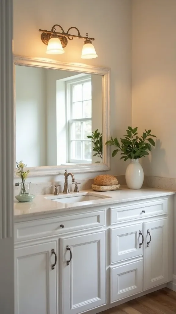
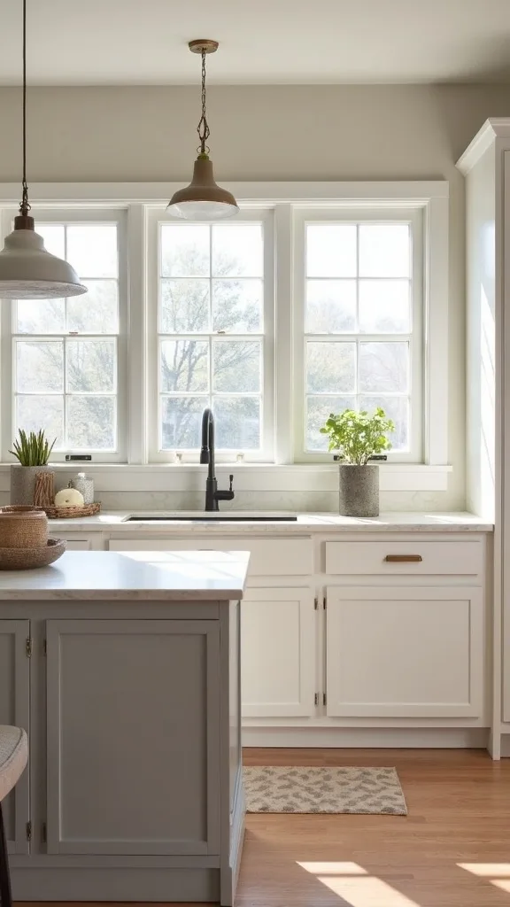
5. How can lighting change the kitchen without rewiring?
Lighting is the sneaky hero of any kitchen transformation budget because it changes how every surface reads—your counters, your backsplash, your coffee. The fix isn’t more brightness; it’s better glow.
Start by swapping bulbs to warm white light (2700K–3000K — the cosy, yellowish tone you see in most homes). Then add plug-in under-cabinet LED strips where you actually prep food. If you can, replace the central fixture with a semi-flush mount that spreads light wide instead of spotlighting the sink.
Choose diffused covers so the LEDs don’t look like tiny runway lights. A linen-look shade or frosted globe softens everything—especially at night.
Pro tip: avoid daylight bulbs in the kitchen unless you love the vibe of a hospital corridor. Warm light makes even budget finishes feel richer, like they’ve always belonged.
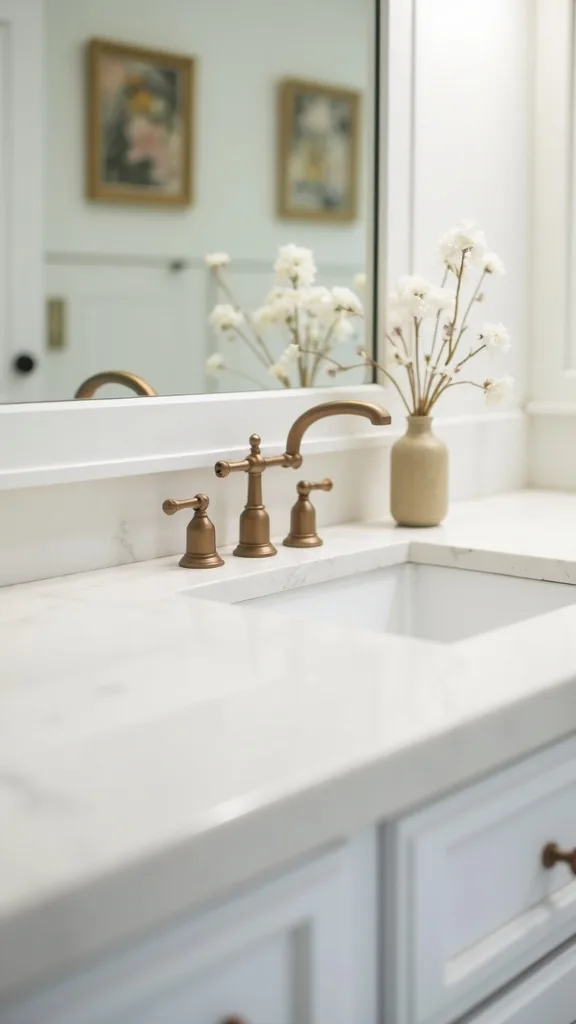
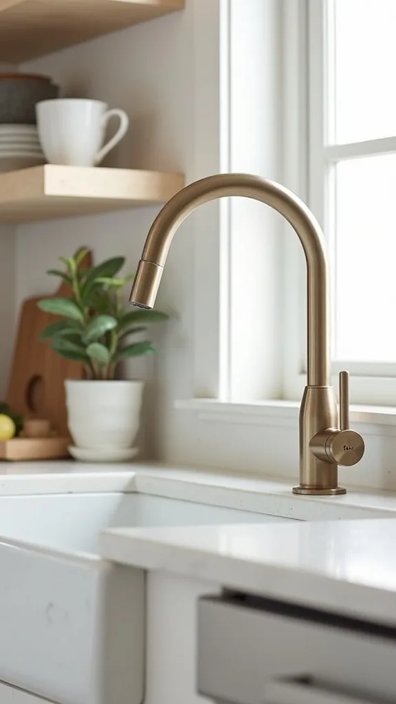
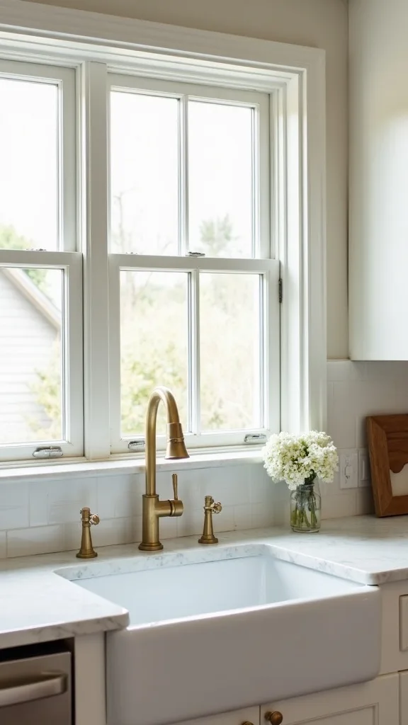
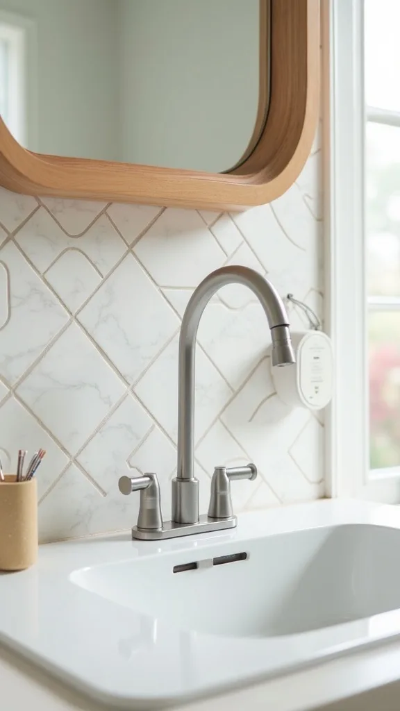
6. What’s the best $30–$80 faucet swap you can DIY?
A new faucet is a tactile upgrade—the kind you feel every morning when you fill the kettle. It works because it’s both jewelry and function, and it sits right in the center of your daily routine.
Turn off water valves under the sink, place a towel down, and use a basin wrench to loosen the old connections. Install the new faucet, then run water for a minute to check for drips. Take a photo before you disconnect anything—future you will thank you.
Matte black looks modern, but brushed nickel hides water spots better. If you want a vintage note, go for a gently arched “gooseneck” silhouette.
Pro tip: avoid the cheapest no-name faucet listings—finishes flake. Spend a little more on a brand with solid reviews so the upgrade stays satisfying, not squeaky.
7. How do you paint cabinets without them looking sticky or streaky?
Painted cabinets can be the biggest visual shift in a cheap kitchen makeover—if you treat them like furniture, not walls. It works because color re-sets the whole room’s temperature and makes old doors feel intentional.
Remove doors, label hinges, and clean with a degreaser until the rag comes away clean. Lightly sand, then use a bonding primer. Roll on cabinet paint in thin coats with a foam roller, sanding lightly between coats for that smooth, worn-in feel.
Late-summer picks: creamy off-white, dusty sage, or a sun-faded blue that reads coastal without going theme-y. Pair with warm hardware for balance.
Pro tip: avoid rushing cure time. Cabinets can feel dry in a day but stay soft for a week—give them space, and they’ll age like good denim instead of peeling like a bad manicure.
8. Can you refresh cabinets without painting them?
Yes—sometimes the most affordable kitchen update is just cleaning, conditioning, and swapping the details. It works because grime and yellowed topcoat make wood look older than it is.
Wash cabinet fronts with a degreaser, then follow with a wood cleaner or a gentle soap solution. If they’re wood, use a restoring oil or polish to bring back depth. Finish with new pulls and a soft under-cabinet glow.
If your cabinets are laminate, focus on handles and lighting—laminate doesn’t love heavy products. Add a peel-and-stick backsplash to give the eye somewhere new to land.
Pro tip: avoid “miracle” scratch-cover markers unless you test in an inside corner. Some turn orange in daylight and you’ll chase that mistake around the kitchen for weeks.
Cost & Materials Estimate
A realistic under-$500 range for this late-summer kitchen refresh is $220–$500 depending on how many cabinets you have and whether you add a new light fixture.
| Item | Estimated Cost | Where to Buy |
|---|---|---|
| Peel-and-stick backsplash (20–30 sq ft) | $60–$120 | Home Depot |
| Countertop contact paper (rolls for 25–40 sq ft) | $35–$90 | Amazon |
| Cabinet pulls/knobs (25–35 pieces) | $45–$110 | IKEA |
| Under-cabinet LED lighting (plug-in set) | $25–$60 | Lowe’s |
| Warm white LED bulbs (2700K–3000K) | $12–$25 | Home Depot |
| Optional: semi-flush ceiling light fixture | $60–$150 | Wayfair |
Total estimated cost: $220–$500 Save by keeping your existing fixture and doing bulbs + under-cabinet lights; splurge on thicker backsplash sheets for the most convincing finish.
9. How do you hide ugly appliances without buying new ones?
Ugly appliances don’t need replacing; they need a little styling strategy. It works because visual clutter reads as “dated” faster than any single finish.
Group small appliances on one tray so they feel like a station, not a scatter. Add a simple appliance garage moment with a bread box or a lidded bin. If your dishwasher front is scuffed, consider a stainless-look magnetic cover (measure first) for an instant clean slate.
Stick to two countertop appliance colors max—black + stainless, or white + stainless. Add warmth with wood: a cutting board that lives out, not hidden.
Pro tip: avoid covering vents or blocking airflow to hide something—overheating is not the vibe. The best disguises still let everything breathe.
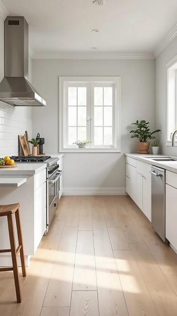
10. What’s the easiest way to make a small kitchen feel bigger under $100?
Make the kitchen feel bigger by clearing the counter line and brightening the edges. It works because the eye reads uninterrupted surfaces as space—even if the square footage didn’t change.
Install a slim rail with hooks for utensils or mugs, or hang a paper towel holder under a cabinet. Add a small mirror or a glossy framed print on the darkest wall to bounce light. Then swap your bulb to warm white light (2700K–3000K — the cosy, yellowish tone you see in most homes) so shadows soften.
Choose one “quiet” counter moment: a wood board, a ceramic crock, and nothing else. Let the rest live in drawers.
Pro tip: avoid open shelving if you don’t love tidying daily. A small kitchen doesn’t need more display—it needs fewer decisions.
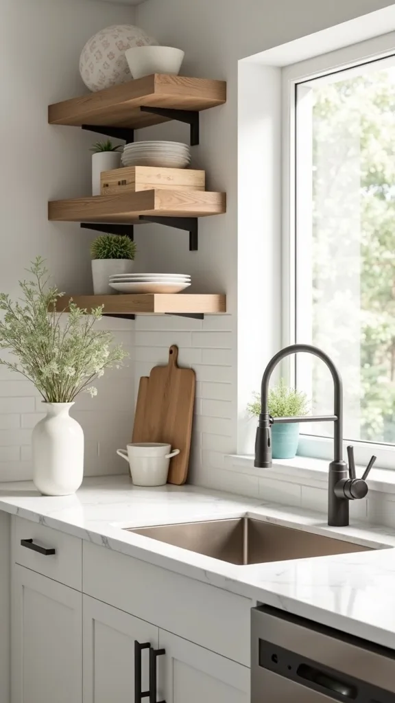
11. How do you add under-cabinet lighting that looks built-in?
Under-cabinet lighting is the easiest way to fake a custom kitchen. It works because it creates that restaurant prep-glow and makes your backsplash look like it was meant to be admired.
Choose plug-in LED bars or strips with adhesive backing. Run the cord along the cabinet underside and hide it with paintable cord cover. If you’re renting, use removable clips so nothing gets torn up later.
Look for a diffused lens—no harsh dots. Dimmable is ideal, because bright task light by day and softer glow by night makes the room feel flexible.
Pro tip: avoid placing lights too close to the cabinet edge. Tuck them 1–2 inches back so you don’t see the fixture, only the wash of light—like a little secret upgrade.
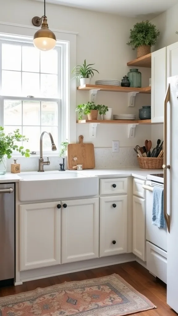
12. What’s a renter-friendly way to update a kitchen floor visually?
If the floor is dragging the whole room down, cover it—don’t fight it. It works because a washable runner changes the color story immediately and makes the kitchen feel styled, not temporary.
Pick a 2′ x 6′ or 2′ x 8′ runner depending on your walkway. Use a non-slip pad underneath so it stays put while you’re cooking. Keep the palette low-contrast if your counters are busy; go bolder if everything else is neutral.
Vintage-style patterns hide crumbs and pet hair better than solid light colors. A flatweave texture is easier to clean than shaggy anything.
Pro tip: avoid cheap rubber-backed rugs that trap moisture—kitchens get wet. A breathable pad keeps the floor happier and the runner feeling crisp.
13. How do you make builder-grade cabinets look custom with trim?
Trim is the quiet design trick that makes basic cabinets feel tailored. It works because it adds shadow lines and detail—like cuffs on a simple shirt.
Add thin lattice trim or shaker-style rails to flat cabinet fronts using wood glue and small brad nails (or strong adhesive if you’re careful). Paint everything the same color so the new detail blends and reads intentional. Finish with updated pulls.
Keep trim widths consistent across doors so it feels calm. A simple square profile looks modern; a slightly rounded profile leans more vintage.
Pro tip: avoid ornate trim unless the rest of your kitchen supports it. Simple lines age better—and you won’t feel like you’re living inside a theme.
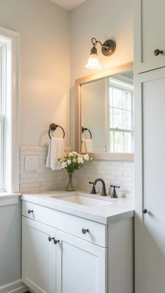
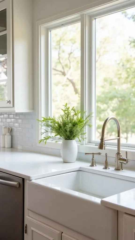
14. Can you update a kitchen sink area without replacing the sink?
Yes—treat the sink zone like a little vignette. It works because that area is always in view, and small changes there read as “the whole kitchen got nicer.”
Swap the faucet if you can, then add a simple soap dispenser and a matching sponge caddy. Replace a stained caulk line (scrape, clean, re-caulk) for a surprisingly fresh edge. Add a small sconce-style plug-in light nearby if the sink corner is shadowy.
Choose materials that feel good: brushed metal, ceramic, and a wood-handled brush that looks vintage but works hard.
Pro tip: avoid leaving dish soap bottles naked on the counter. Decanting into one dispenser is a tiny move that makes the space feel like a place you actually chose.
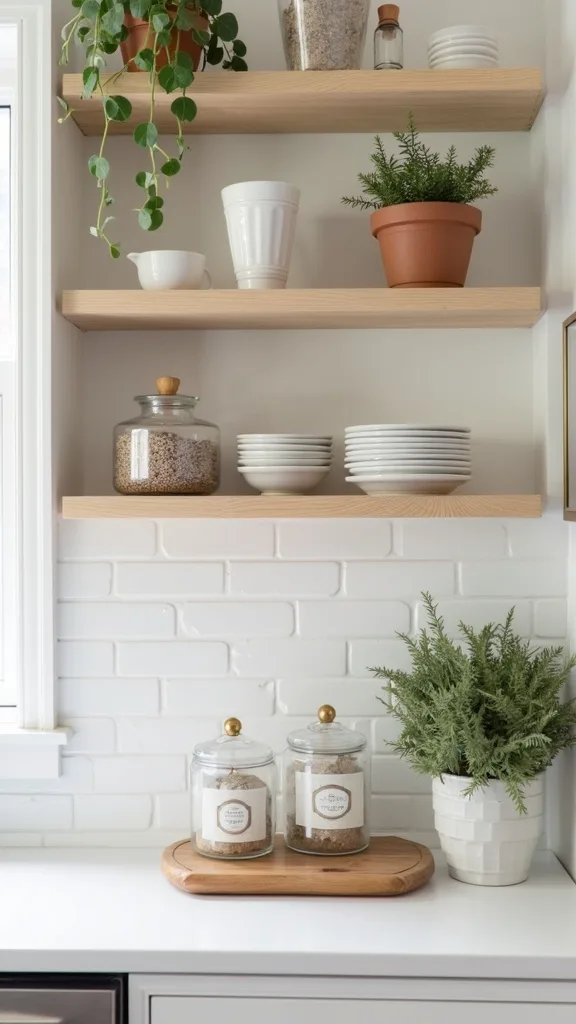
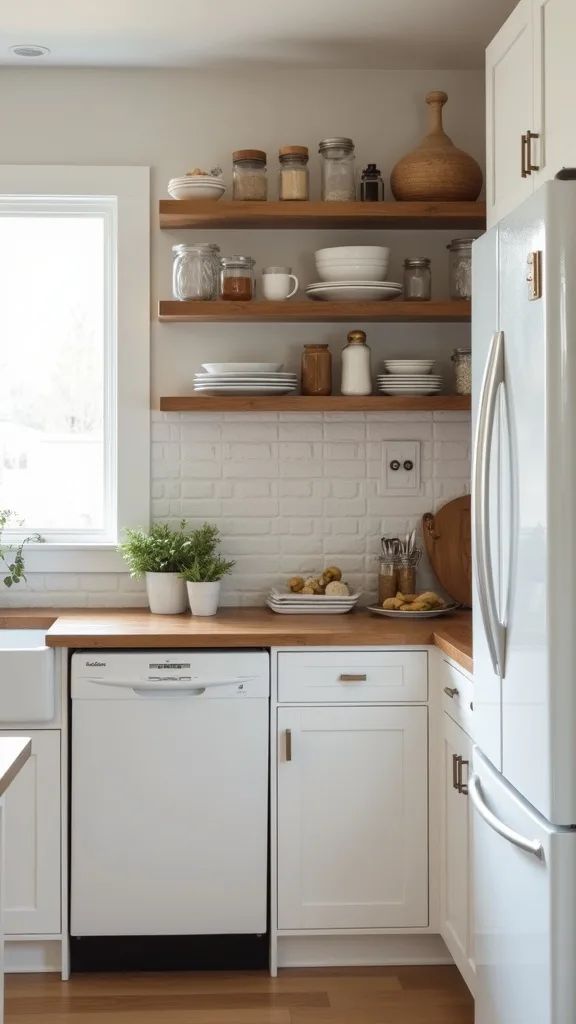
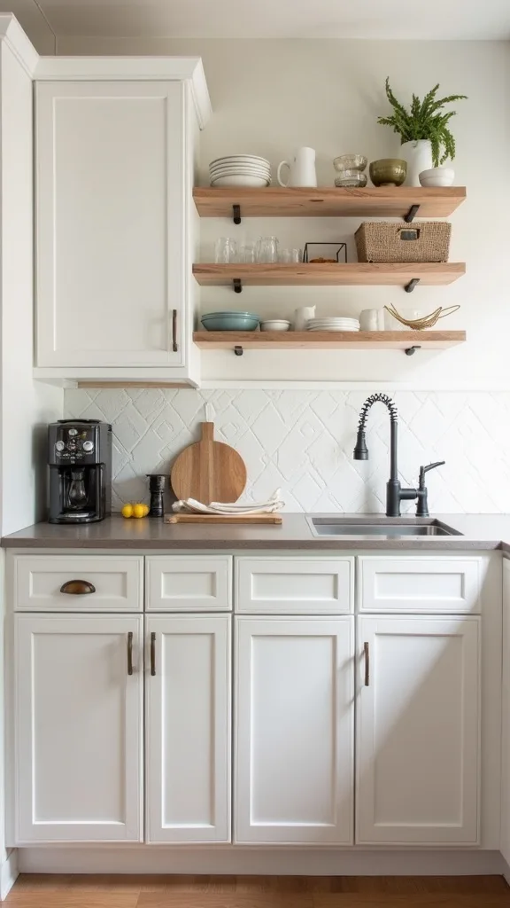
15. How do you style open shelves so they don’t look cluttered?
Open shelves can be airy or chaotic—there’s no middle. They work when you treat them like a curated collection, not extra storage.
Limit shelves to one short run if you’re nervous. Keep daily items on the lowest shelf and display pieces up top. Use a simple rule: stacks, not singles—three plates together reads calmer than three different mugs scattered.
Mix in one vintage find: a stoneware pitcher, an old cutting board, a small framed recipe card. Then anchor with modern basics like white bowls so it doesn’t look like a thrift store shelf.
Pro tip: avoid putting anything greasy or dusty-prone up there (hello, blender). If you won’t wipe it weekly, it doesn’t belong on open display.
16. What’s the cheapest way to add a “statement” in a plain kitchen?
A statement doesn’t have to be expensive—it just has to be deliberate. It works because one strong focal point makes everything else feel like it’s part of a plan.
Choose one: a bold peel-and-stick backsplash behind the stove, a vintage-style pendant over the sink, or painted lower cabinets with neutral uppers. Keep the rest simple so the statement gets room to breathe.
Late-summer colors that feel grounded: olive, clay, smoky navy, or a soft terracotta that reads sun-warmed instead of trendy.
Pro tip: avoid making three statements at once. Pick one hero, then let the supporting cast be quiet—your kitchen will feel edited, not busy.
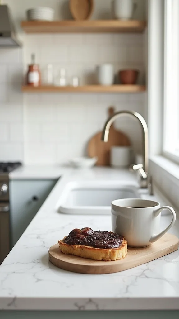
17. How do you create more counter space without remodeling?
Counter space is a feeling as much as a measurement. It works when you shift what lives on the counter and add one movable surface.
Try a narrow rolling cart (about 18″–20″ wide) that can tuck into a corner. Or add a sturdy cutting board that spans part of the sink for temporary prep space. Mount a magnetic knife strip to free up the block footprint.
Look for warm wood tops—they hide scratches and get better with age. A cart in black metal adds a little industrial edge without trying too hard.
Pro tip: avoid tiny carts that wobble. If it can’t hold a mixing bowl without shaking, it’ll annoy you daily—and you’ll stop using it.
18. What’s a late-summer color palette that makes a kitchen feel cooler?
When it’s still hot outside, a kitchen can start to feel heavy. Cooler palettes work because they visually lower the “temperature” of the room.
Choose one soft cool tone—sage, dusty blue, or pale greige—and repeat it twice (a backsplash and a towel, or a runner and a utensil crock). Keep metals consistent so the palette doesn’t splinter.
Textures do the work: linen towels, a matte backsplash, and a wood board that looks sun-bleached rather than orange.
Pro tip: avoid icy whites if your lighting is harsh. Pair cool tones with warm white light (2700K–3000K — the cosy, yellowish tone you see in most homes) so the space feels refreshing, not sterile.
19. How do you upgrade pantry storage without buying a whole system?
A pantry refresh is a DIY kitchen refresh that pays you back every single grocery day. It works because you stop rebuying what you already have and the kitchen feels calmer by default.
Start with a quick edit: toss expired items, group by category, then add a few clear bins. Label simply—tape and a marker is fine. Add a door-mounted rack for spices or snacks if you’re short on shelf depth.
Mix in one vintage element like amber jars for pasta or oats. The warm glass makes pantry staples feel a little more like décor.
Pro tip: avoid decanting everything just for aesthetics. Only decant what you buy often—otherwise it becomes a weekend project that never stops.
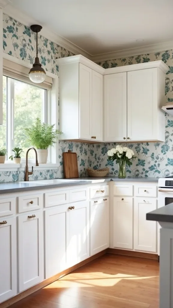
20. Can peel-and-stick wallpaper work in a kitchen?
Peel-and-stick wallpaper absolutely works in a kitchen—if you place it smart. It works because it adds pattern and softness where tile or paint can feel flat.
Use it on a breakfast nook wall, inside a pantry, or above a chair rail—areas away from direct splatter. Clean the wall first, then apply in vertical panels with a smoothing tool. Trim with a sharp blade for crisp edges.
Go for small-scale patterns that read textured from a distance: tiny stripes, soft botanicals, or a linen-look print. It plays well with simple hardware and neutral counters.
Pro tip: avoid putting wallpaper right behind the stove unless it’s specifically washable and heat-safe. Put the pattern where it can stay pretty without fighting grease.
21. How do you make mismatched finishes look intentional?
Mismatched finishes can look layered and cool—or like you gave up halfway. The difference is repetition. It works because the eye forgives variety when it sees a pattern.
Pick one “main” metal (like satin nickel) and repeat it on hardware and faucet. Let one “accent” metal show up once or twice—maybe a brass pendant or a vintage thrifted tray. Keep everything else neutral so the metals don’t start arguing.
Use texture as the bridge: matte backsplash, soft wood, and a few ceramics that feel hand-touched. Those surfaces calm the shine.
Pro tip: avoid mixing three shiny metals in a small kitchen. If you want more dimension, add it with textiles and wood—those age better and feel more lived-in.
22. What’s the best thrift-store find for a kitchen makeover?
The best thrift-store kitchen find is something useful that also reads like décor. It works because it gives the kitchen a little history—like the space has a point of view.
Look for a solid wood cutting board, vintage canisters, a stainless tray, or old glass jars with good lids. Wash thoroughly, then put it to work: corral oils, hold fruit, or store wooden utensils by the stove.
Go for pieces with patina—small scratches, softened edges, that slightly cloudy glass that catches light in a cozy way. Mix them with one crisp new item so it doesn’t feel like a set.
Pro tip: avoid anything with mystery peeling paint or strong odors that won’t wash out. The goal is “collected,” not “questionable.”
23. How do you refresh a backsplash area if you can’t add tile?
If tile isn’t an option, you can still fake that clean, finished backsplash zone. It works because the wall behind your counters is a high-visibility strip that signals “new” when it looks crisp.
Paint just the backsplash band in a wipeable satin finish, or add a single sheet of stainless or acrylic behind the stove. Another move: install a thin ledge (a picture ledge works) for oils and spices, keeping the counter clearer.
Choose a paint color that plays nice with your counters—soft white, warm greige, or pale sage. Add a couple framed prints leaned against the wall for an effortless layer.
Pro tip: avoid flat paint in the splash zone. It scuffs and stains fast, and you’ll be scrubbing like it’s your second job.
24. What should you avoid in a sub-$500 kitchen update?
The biggest thing to avoid is starting three half-projects that never get finished. It works against you because an unfinished kitchen feels worse than an old kitchen—it’s visual noise and constant reminders.
Skip ripping out anything you can’t replace the same weekend. Avoid super-cheap peel-and-stick that’s thin and glossy, and don’t buy random hardware in mixed sizes hoping it’ll “work out.” Choose fewer upgrades and do them cleanly.
If you’re painting, avoid dark colors on cabinets in a low-light kitchen unless you’re also upgrading lighting. Dark paint plus bad bulbs equals cave.
Pro tip: decide your “non-negotiable” (usually lighting or counters), then let everything else support it. A focused plan feels expensive—even when your receipt says otherwise.
25. How do you pull the whole kitchen together so it feels finished?
A kitchen feels finished when the little things match the big story. It works because cohesion isn’t about buying more—it’s about repeating materials and editing what’s out.
Pick a simple trio: one metal finish, one wood tone, one soft textile color. Repeat them across the room—hardware and faucet, cutting board and stools, towels and runner. Then clear one full counter zone so your new surfaces can actually be seen.
Add one “softener”: a linen café curtain, a small piece of art, or a plant in a ceramic pot. Kitchens need something that isn’t purely functional to feel like a room.
Pro tip: take a photo from your doorway. Anything that looks messy in the photo is what your brain is catching every day—edit that, and the kitchen will start to feel like it’s exhaling.
Final Thoughts
The secret of a sub-$500 kitchen isn’t perfection—it’s relief. When the backsplash is cleanable, the counters look intentional, and the lighting stops buzzing like a bad mood, the whole room gets quieter. Dinner gets easier. Even the morning coffee feels less rushed.
A smart kitchen transformation budget is basically a series of small decisions that stack: touch points (hardware, faucet), big planes (counters, backsplash), then the glow that makes it all feel warm and lived-in. That’s the difference between “I changed a few things” and “this kitchen finally feels like mine.”
Do one thing today: measure your backsplash area and count your cabinet pulls, then add two options of peel-and-stick tile and one hardware set to your cart. Tonight, flip your bulbs to warm white light and see how the room feels when you walk in—softer, calmer, more like a place you want to be.
What I’d Do Differently
When I first tried this, I got cocky and started with countertop contact paper before I handled the backsplash. I figured, “It’s just stickers—how hard can it be?” Two hours later I was leaning over my fresh counter film to align tile sheets, trapping grit underneath, and I nicked the edge with a utility blade while trimming around an outlet. The counter still looked better than before, but every time the afternoon light hit that little scratch, my eye went straight to it. The correct approach is to work top-down on the wall first, then do counters, and only then finish with hardware and lighting—less leaning, less trimming over a finished surface, fewer chances to mess up what you just paid for.
I also wish I knew to buy one extra roll of contact paper and two extra backsplash sheets from the start. Dye lots and print batches can shift slightly, and matching later is a headache you don’t need. Keep your plan simple, do the “messy” steps first, and start this weekend with one surface—momentum is the whole game.