
This post contains affiliate links. As an Amazon Associate, I earn from qualifying purchases at no extra cost to you.
The bathroom is the room that turns on you fastest. One week it feels clean and calm; the next, it’s a cluttered mix of half-used bottles and mismatched plastics that somehow makes even a fresh shower feel rushed.
The design principle that fixes this (without remodeling) is simple: reduce visual noise and replace it with repeatable, touchable materials. Warm neutrals work psychologically because they lower contrast, soften harsh light, and cue “care” instead of “utility”—exactly what you want in an early fall bathroom when the mornings start getting darker.
This is perfect for renters, small bathrooms, and anyone who wants an earth tone bathroom look without buying new tile or a new vanity.
You’ll see how the same idea flexes three ways—modern, traditional, and transitional—using the same core moves: one tray, one textile upgrade, one intentional stem, and better lighting. Expect practical swaps like linen towels, matte ceramics, and wood or stone accents that read as simple bathroom decor, not seasonal clutter.
Below are 25 Warm Neutral Bathroom Refresh Ideas that pull your space into early-fall calm with neutral bathroom refresh moves you can do in a weekend.
Products I Recommend for This Project
Here are some of my favourite products to help you bring these ideas to life:
- Amolliar Ceramic Soap Dish (Terracotta) — A small clay-toned accent that instantly warms up a sink without adding clutter.
- Utopia Towels Turkish Hand Towels (Oatmeal/Beige) — Soft, neutral towels that add texture and make the space feel more spa-like.
- Naturally Modern Travertine Vanity Tray (Stone Look) — Creates a clean boundary for daily items so your counter looks styled, not scattered.
- AOZITA Amber Glass Soap Dispenser Bottle (16 oz) — Reduces visual noise from packaging and looks right at home in an earth-tone palette.
- Philips LED Warm Glow Bulbs (2700K–3000K) — The quickest way to make warm neutrals read warm and flattering in real life.
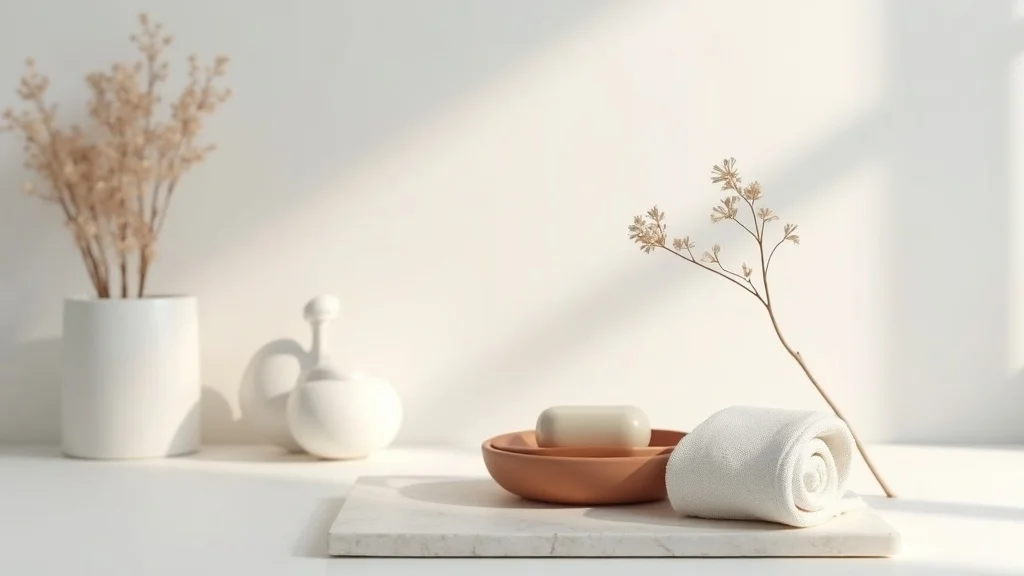
1. Style a “quiet sink moment” with a terracotta dish, linen towels, one dried stem, and a travertine tray
This idea is a micro-still-life that makes the whole room feel finished. It works because your eye lands on one composed cluster instead of scanning random bottles and bright labels—instant calm in a warm neutral bathroom.
Start by clearing everything off the counter except daily essentials. Place a travertine tray near the faucet, add a terracotta soap dish on top, then fold two linen hand towels (one for use, one for backup) and tuck a single dried flower stem into a slim bud vase. Keep the arrangement tight—think “one footprint,” not “spread out.”
Choose clay in rust or muted peach, towels in oatmeal or flax, and stone with soft veining. These materials read warm even under cooler bathroom lighting.
Beginner version: use any stone-look tray and one neutral towel you already own, then add the soap dish. Upgrade later with real linen and a travertine piece for that quiet, spa-like weight.
2. How do I pick a warm neutral palette that doesn’t look muddy?
A warm neutral palette succeeds when it has contrast—just not high contrast. Psychologically, your brain relaxes when it can predict the color family, and it perks up when there’s a small, clear “anchor” shade to organize everything else.
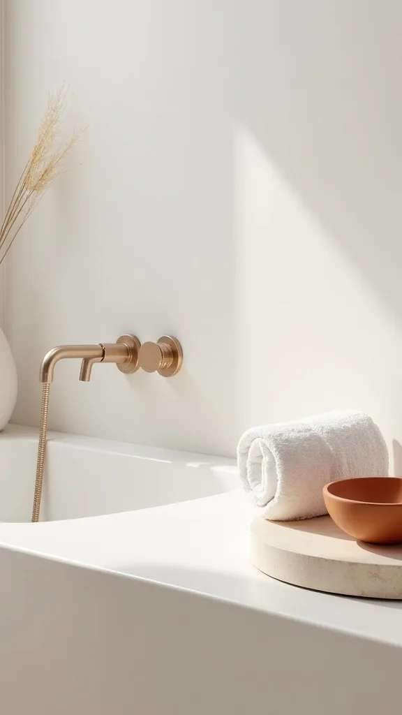
Pick one light base (creamy white), one mid neutral (sand or greige), one earthy accent (terracotta, camel, or tobacco), and one dark grounding note (espresso or matte black). Repeat each shade at least twice—towels + rug, tray + soap dish, frame + hardware—so the room feels designed, not collected.
For an earth tone bathroom, terracotta plus flax linen is the easiest early-fall combo because it looks warm even with minimal sunlight. Keep bright white limited to fixtures so it reads clean, not stark.
Beginner version: choose just two: flax + terracotta. Add the darker grounding note later through a mirror frame or small lidded canister for a more intentional finish.
3. What’s the fastest neutral bathroom refresh if I only have 30 minutes?
The fastest refresh is editing plus one tactile swap. It works because reducing objects is an instant visual reset, and a single texture change signals “new” without changing anything permanent.
Set a timer for 10 minutes and remove everything from the counter. Put back only: soap, a hand towel, and one catch-all tray for daily items. Then swap one thing you touch every day—typically the hand towel—for linen or a Turkish cotton towel in oatmeal or warm white. Finally, wipe the mirror and faucet so the “clean” reads from across the room.
Stick to simple bathroom decor: one tray, one towel, one soap. Choose a tray in travertine-look resin if you’re worried about cost or water.
Beginner version: if you can’t buy anything today, fold your best neutral towel neatly and move all bottles into a cabinet or basket. Less stuff is the refresh.
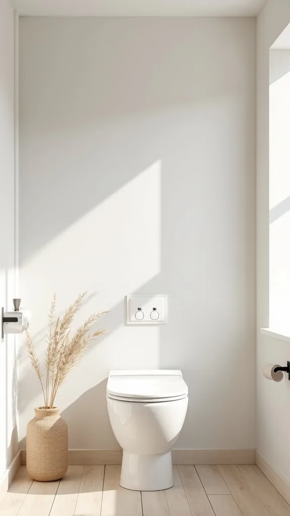
4. How can I do a minimalist bathroom fall look without pumpkins?
Minimalist fall isn’t about seasonal icons; it’s about seasonal materials. Warm neutrals and dry textures mimic what’s happening outdoors—less shine, more softness—so your bathroom feels aligned with early fall without looking themed.
Replace shiny plastic accessories with matte ceramics, stone, or wood. Add one dried element (pampas, bunny tails, or a single stem) and one textile with visible weave (linen or waffle). Keep the counter at least 70% clear so the fall cues feel intentional rather than cluttered.
This is where minimalist bathroom fall shines: a terracotta dish, a travertine tray, and flax towels do the seasonal work for you. If you want one more nod, choose a hand soap in a warm scent like cedar or amber—but keep the label minimal.
Beginner version: add one dried stem in a small bottle and swap to a warm-toned hand towel. That’s enough to shift the mood.
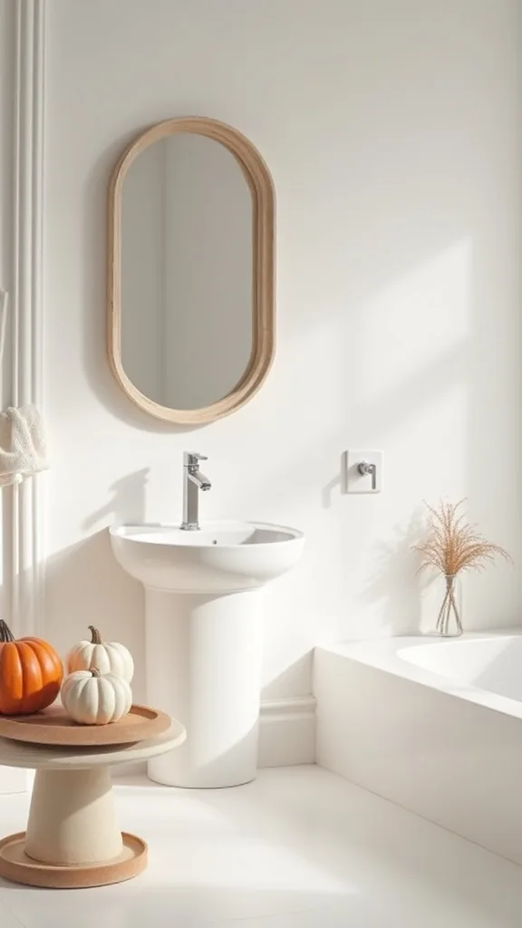
5. Which towel colors make a bathroom feel warmer (without looking dirty)?
Towels sit at eye level and carry a lot of color weight. Warm neutrals work because they soften contrast against white sinks and tubs, which reduces that “clinical” feeling many bathrooms default to.
Choose towels in flax, oatmeal, mushroom, or warm white. Avoid anything too yellow; it can look dingy under overhead lighting. If you want an earthier note, add a second towel in muted clay or cinnamon as an accent—especially effective in a modern space with simple lines.
Look for texture: linen blends, waffle weave, or Turkish cotton. The tactile surface makes even plain colors feel rich and intentional.
Beginner version: keep your current towels but add one new hand towel in flax and fold it “spa style” (thirds, then thirds). The neat fold is half the effect, and it costs under $20 to try.
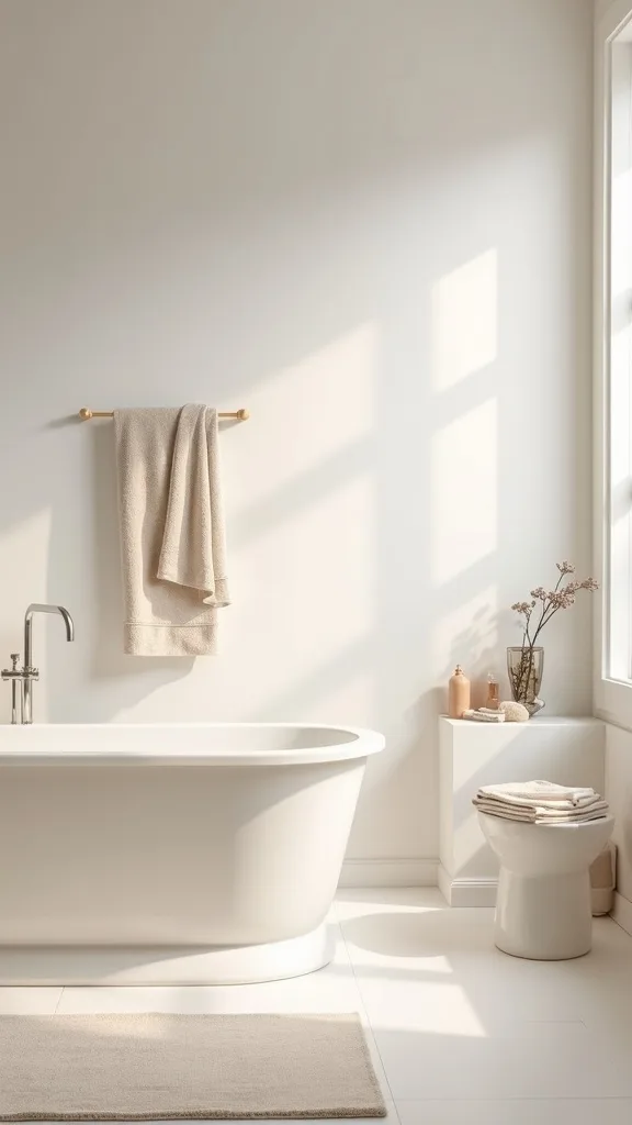
6. How do I make countertop styling look intentional, not cluttered?
The trick is containment. A tray creates a boundary, and your brain reads boundaries as order—one of the quickest ways to make a small bathroom feel calmer.
Use one tray near the sink and commit: everything “daily” goes on it, everything else goes away. Keep it to 3–5 items max—soap, a small canister, a lotion, maybe a match bottle if you light candles. Leave at least 6 inches of clear counter around the tray so it looks curated, not crowded.
For a warm neutral look, a travertine tray or stone-look resin tray adds weight and quiet pattern. Pair it with matte ceramic containers in cream or sand.
Beginner version: use a small cutting board or thrifted plate as a temporary tray. The boundary still works, and you can upgrade later.
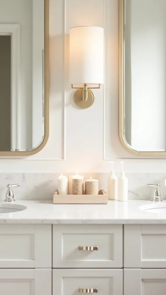
7. What lighting change makes warm neutrals actually look warm?
Warm neutrals are sensitive to lighting; the wrong bulb can turn flax into gray. Psychologically, warm light signals safety and rest—exactly what you want in a bathroom at night and on darker early-fall mornings.
Swap bulbs to warm white light (2700K–3000K — the cosy, yellowish tone you see in most homes). If you have a single overhead fixture, add a plug-in night light or a small lamp (yes, in a bathroom if it’s safely placed away from water) to create a softer second layer. Aim for comfortable brightness (measured in lumens) rather than “blinding clean.”
Choose frosted bulbs or globe bulbs for softer shadows. If your vanity light is harsh, a linen shade sconce look can be mimicked with a warmer bulb and a matte fixture finish.
Beginner version: change one bulb first. It’s the cheapest “remodel” you’ll ever do.
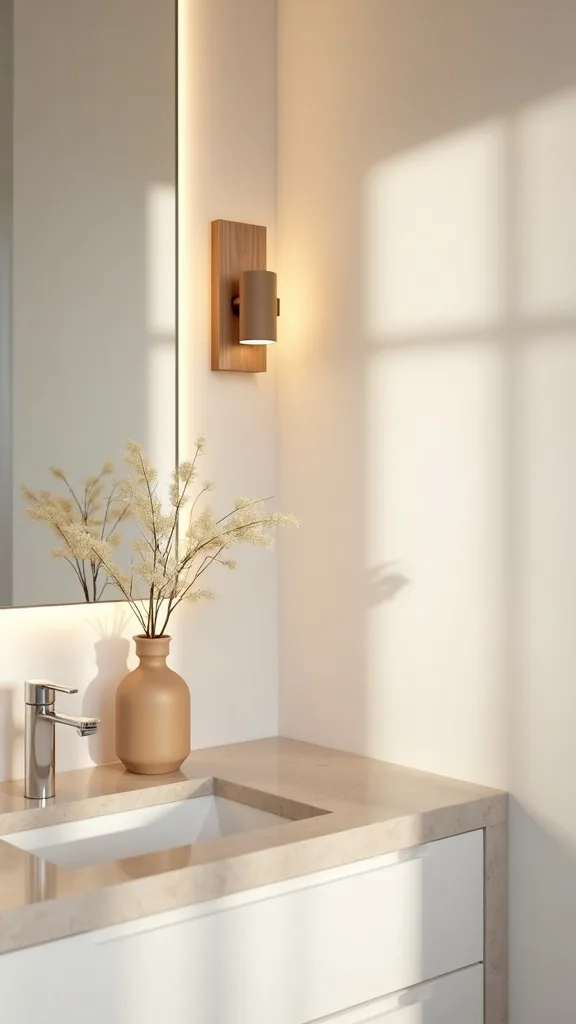
8. How can I add terracotta without committing to tile?
Terracotta reads as warmth instantly, but it can overwhelm if it’s too big or too orange. Used in small, repeated touches, it becomes a gentle accent that makes neutrals feel lived-in instead of sterile.
Start with a soap dish, a small planter, or a bud vase—items that sit near the sink where you’ll see them daily. Repeat the tone once more with a candle, a framed print with clay tones, or a small storage jar. Keep surrounding items creamy and stone-toned so the terracotta looks intentional.
This is a reliable path to an earth tone bathroom that still feels clean. Matte finishes are key; glossy terracotta can read like kitchenware.
Beginner version: add one terracotta accessory only. Live with it for a week before adding a second, so you don’t accidentally swing too orange.
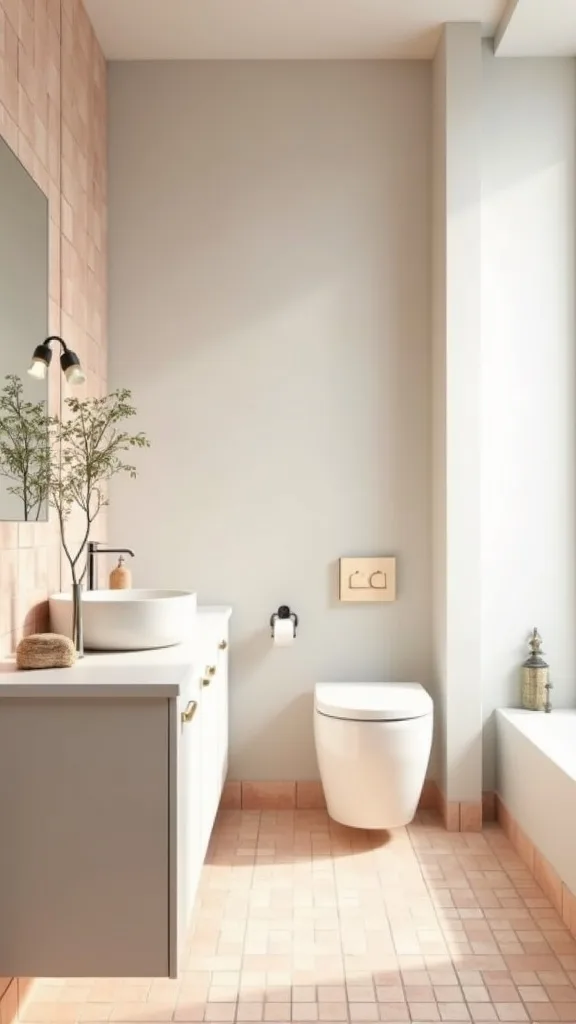
Cost & Materials Estimate
Most warm-neutral bathroom refreshes land between $75 and $350 depending on whether you swap textiles only or also upgrade lighting and storage pieces.
| Item | Estimated Cost | Where to Buy |
|---|---|---|
| Linen or Turkish cotton hand towel set (2) | $18–$45 | Amazon |
| Travertine or travertine-look vanity tray | $18–$55 | Wayfair |
| Terracotta soap dish or ceramic accessory | $10–$28 | Amazon |
| Refillable soap dispenser (glass/ceramic) | $12–$30 | IKEA |
| Warm white light bulbs (2700K–3000K) | $8–$22 | Home Depot |
| Woven storage basket (under-sink or shelf) | $16–$40 | Target |
Total estimated cost: $82–$220 Save money by starting with towels + bulbs; splurge on the tray if you want the “designed” look to feel immediate.
9. What’s the best way to use travertine (or the look of it) in a bathroom?
Travertine brings “quiet pattern”—subtle movement without busy contrast. That’s why it works so well in warm neutral bathrooms: it adds interest while staying calm, like a visual deep breath.
Use travertine as a tray, soap dispenser base, or canister. Keep it away from constant puddling, and wipe it dry if it’s real stone. If you want the look with less maintenance, choose a resin or ceramic travertine-effect piece; it reads similar from a few feet away.
Pair it with linen textiles and matte ceramics so the stone doesn’t fight with shiny chrome. If your hardware is chrome, it’s fine—just keep other finishes muted.
Beginner version: start with one small tray. It instantly “upgrades” the sink area without changing any fixtures.
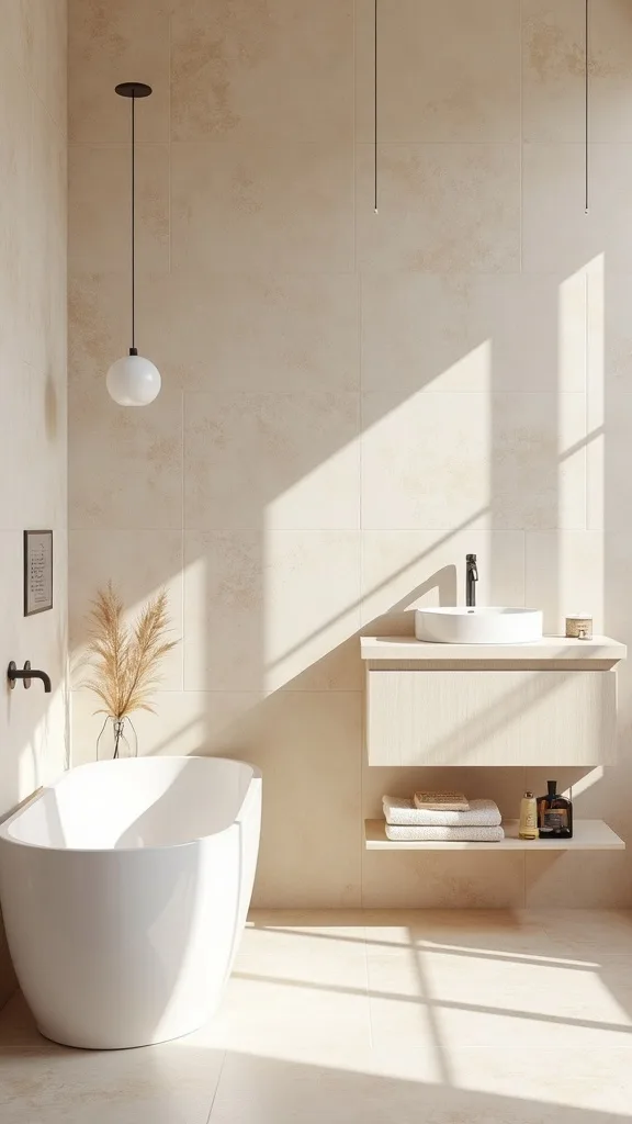
10. How do I refresh a bathroom mirror area without replacing the mirror?
The mirror zone sets the tone because it’s where your eye goes first. A refresh here works because it frames your daily routine; when the frame feels intentional, the whole room feels more cared for.
Add a simple frame kit if you have a builder-grade mirror, or fake the effect with a slim wood ledge beneath it to create a visual base. Then style the ledge minimally: one small vase with a dried stem and one canister. Keep heights staggered and leave negative space.
For a warm neutral direction, choose wood in walnut, oak, or a light driftwood tone. Avoid high-gloss black unless you’re aiming modern and repeating black elsewhere.
Beginner version: clean the mirror thoroughly and swap the hand soap dispenser to a matte neutral bottle. The mirror will reflect the upgrade twice.
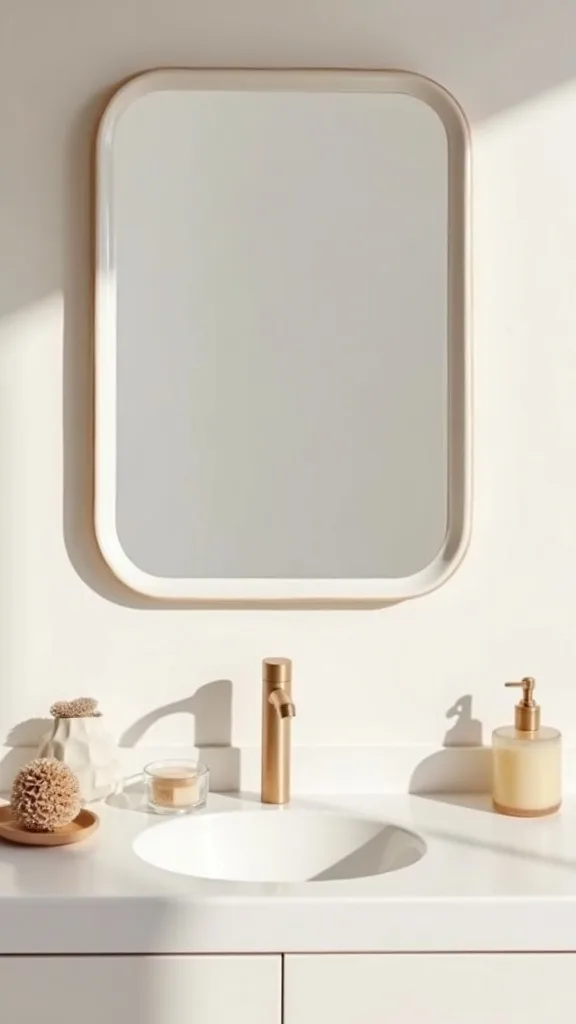
11. What’s one thing I should avoid when decorating with warm neutrals?
Avoid mixing too many undertones at once. Warm neutrals can turn chaotic when you combine pink-beige, green-beige, and gray-beige in the same small space—your eye can’t settle, and the room feels “off” even if every item is technically neutral.
Pick one lane: creamy/ivory + camel + terracotta (warm), or sand + taupe + walnut (neutral-warm). Then edit ruthlessly. If a towel reads gray next to your tile, it’s not “a nice neutral”—it’s a clash waiting to happen.
Also avoid overcrowding the sink with matching sets. Three matching acrylic pieces often look more like a hotel than a home.
Beginner version: stand in the doorway and take a photo. If you can’t name your palette in one sentence, remove one color family and try again. Clarity is the goal.
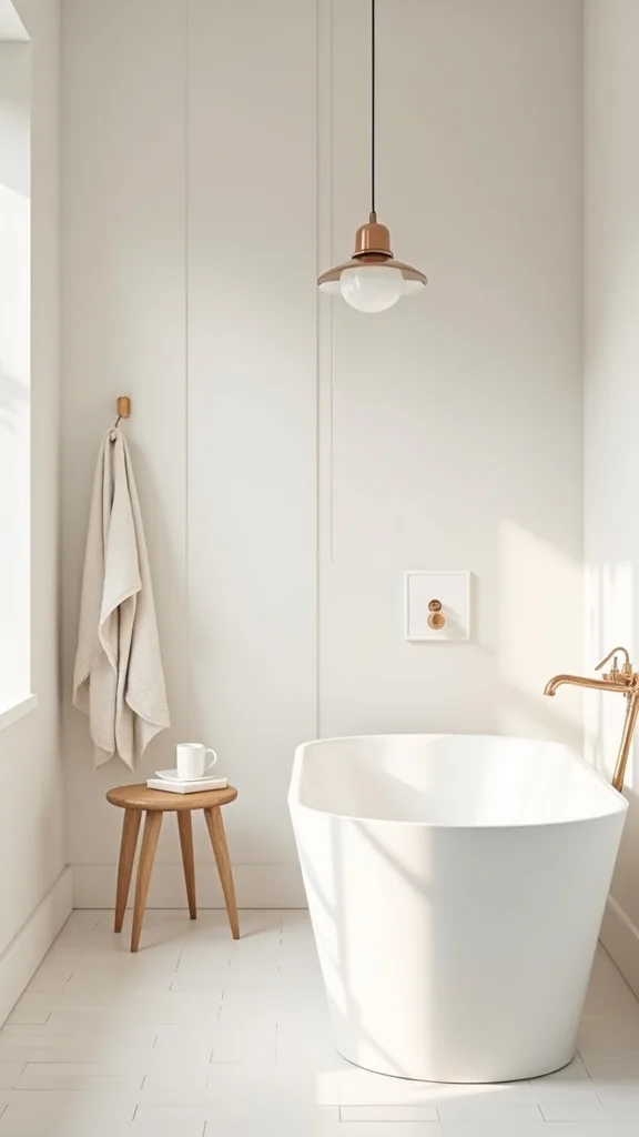
12. How do I make chrome fixtures work with an earth-tone palette?
Chrome isn’t the enemy; it’s just loud when everything else is soft. Warm neutrals work psychologically because they reduce glare, so the goal is to soften what chrome reflects rather than replacing it immediately.
Add matte, warm elements near the fixtures: a linen towel, a stone tray, a ceramic soap dispenser. The chrome will reflect those tones and feel less icy. If you can swap one thing, change the faucet aerator area’s visual neighbors—soap bottle and towel—before you think about hardware.
Stick to creamy whites and camel tones instead of cool grays. They “warm up” the reflection. A wood-framed mirror also helps by putting a warm band around the shiniest spot in the room.
Beginner version: keep chrome, but remove shiny plastic accessories. The contrast between soft + shiny becomes controlled, not random.
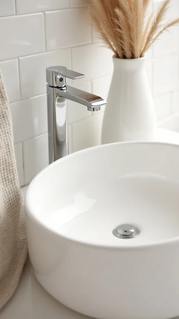
13. Modern direction: What defines a modern warm neutral bathroom refresh?
Modern style is about clean lines and controlled repetition. Warm neutrals prevent modern bathrooms from feeling cold, which is why this pairing is so effective—order plus comfort.
Choose one statement shape (a round mirror, a cylinder soap dispenser, or a rectangular tray) and repeat it twice. Keep the palette tight: warm white, sand, and one accent like terracotta. Limit decor to functional items and let materials do the talking: stone, linen, matte ceramic.
For the sink, do one travertine tray with a single soap bottle and a small lidded canister. Add a minimal print in clay tones if the wall feels empty.
Beginner version: remove anything with bright labels, decant soap into one neutral bottle, and add one textured towel. Modern is mostly subtraction—and it’s freeing once you try it.
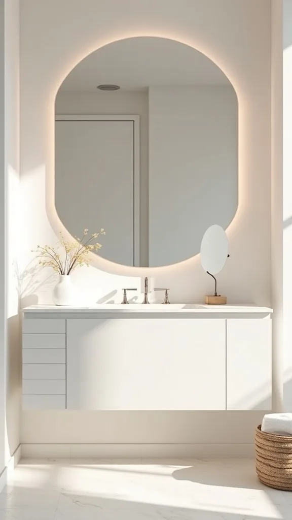
14. Traditional direction: How do I keep warm neutrals from feeling bland in a classic bathroom?
Traditional rooms need a little story—layers, heritage shapes, and gentle contrast. Warm neutrals work here because they highlight curves and classic finishes without competing with them.
Bring in a small vintage-style element: a fluted ceramic canister, a scalloped tray, or an antique-look brass picture frame. Then balance it with plain linen towels so it doesn’t feel fussy. If you have beadboard or classic tile, let that be the pattern and keep your accessories calm.
Colors that read “traditional warm” are ivory, biscuit, camel, and soft terracotta. Add a single dried stem in a small glass bottle for that early-fall nod without clutter.
Beginner version: swap just the soap dispenser to a ceramic one and add a framed print in warm neutrals. Traditional style builds slowly, and that’s part of the charm.
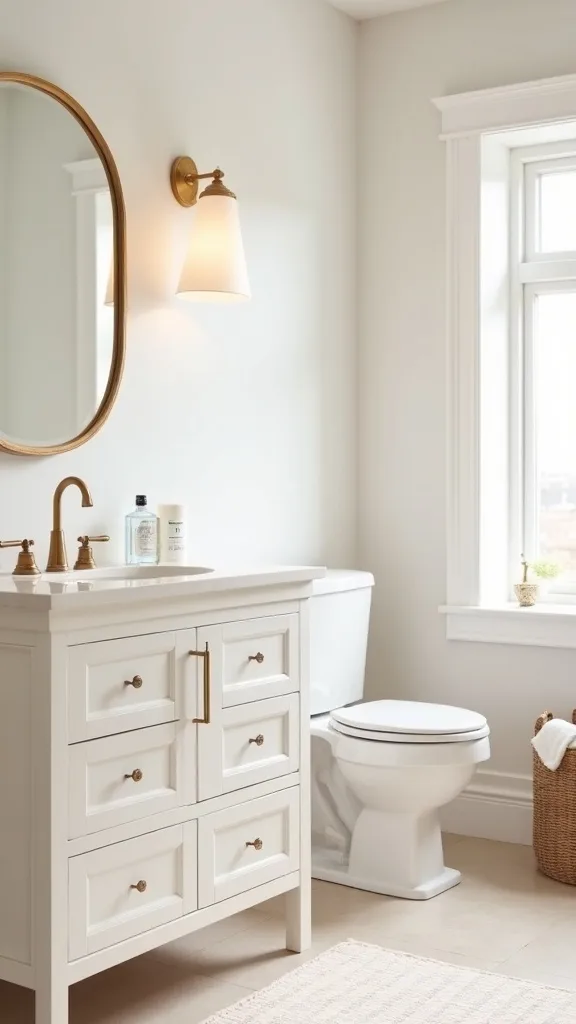
15. Transitional direction: What’s the easiest way to blend warm neutrals with mixed finishes?
Transitional style is the bridge: not too sleek, not too ornate. Warm neutrals unify mixed finishes because they act like a “soft background,” letting black, chrome, and brass coexist without visual arguing.
Pick one unifying material—travertine, light wood, or linen—and repeat it in two zones (sink + towel area). Then choose one metal finish to “lead” (maybe your existing faucet) and keep the rest secondary. A simple tray at the sink and a woven basket under it can tie modern and traditional together instantly.
Think creamy towels, stone accessories, and one terracotta accent. This combination reads current but not trendy.
Beginner version: don’t replace hardware. Add one stone tray and one linen towel, then see how much calmer the mixed finishes feel.
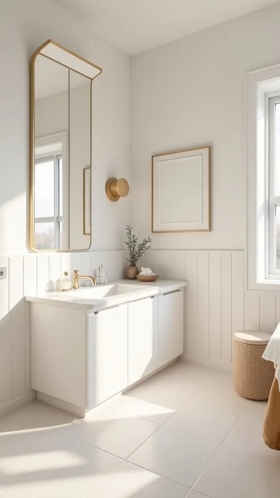
16. How can I make a small bathroom feel bigger using warm neutrals?
Small bathrooms feel larger when edges blur and contrast drops. Warm neutrals help because they reduce harsh visual stops—your eye glides instead of bouncing, which reads as “more space.”
Match your shower curtain to your wall tone (warm white on warm white) and keep patterns subtle. Use one large bath mat instead of two small ones; a 20″ x 30″ mat often looks more expansive than a tiny rug that floats. Keep countertop items contained in one tray and mount hooks so towels aren’t piled on the vanity.
Choose light linen towels and a pale travertine look tray. Add one vertical element—a dried stem or a slim sconce—to draw the eye up.
Beginner version: clear the floor and hang towels. Visual floor space is the fastest “square footage” you can create.
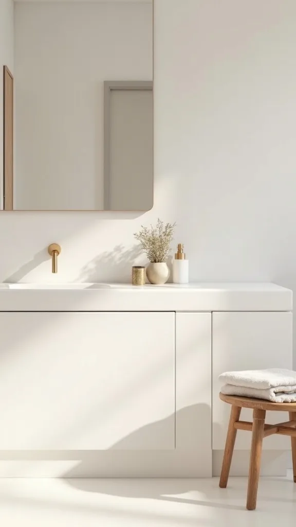
17. What’s the best shower curtain choice for a warm neutral bathroom?
A shower curtain is basically a wall. If it’s too bright or too patterned, it dominates the room and fights the calm you’re trying to build.
Choose a fabric curtain in warm white, oatmeal, or a subtle stripe. Linen or linen-look cotton adds the right early-fall texture without looking heavy. Hang it high (close to the ceiling if possible) so the room feels taller, and use simple rings in a finish that matches your main hardware.
Avoid stark optical white if your walls are creamy—it can make everything else look dingy by comparison. Also skip tiny busy prints; they read like clutter from across the room.
Beginner version: keep your current curtain but swap to a warmer liner and add a fabric outer curtain in a solid neutral. It’s an instant mood shift for under $40–$60.
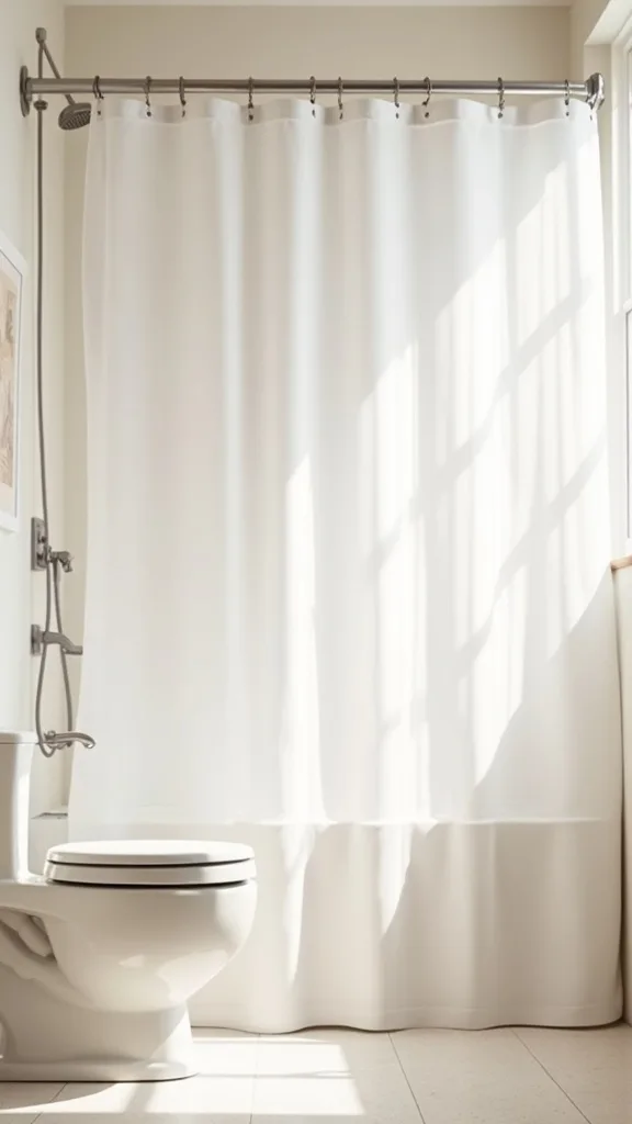
18. How do I upgrade bathroom storage so it matches the decor?
Storage is decor in a bathroom because it’s usually visible. Warm neutrals make storage feel intentional when you choose containers that look like they belong in a living space, not a supply closet.
Swap plastic bins for woven baskets, lidded ceramic jars, and amber or frosted bottles. Group like items: hair tools in one basket, extra hand towels in another. Label subtly (small tags or a label maker in a neutral tape) so it stays functional without shouting.
In an earth tone bathroom, lean into natural fibers and stone: a seagrass basket + travertine tray is a reliable pairing. Keep one “open” basket and one “closed” container to balance texture with visual calm.
Beginner version: start with one lidded jar for cotton rounds and one basket for backstock. Hiding the small stuff is the quickest way to look pulled together.
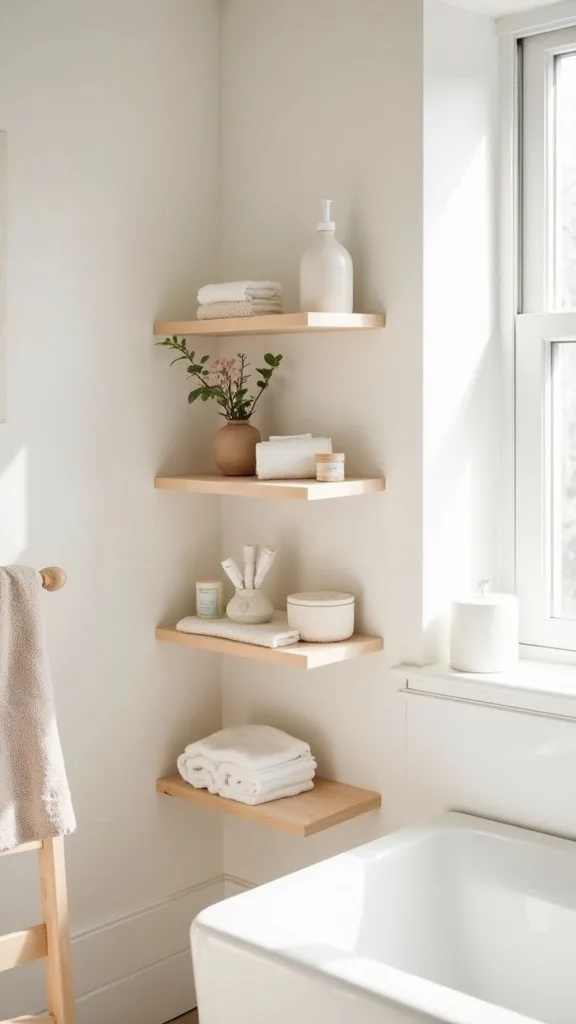
19. What wall art works in a minimalist fall bathroom?
Wall art should reinforce the palette, not introduce a new one. In early fall, warm neutrals feel best with organic shapes and muted contrast—your brain reads it as restful and cohesive.
Choose one medium piece (roughly 11″ x 14″ or 16″ x 20″) rather than several tiny frames that look busy. Look for line drawings, botanical sketches, or abstract landscapes in clay, sand, and soft brown. Frame it in light wood for warmth or thin black for a modern edge—just repeat that finish once elsewhere.
Avoid glossy posters behind shiny glass if your lighting is harsh; glare makes the wall feel messy. Matte prints or a simple canvas are calmer.
Beginner version: print a public-domain botanical and place it in a thrifted wood frame. One thoughtful piece beats a gallery wall in a small bathroom.
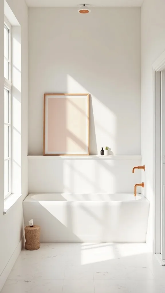
20. How do I make a builder-grade vanity feel warmer without painting it?
Builder-grade vanities often feel flat because they lack texture and contrast. Warm neutrals fix that by adding layered materials around the vanity so it reads as part of a styled room, not just a fixture.
Start with hardware: if you can swap knobs, choose brushed brass, champagne bronze, or matte black depending on your direction. Then add a woven basket on the lower shelf (or on the floor beside it) and a linen hand towel on a hook instead of the vanity bar. Top it off with a stone tray and one ceramic accessory so the countertop feels curated.
Keep colors consistent—oatmeal, sand, terracotta accents. This creates a “designed” halo around the vanity without touching the cabinet paint.
Beginner version: don’t change hardware yet. Add the basket + tray combo first; it does more than you’d expect.
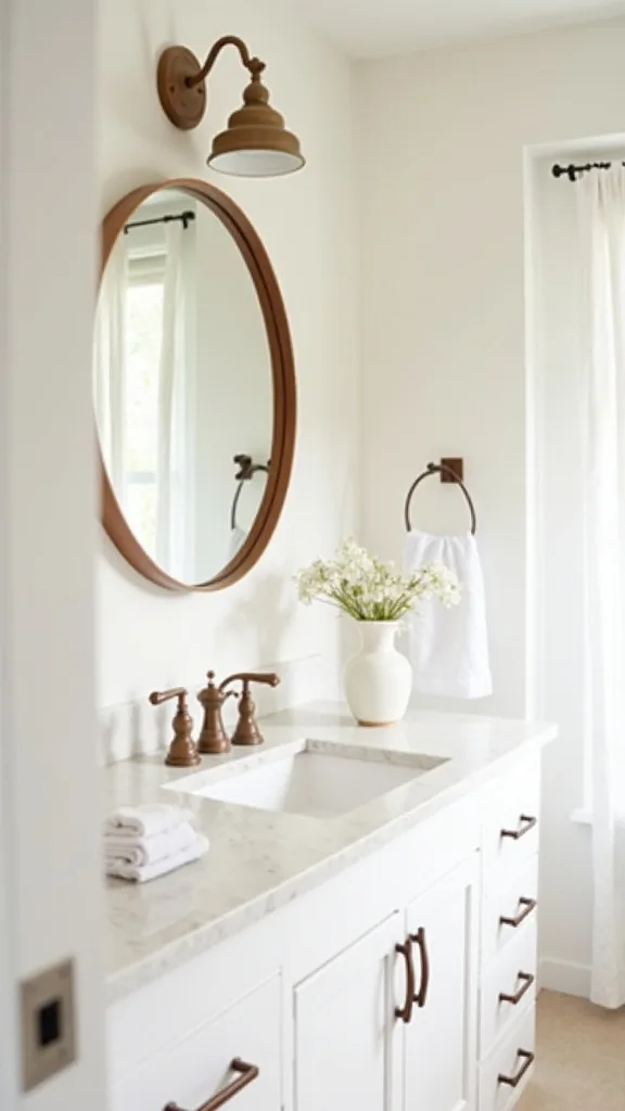
21. What’s the right way to use wood tones in a humid bathroom?
Wood brings instant warmth, but it needs smart placement. Psychologically, wood reads as shelter and comfort—perfect for early fall—yet bathrooms demand materials that can handle moisture.
Use wood where it won’t sit in water: a framed mirror, a small stool, a wall shelf, or a teak bath mat. If you add a wood tray, choose sealed wood or use it only for dry items like a candle and matches. Wipe it down regularly so it doesn’t warp.
Wood tones that pair best with warm neutrals are white oak, walnut, and bamboo. Avoid very red cherry if you’re also using terracotta; it can skew too warm and feel heavy.
Beginner version: add one small wood element—a stool or frame—before committing to shelves. One warm note can balance the whole room.
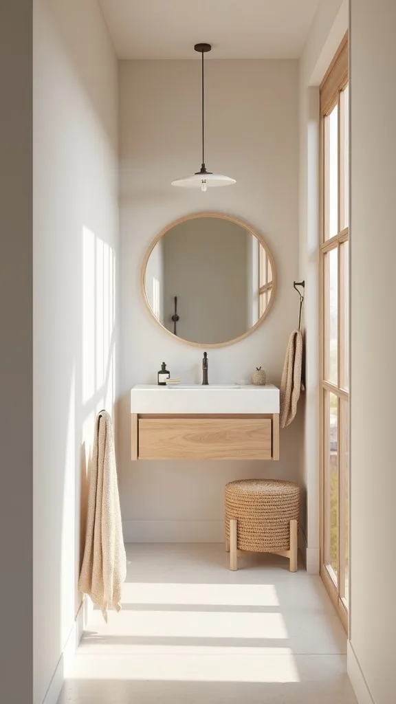
22. How do I choose a bath mat that looks elevated (and stays washable)?
A bath mat is both a comfort item and a big color block. In a warm neutral scheme, the right mat grounds the room and makes everything else look more intentional.
Pick a mat in oatmeal, sand, or warm gray-brown with a low-contrast pattern (subtle stripe or small geometric). Look for washable cotton or a flatweave option that dries quickly. If your bathroom is small, one larger mat often looks cleaner than multiple little rugs that shift around.
Avoid super plush bright-white mats if you have creamy walls—they show every mark and can make your palette look mismatched. A warm neutral hides wear better and feels more relaxed.
Beginner version: buy one mat and commit to it for 30 days. If it doesn’t make the room feel calmer immediately, return it—your mat should be a “yes” from day one.
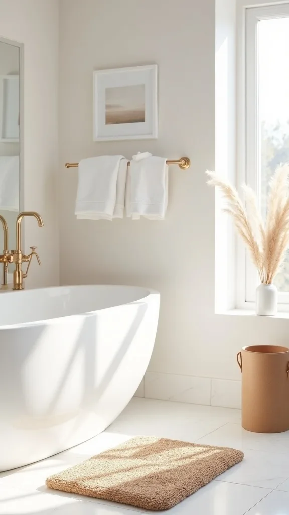
23. How can I make soap and skincare packaging not ruin the vibe?
Packaging is visual noise, and bathrooms are already full of it. Decanting works because it reduces competing fonts and colors, letting your materials—linen, stone, ceramic—be the design story.
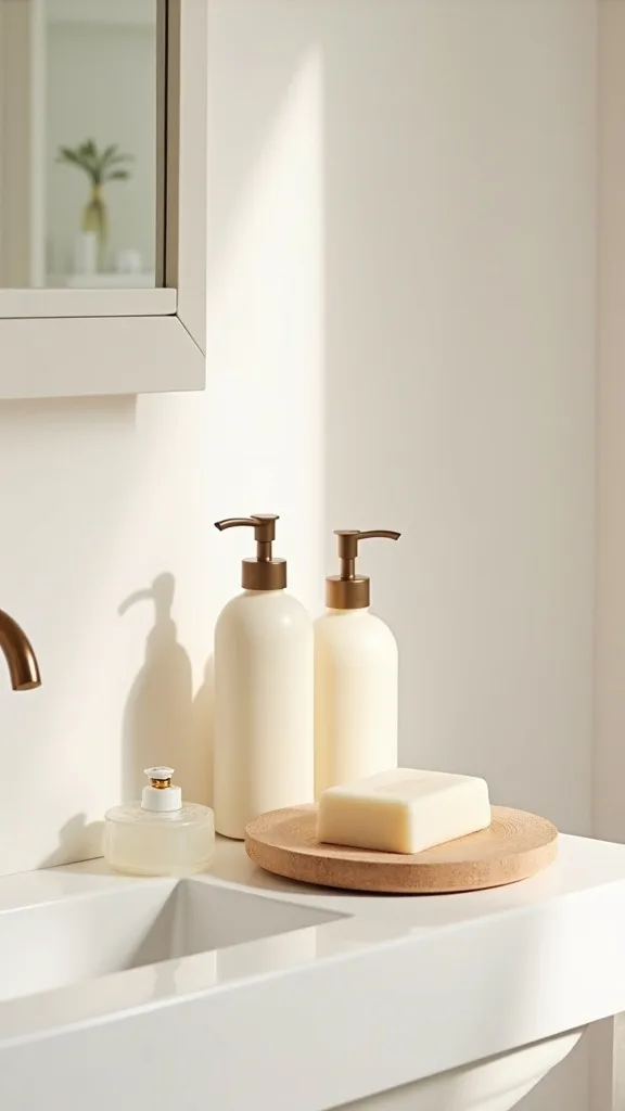
Move daily soap into one refillable dispenser in matte cream, amber, or clear glass. For skincare, corral bottles into a tray and turn labels inward if they’re bright. Keep backups under the sink in a basket so the counter stays calm.
Choose accessories that echo your palette: terracotta for the soap dish, travertine for the tray, and one small lidded jar for cotton swabs. This is simple bathroom decor that also makes cleaning faster.
Beginner version: decant just hand soap. One bottle swap can make the whole sink feel upgraded.
24. What scent choices support an early-fall warm neutral bathroom (without overpowering)?
Scent is part of design because it changes how you experience the space. Warm, resinous notes feel grounding in early fall, and when they’re subtle, they reinforce the calm effect of warm neutrals rather than competing with it.
Choose one delivery method: a candle, a reed diffuser, or a gentle room spray. Look for cedar, sandalwood, amber, fig, or light vanilla—not sugary. Place it on your tray so it reads as part of the styling, and keep it away from towels to avoid residue.
Avoid mixing multiple strong scents (candle + plug-in + spray). That’s the fastest way to make a bathroom feel chaotic, even if it looks tidy.
Beginner version: add one candle in an amber jar. Light it for 10 minutes before guests arrive and blow it out—soft scent, zero clutter.
25. What’s the one-step reset that keeps the look going all season?
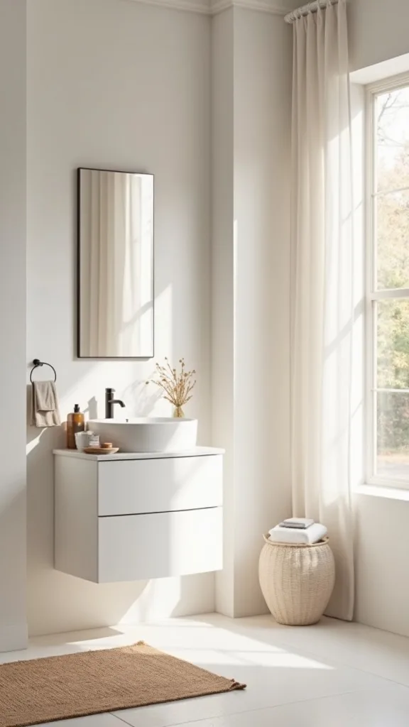
The most sustainable refresh is a reset routine, not a shopping list. It works because your brain associates the bathroom with ease when it’s quick to maintain—less friction means you actually keep it tidy.
Set up a nightly 2-minute reset: wipe the sink, put everything back on the tray, hang the towel, and empty any stray packaging. If you have kids, add one small “drop zone” bin under the sink so the counter doesn’t become the default landing spot. This habit protects your neutral styling from being swallowed by real life.
Keep your anchor items consistent: tray, soap dish, towel, and one stem. That repetition is what makes the room feel designed day after day.
Beginner version: do the reset only on weekdays. Consistency beats intensity, and your space will still feel calm by Friday.
Final Thoughts
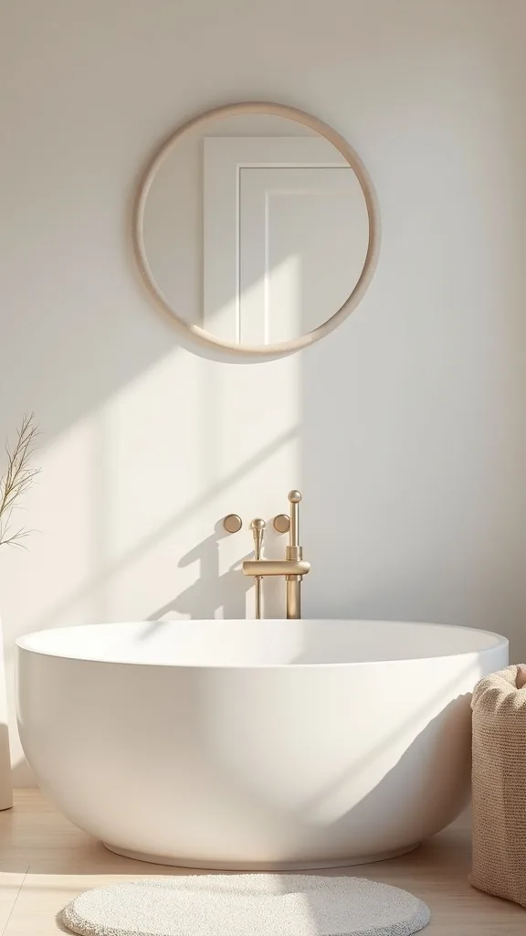
Warm neutrals aren’t a trend so much as a strategy: lower contrast, repeat natural texture, and let one small focal point do the heavy lifting. When you apply that principle, the bathroom stops feeling like a storage closet with plumbing and starts feeling like a room you enter on purpose—especially in early fall when the light shifts and you crave softer edges.
If you’re torn between modern, traditional, or transitional, don’t overthink it. Keep the palette steady (cream, sand, terracotta, one dark note) and let the “style” show up in shapes: sleek cylinders for modern, classic curves for traditional, and a balanced mix for transitional.
The single most important thing to get right is the counter: one tray, a few touchable materials, and plenty of clear space. Today, clear the sink area completely, put back only soap and one towel, then add a tray and one dried stem—your bathroom will look refreshed before dinner.
What I’d Do Differently
When I first tried this, I bought “neutral” items one at a time—an off-white towel here, a beige mat there, a tan soap dispenser that looked right online. In my bathroom, it all turned into a weird mix of undertones: one piece read pink, another read green-gray, and the whole sink area looked slightly dirty even after I cleaned it. The mistake wasn’t the idea of neutrals; it was failing to choose one clear lane and repeat it. The fix was embarrassingly simple: I picked a base (creamy white), a mid (flax), and one accent (terracotta), then removed anything that didn’t match those three. The room immediately felt calmer because my eye stopped “correcting” the color confusion.
I also wish I’d started with lighting before buying accessories. Warm white light (2700K–3000K — the cosy, yellowish tone you see in most homes) made every towel and stone piece look richer, so I stopped chasing the perfect shade. Choose your palette, swap one bulb, and set up your tray today—you’ll know exactly what to buy next.