
This post contains affiliate links. As an Amazon Associate, I earn from qualifying purchases at no extra cost to you.
Your living room can be clean, styled, and still feel oddly “off” the minute summer ends. It’s not the sofa or the rug. It’s the wall art still shouting July—bright blues, beach photos, high-contrast graphics—while everything else is begging for softer, warmer balance.
This post gives you a simple technique: keep the structure (frames + layout), change the mood (prints + tones). You’ll get early-fall swaps that feel grown-up: dried floral studies, abstract warm tone canvases, and vintage maps that add depth without turning your home into a pumpkin display.
This is perfect for homeowners who want seasonal wall art that looks intentional, not themed—and who’d rather spend money on a few smart upgrades than a cart full of temporary decor.
Inside you’ll find ways to build a fall gallery wall from what you already own, plus a few high-impact additions: one oversized anchor print, a muted color story, and texture that reads cozy from across the room. Expect ideas that work above a sofa, around a TV, or on that blank wall you keep ignoring.
Below are 25 Autumn Art & Seasonal Gallery Wall Ideas that make seasonal wall art feel polished, keep your fall gallery wall cohesive, and turn everyday fall home art into a living-room upgrade.
Products I Recommend for This Project
Here are some of my favourite products to help you bring these ideas to life:
- MCS Gallery Wall Frame Set (Black, Multiple Openings) — Makes a cohesive gallery wall fast when you want consistent spacing and finish.
- Command Picture Hanging Strips (Large, Damage-Free) — Helps you hang and adjust frames without extra holes, especially useful for seasonal swaps.
- Golden State Art Pre-Cut Mat Board Set (White/Warm White) — Instantly elevates printable art and helps mismatched pieces look unified.
- Epson Premium Presentation Paper Matte — Produces richer, less-glare prints for botanicals, maps, and warm abstracts.
- Battery Operated LED Picture Light (Warm White) — Adds focused glow over your anchor piece so autumn tones look warmer at night.
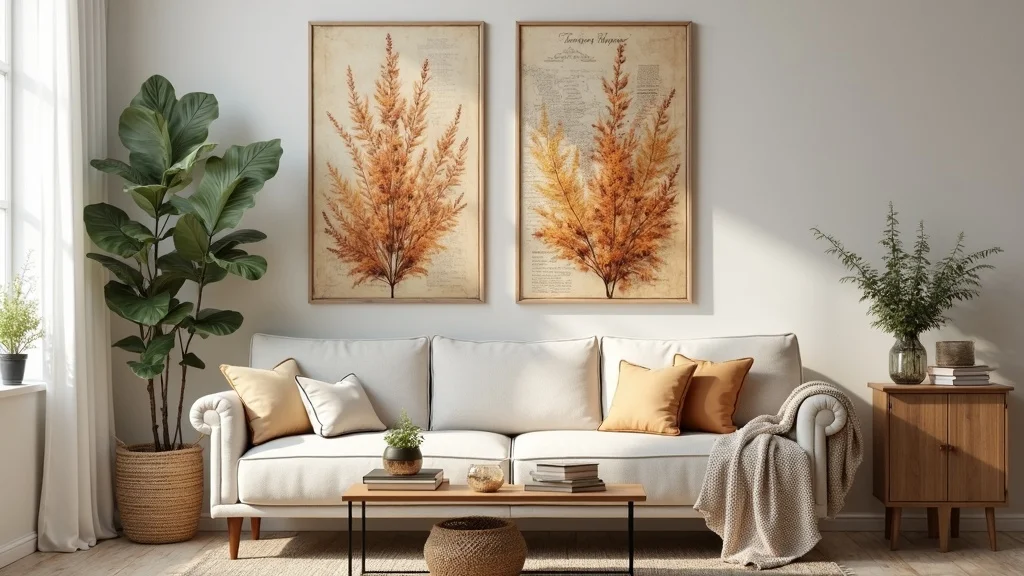
1. Swap summer art for earthy prints (dried florals, warm abstracts, vintage maps)
This idea is a straight swap: keep your frames and layout, but replace your bright summer pieces with earthy prints. It works because your eye reads the wall as “the same,” while the palette quietly shifts the entire room into early fall.
Pull your frames down once, lay them on the floor, and drop in new art: 2 dried botanical studies, 2 warm abstract shapes, and 1 vintage map as the “story” piece. Stick to a tight palette—clay, olive, tobacco, and cream—so even mixed styles look curated. If you’re printing at home, choose one paper type for everything so the finish matches.
Look for dried floral line drawings, abstract warm tone canvases, and sepia vintage maps (even your own city). Matte paper reads calmer than gloss in a living room with lamps.
Pro tip: add one piece with a slightly darker background to anchor the set; it makes the rest feel intentional instead of “new prints in old frames,” and the wall suddenly feels like it belongs.
2. How do you choose an early-fall color palette that doesn’t feel Halloween?
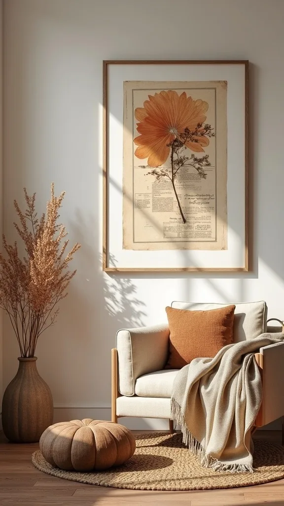
An early-fall palette should feel like a wardrobe shift, not a costume. It works because your living room keeps its everyday sophistication while still nodding to the season through undertone, not icons.
Start with what’s already in the room: your sofa color and your largest rug color. Then pick two “leaf tones” (rust, ochre, deep olive, or warm taupe) and one light neutral (cream or sand). When shopping for seasonal wall art, ignore anything with bright orange and black together—those two instantly read Halloween, even in abstract art.
Materials that land the look: raw linen backgrounds, muted terracotta, and antique brass frames if you want a warmer edge. If you like cooler interiors, choose mushroom, caramel, and charcoal instead of pumpkin shades.
Pro tip: repeat one color in at least three frames (a rust brushstroke, a map border, a botanical stem). That repetition is what makes the wall feel designed, not seasonal.
3. What’s the easiest fall gallery wall layout for above a sofa?
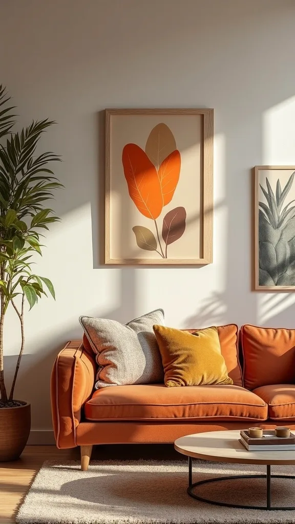
The easiest layout is a tidy rectangle: two rows that line up cleanly. It works because a sofa already feels like a big horizontal block, and a rectangular gallery reads stable instead of chaotic.
Measure your sofa width and aim for art that spans about two-thirds of it. For a standard 84-inch sofa, that’s roughly 56 inches of art width. Use 6–8 frames in consistent sizes (like 11×14 and 8×10) and keep 2-inch spacing between frames so the wall can “breathe.” Tape paper templates to the wall first; you’ll catch mistakes before you hammer anything.
Choose a mix of botanical prints and soft abstracts with one map or landscape for variety. Keep frame finishes consistent—black, oak, or brass.
Pro tip: align the top row perfectly and let the bottom row vary slightly if needed. Your eye forgives the bottom, but it demands a crisp top edge.
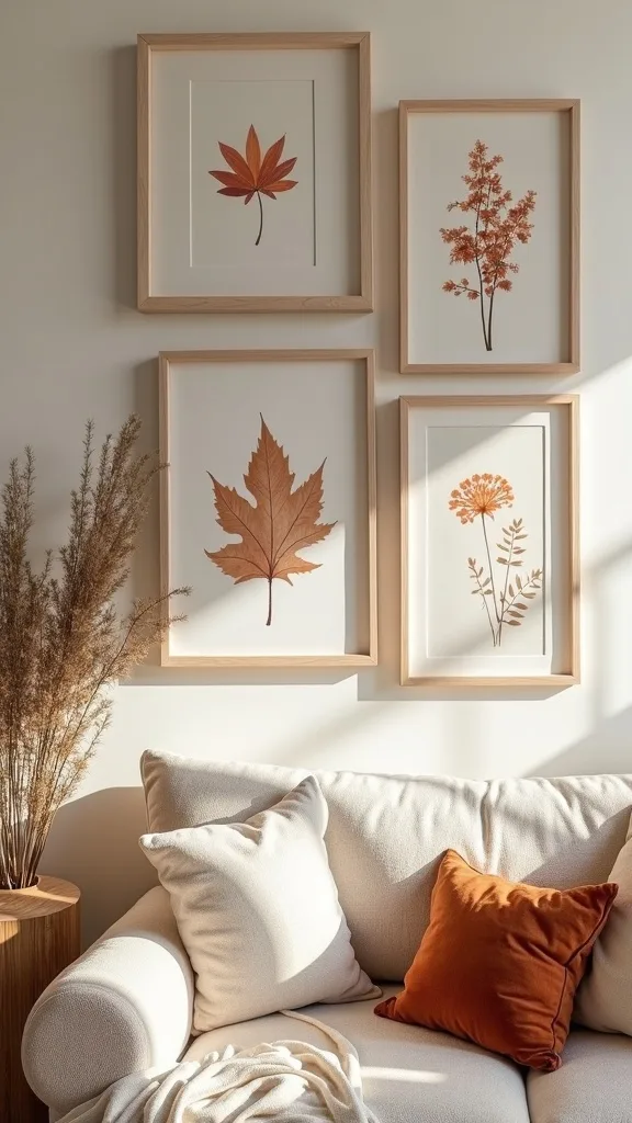
4. How do you make seasonal wall art look expensive on a budget?
Expensive-looking art is usually consistent, not rare. It works because cohesion reads like a “collection,” even if you printed half of it at home.
Pick one unifying element: same mat color, same frame finish, or same paper type. Then source art inexpensively—public domain vintage botanicals, downloadable abstracts, or thrifted frames with new prints. Spend your money on one “hero” piece (an 18×24 or 24×36) and let smaller pieces support it.
Budget materials that don’t look cheap: white mats (they create breathing room), thin black metal frames, and heavyweight matte paper. Avoid flimsy poster frames with shiny plastic; glare makes even good artwork look like a dorm room.
Pro tip: if you can only upgrade one thing, upgrade the mat. A crisp mat makes a $12 print read like a gallery piece, and that’s the kind of math worth doing.
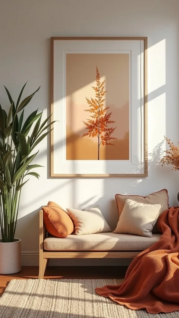
5. Should you mix frame finishes (black, wood, brass) in autumn wall decor?
Yes—if you limit the mix. It works because a controlled blend feels collected over time, which suits fall’s layered, earthy mood.
Use the 70/20/10 rule: 70% one finish (say, matte black), 20% a second (oak), and 10% a third (antique brass). Keep shapes consistent—mostly rectangles—so the finish mix doesn’t turn into visual noise. If your living room has warm woods, let wood frames show up near the warmest prints to reinforce the palette.
Pair oak frames with dried florals, black frames with maps and line art, and brass accents with the smallest pieces. That distribution keeps brass from feeling flashy.
Pro tip: repeat the third finish at least twice (two small brass frames, not one). One looks accidental; two looks like a decision.
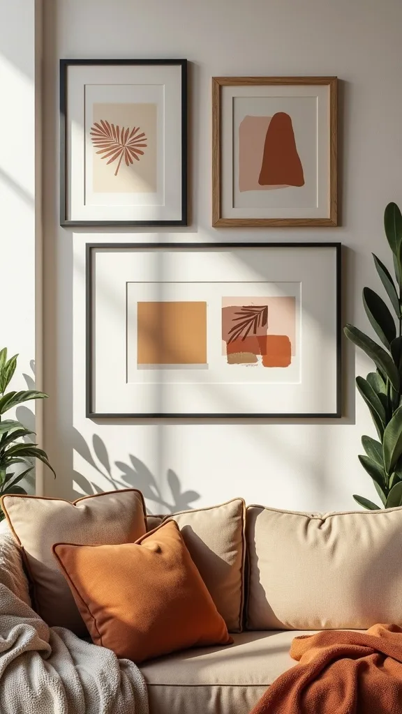
6. What art sizes look balanced in a living room gallery wall?
Balance comes from size variety with one clear anchor. It works because your eye needs a “starting point,” then smaller pieces can create rhythm around it.
Choose one large piece first: 18×24 or 24×36 above a console or sofa. Then build with supporting sizes: two 11x14s and three 8x10s is a reliable mix. Keep the bottom edge of the overall arrangement about 6–8 inches above the sofa back so it feels connected, not floating.
For early fall, let the large piece be a warm abstract or a moody landscape, then scatter botanical studies and vintage cartography around it. Consistent mat width helps different sizes feel related.
Pro tip: if your wall feels busy, it’s often because your medium pieces are too similar in size. Add one noticeably smaller frame to create a pause—like punctuation for the wall.
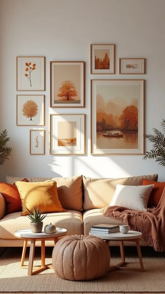
7. How do you use dried florals on the wall without it looking crafty?
Dried florals look elevated when they’re treated like specimens, not decorations. It works because “study” styling feels timeless and calm, especially in a living room where you want longevity.
Press a few stems (fern, eucalyptus, or hydrangea petals) between heavy books for a week, then mount them on off-white cardstock. Frame them with a wide mat so the negative space does the heavy lifting. Keep the arrangement minimal: one stem per frame, not a bouquet.
Choose thin wood frames or black metal frames and avoid glittery craft paper or overly ornate frames. If you want color, use naturally muted blooms—dusty rose, straw, or olive.
Pro tip: spray a light coat of matte fixative outdoors to reduce shedding. The result feels like a small museum moment, and that’s exactly the energy you want for early fall.
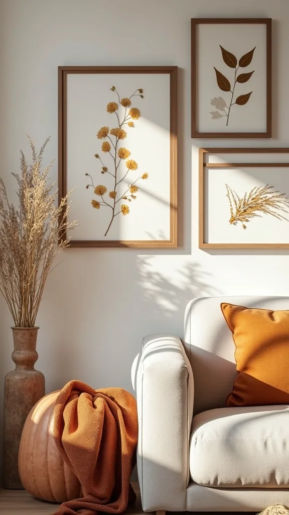
8. What’s a smart way to add vintage maps without making the room feel like a study?
Vintage maps work when they’re used as texture, not a theme. It works because the fine lines and sepia tones add detail that reads warm and layered from across the room.
Pick one location with meaning—your hometown, a favorite national park, or the city you met in—and print it in muted tones. Use a mat to keep it airy, then pair it with softer pieces like botanicals or abstract color fields so the map doesn’t dominate. If your living room already has busy patterns, choose a map with more open water/blank space.
Look for antique-style cartography, parchment backgrounds, and frames in walnut or black. Skip glossy finishes; glare turns detail into noise.
Pro tip: crop the map tight so it becomes graphic. A close-up of streets or contour lines feels modern, even if the source is vintage.
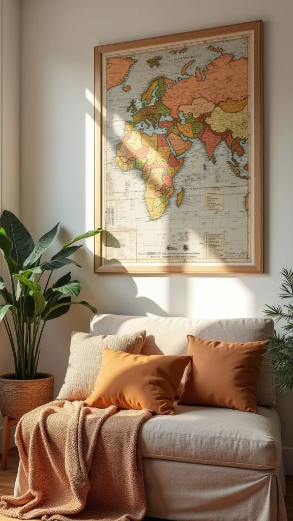
Cost & Materials Estimate
A realistic early-fall gallery wall refresh typically runs from a small print swap to a full frame-and-art update, depending on how much you already own.
| Item | Estimated Cost | Where to Buy |
|---|---|---|
| Set of 6 minimalist frames (8×10 or 11×14) | $28–$55 | Amazon |
| Mat board set (pre-cut or DIY cut-to-size) | $12–$24 | Amazon |
| Printable art paper (heavyweight matte, 50 sheets) | $14–$26 | Amazon |
| Removable hanging strips (large pack) | $10–$18 | Home Depot |
| 36–48 inch picture ledge shelf | $19–$45 | IKEA |
Total estimated cost: $83–$168 Save by reusing frames and only replacing prints; splurge on one larger anchor piece if you want the biggest visual shift.
9. How do you create a minimalist fall art wall (not bare, not busy)?
Minimalist fall art is about fewer pieces with better scale. It works because the season already brings visual weight through textiles and lighting; your wall can stay calm and still feel seasonal.
Choose three pieces max: one large warm neutral abstract, one simple botanical line drawing, and one small textural print (like a charcoal sketch). Hang them in a straight line or a tight cluster with consistent spacing. Keep frames identical to avoid “mix-and-match” energy.
Use sand, clay, and soft brown tones, plus matte black or light oak frames. If you want depth, choose prints with visible paper grain or brush texture.
Pro tip: add one picture light above the largest piece with warm white light (2700K–3000K — the cosy, yellowish tone you see in most homes). Minimal doesn’t mean flat; it means intentional.
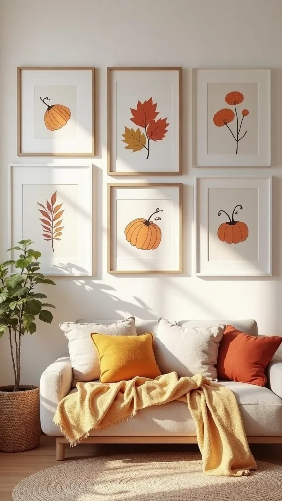
10. What should you avoid when styling autumn artwork in a living room?
Avoid mixing too many seasonal motifs at once—pumpkins, plaid, corny quotes, and leaf clipart. It fails because your eye can’t find a focal point, and the room starts to feel like a retail display instead of a home.
Instead, pick one “seasonal signal” and keep it subtle: color temperature, natural textures, or subject matter (like botanicals). If you love a phrase print, pair it with quiet abstracts and keep the typography minimal. Also avoid hanging art too high; if you have to tilt your head back, the wall will always feel disconnected from your furniture.
Better materials: matte prints, simple frames, and one piece with real texture (canvas or linen). Keep novelty items to a shelf, not the main wall.
Pro tip: when in doubt, remove one piece. The wall almost always looks more expensive after a thoughtful edit—and you’ll feel the calm every time you walk in.
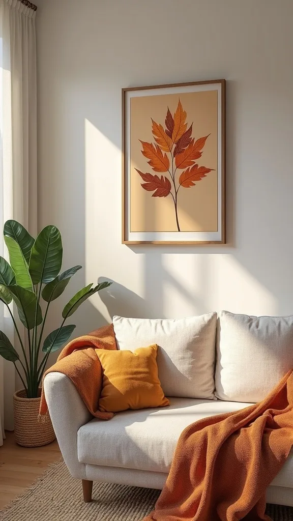
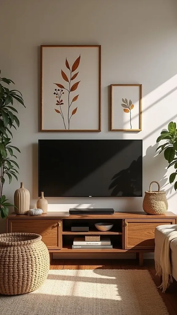
11. How do you style a fall gallery wall around a TV?
A TV wall looks best when the art supports the screen, not competes with it. It works because the TV is already a dark rectangle; your art should soften the edges and add warmth without creating visual chaos.
Keep frames tight to the TV perimeter—think of building a wider “black zone” that feels intentional. Use 4–6 pieces, mostly vertical, and keep the palette quiet: creams, warm grays, sienna, and olive. If cords are visible, handle that first; no artwork can out-style a dangling cable.
Choose monochrome botanicals, warm neutral abstracts, and one vintage map to add fine detail. Black frames often look best here because they echo the screen.
Pro tip: include at least one piece with a darker background so the TV doesn’t feel like the only “heavy” element. The whole wall starts reading as one designed composition.
12. Can you use canvas art for early fall without overwhelming the room?
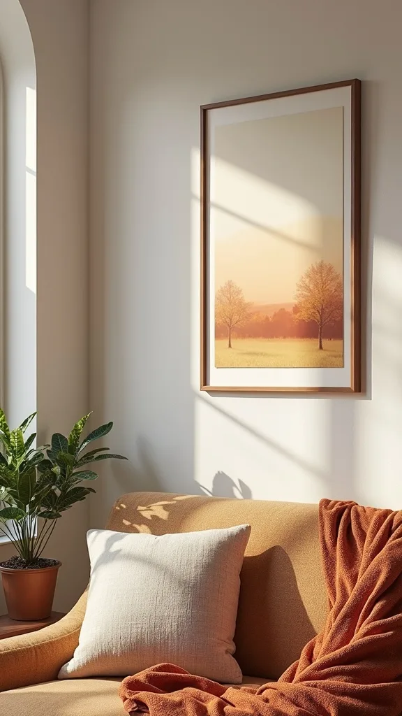
Canvas works beautifully in early fall when the color is restrained. It works because canvas texture adds warmth even when the artwork is simple—your wall feels cozier without adding clutter.
Choose one canvas as an anchor (24×36 is impactful above a console) and keep the rest as framed prints. Look for abstracts with soft edges—rust washed into cream, olive brushed into taupe—rather than sharp geometric contrasts. Hang the canvas at eye level and keep the surrounding pieces slightly smaller so it stays the star.
Materials to consider: gallery-wrapped canvas, linen-look texture, and muted pigments like burnt sienna and umber. Pair with thin frames nearby to keep the mix light.
Pro tip: if the canvas feels too bold, flank it with two very quiet pieces (simple line drawings). Contrast isn’t only color; it’s also detail level.
13. How do you build seasonal wall art from printable sources that look legit?
Printable art looks legitimate when you treat it like real art: proper paper, proper matting, and thoughtful curation. It works because presentation signals value long before anyone notices where it came from.
Pick a set of 5–7 prints from the same artist or same era so the style matches. Print on heavyweight matte paper, then use identical mats for consistency. If your printer can’t handle large sizes, print two 11x14s instead of one 24×36; multiple mid-size pieces can still feel substantial.
Choose public domain botanicals, vintage landscape sketches, and minimal abstracts in warm neutrals. Keep saturation low for early fall.
Pro tip: add a small caption label (even handwritten neatly) under one “specimen” print. It’s a tiny museum trick that makes the whole wall feel curated and personal.
14. What’s the best way to use mats so frames look cohesive?
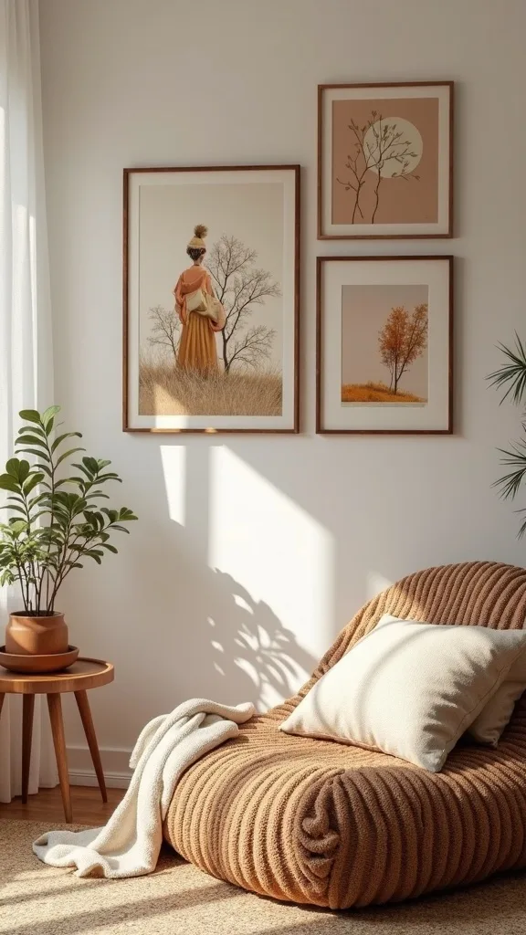
Mats are the quiet tool that makes mismatched art feel unified. It works because a consistent border gives your eye a repeated shape, even when the images vary.
Choose one mat color—bright white for crisp modern, warm white for softer traditional—and stick to it. If your frames are different sizes, use the same mat “reveal” width whenever possible (for example, a 2-inch mat border around each print). For small prints, a larger mat can make them look intentional instead of undersized.
Try warm white mats with earthy autumn artwork, especially dried florals and maps. Pair with black or walnut frames for contrast without harshness.
Pro tip: don’t overdo double-matting unless the art is truly special. A single generous mat usually looks more current, and it keeps your fall gallery wall from feeling like a formal hallway display.
15. How do you add texture to a gallery wall (beyond framed prints)?
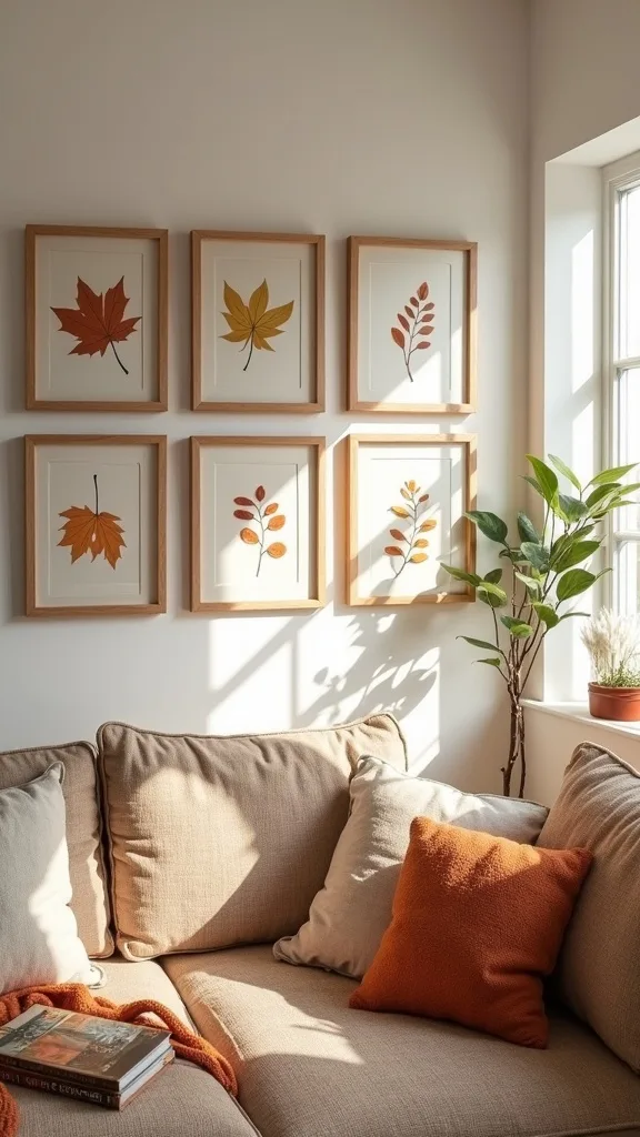
Texture is what makes early fall feel like a season, not a color swap. It works because texture catches lamplight and adds depth, especially at night when living rooms are actually lived in.
Add one non-glass element: a small woven wall hanging, a framed linen textile, or a slim wooden relief panel. Keep it the same scale as a standard frame so it integrates easily. Place it near the center of the arrangement so it reads as part of the collection, not an afterthought.
Look for linen fabric panels, woven neutral textures, and wood-toned accents that echo your furniture. Keep colors muted so texture—not pattern—does the work.
Pro tip: if you’re nervous about adding “craft” vibes, choose one texture piece with a clean border (framed or mounted). The crisp edge keeps the whole wall sophisticated.
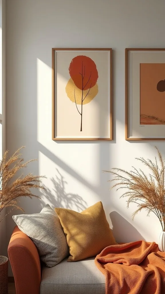
16. How do you create a cohesive theme without matching every print?
Cohesion isn’t identical prints; it’s a shared story. It works because your brain loves patterns—repeated tones, repeated shapes, repeated mood—more than it loves perfect matching.
Pick a theme like “botanical studies + landscapes” or “maps + abstracts.” Then limit your palette to three main colors plus a neutral. If a print is gorgeous but introduces a new bright color, save it for another room; editing is part of good decorating.
Try combining sepia maps, charcoal sketches, and rust-toned abstracts. Keep frame finishes consistent even if the art styles vary.
Pro tip: repeat one shape across multiple pieces (arched forms, circles, or organic blobs). Even subtle shape repetition makes a wall feel designed, and it keeps your seasonal wall art from looking like a random swap.
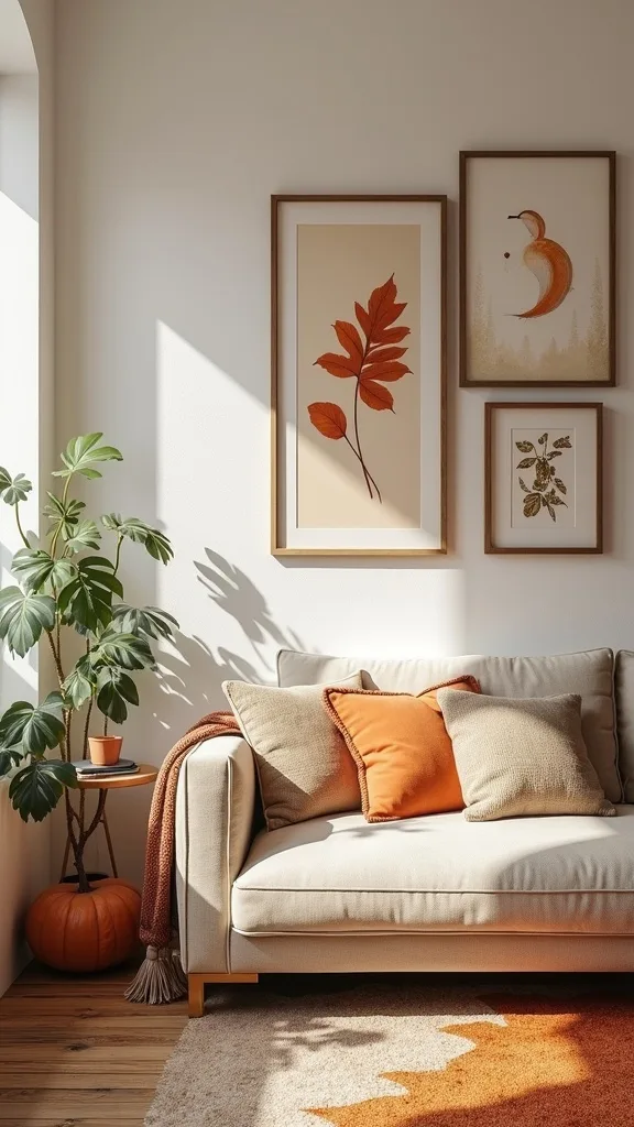
17. What’s a simple way to update a single large wall without a full gallery?
A “big wall” doesn’t require a big gallery—often it needs one oversized statement. It works because one large piece simplifies decisions and reads calmer in an open living room.
Choose a 30×40 (or similar) warm abstract or landscape and hang it centered over your main furniture piece. If the wall still feels empty, add one slim picture ledge beneath it with two small frames leaning—easy to swap as seasons change. Keep the ledge about 4–6 inches below the artwork so the grouping feels connected.
Great choices: moody horizon landscapes, earth-tone color fields, and subtle vintage topographic prints. Use a thin black or walnut frame for structure.
Pro tip: a single large piece is where you can splurge without regret. It’s the one thing guests notice, and it sets the tone for everything else.
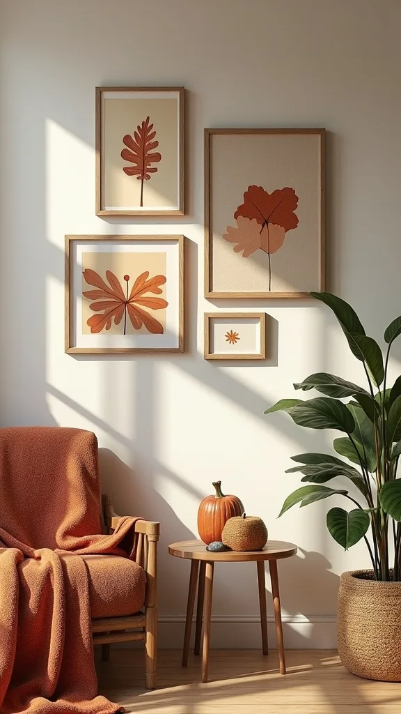
18. How do you use picture ledges for seasonal swaps in early fall?
Picture ledges are the cheat code for seasonal updates. It works because you can rotate art without patching holes, measuring again, or committing to a new layout every few months.
Install one 36–48 inch ledge (or two shorter ledges stacked) and layer frames: largest in back, smaller in front. Keep the palette tight and tuck in one small object—like a ceramic bud vase with dried stems—to bridge art and decor. Make sure frames overlap slightly so the arrangement looks intentional, not lined up like a store shelf.
Use black or oak frames, warm neutral prints, and one vintage map for fine detail. Avoid shiny frames; they reflect lamps and distract.
Pro tip: keep a flat “art folder” in a closet with your off-season prints. When swapping takes five minutes, you actually do it—and your living room stays current without trying.
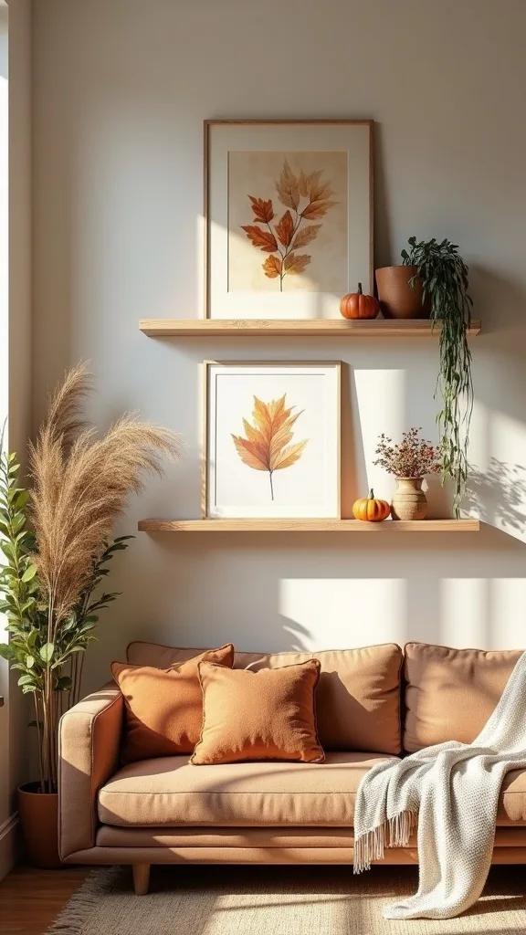
19. What’s the best fall home art for renters who can’t add many nails?
Renters need impact with minimal holes. It works because you can still build a strong wall composition using fewer, larger pieces and removable hanging solutions.
Go for 2–3 larger frames instead of 10 small ones. Hang with removable strips rated for the frame weight, and clean the wall first so they grip properly. If you want a gallery look, use a picture ledge—often two screws total—then lean and layer your seasonal wall art.
Choose lightweight frames (thin metal or acrylic), warm abstracts, and botanical prints with plenty of negative space. Avoid heavy glass if you’re worried about weight limits.
Pro tip: build your arrangement on the floor, take a quick photo, then replicate it on the wall. Renters don’t have time for endless patch-and-paint, and you shouldn’t need it to have a polished fall gallery wall.
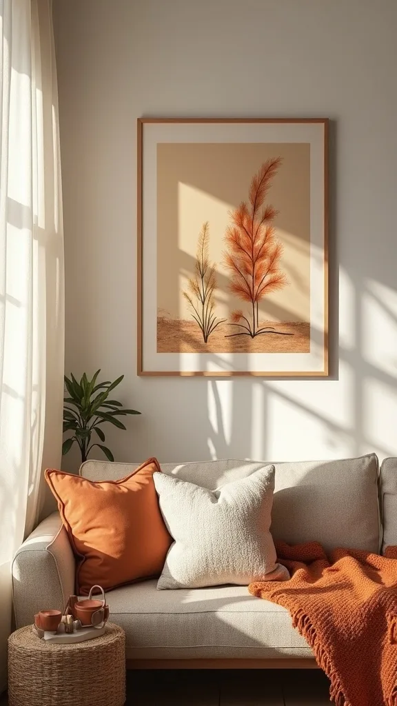
20. How do you incorporate family photos into autumn artwork without clashing?
Family photos can absolutely live with seasonal art—if you control the color treatment. It works because consistent tone makes different subjects feel like one collection.
Convert photos to black-and-white or warm monochrome (slight sepia) and print them on the same paper as your other pieces. Choose images with simple backgrounds—outdoor shots, cozy indoor moments—so they don’t fight the more minimal art. Then place photos evenly across the layout rather than clustering them all together, which can feel like a separate “photo wall.”
Use warm black-and-white prints, white mats, and frames that match your gallery. Pair with botanicals and maps to keep the overall mood calm.
Pro tip: include one photo with a lot of negative space (sky, wall, water). That quiet image acts like a neutral and makes the whole wall feel more elevated.
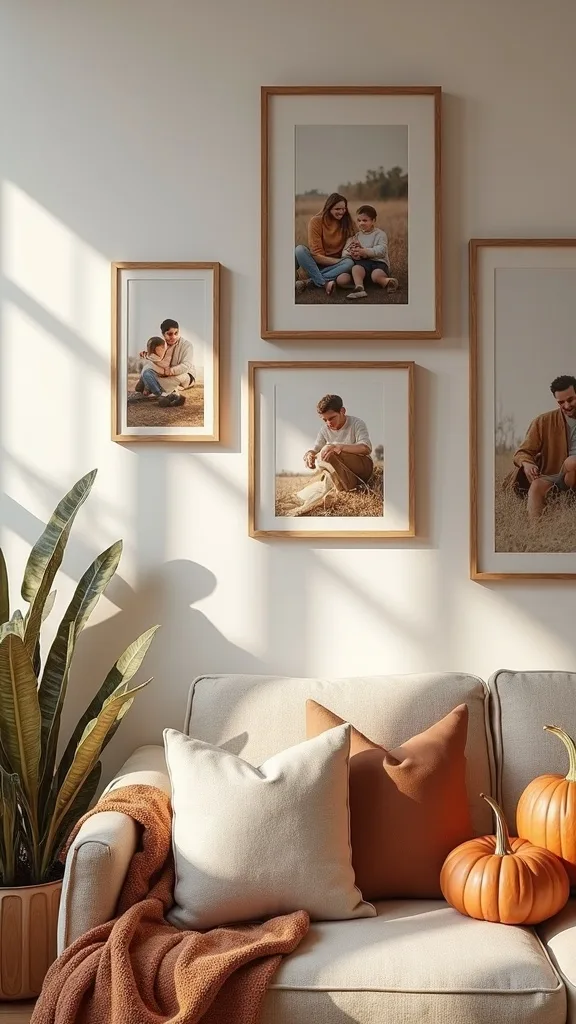
21. What lighting helps seasonal wall art look warmer at night?
Great art can look flat under the wrong bulb. It works because warm, directional light brings out texture and makes earthy tones feel richer after sunset.
Add a plug-in picture light above your main piece, or angle a nearby floor lamp so it grazes the wall. Choose warm white light (2700K–3000K — the cosy, yellowish tone you see in most homes) so your rusts and creams don’t turn gray. If your lamp is harsh, use a softer shade or a lower brightness (measured in lumens) bulb so the wall doesn’t glare.
Best pairings: matte prints (less glare), canvas texture, and frames with subtle sheen like satin black. Avoid glossy posters in direct light—they reflect everything.
Pro tip: light the “hero” piece only. One intentional beam looks designed; a fully lit wall can feel like a waiting room.
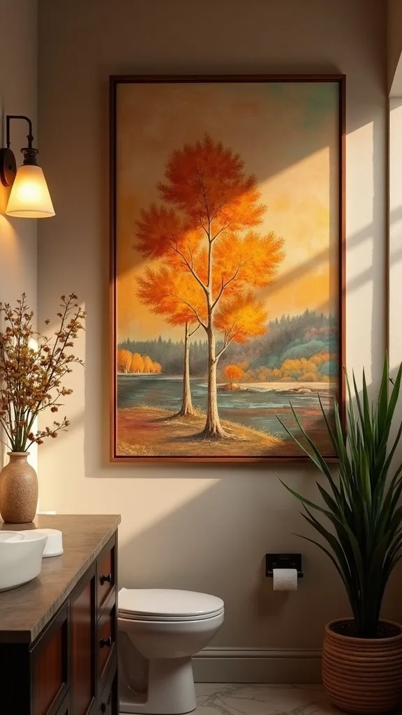
22. How do you curate seasonal wall art so it still feels like you?
The goal isn’t a seasonal costume; it’s a seasonal accent. It works because your home stays consistent year-round, and early fall becomes a subtle shift instead of a full reset.
Start with one personal anchor—your favorite landscape style, a color you always wear, a place that matters—and let that guide the art choices. If you’re drawn to modern interiors, choose abstract warm tones and minimal botanicals. If you lean traditional, use vintage maps and classic botanical plates. The key is to keep your core style and just change the temperature.
Build around your existing frames, your room’s neutrals, and one or two seasonal tones. That’s enough to feel fresh without feeling temporary.
Pro tip: write three words you want the room to feel like—“calm, warm, grounded”—and choose art that matches those words. Taste is a filter, and it saves you money.
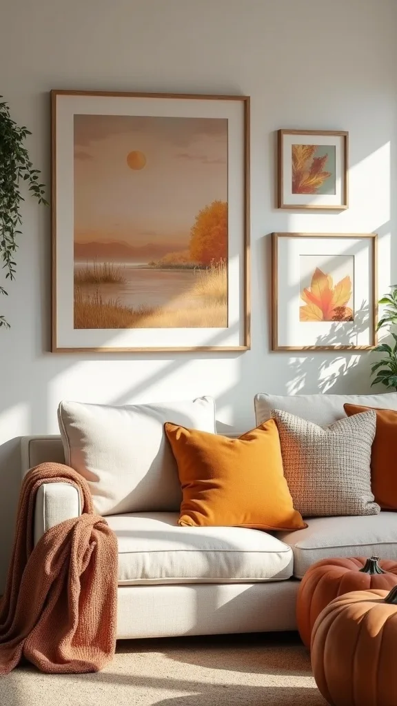
23. How do you use negative space so a fall gallery wall doesn’t feel crowded?
Negative space is what makes a gallery wall feel like design, not storage. It works because empty wall acts as a visual rest, and rest is what makes everything look more expensive.
Keep spacing consistent—2 inches is a reliable target—and don’t fill every gap with a tiny frame “just because it fits.” If you have many small pieces you love, group them into one tight cluster and leave a larger empty margin around the cluster. Also, avoid pushing the gallery all the way to a corner; give it at least 6 inches from adjacent walls or trim so it can breathe.
Use wide mats, simple frames, and art with calm backgrounds. Busy prints need more space around them, not less.
Pro tip: step back to the doorway and squint. If the wall becomes one noisy block, you need more negative space—not more art.
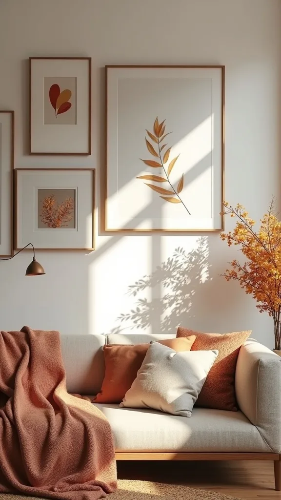
24. What’s a quick “before and after” swap you can do in 20 minutes?
The fastest swap is changing only the center pieces. It works because the eye lands in the middle first; update that, and the whole wall reads seasonal even if the outer frames stay the same.
Pick 2–3 central frames and replace summer art with early-fall prints: a dried floral study, a warm abstract, and a vintage map crop. Keep the mats and frames exactly the same, so you’re only changing the paper. If you want an even quicker win, add one small brass frame among black ones—instant warmth without a full redo.
Choose earth-tone prints with soft contrast, and avoid anything overly saturated. Early fall is about warmth, not intensity.
Pro tip: keep a labeled envelope with “Fall Prints” in a drawer near your tools. When the process is frictionless, your autumn wall decor becomes a habit, not a project.
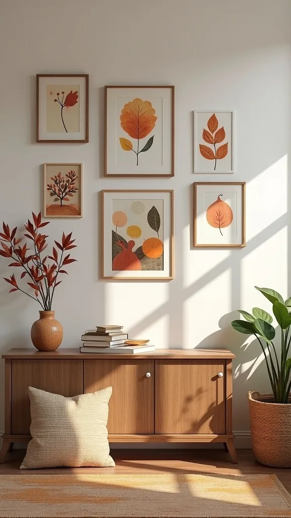
25. How do you plan a seasonal rotation so you don’t keep rebuying art?
A seasonal rotation is a small system, not a shopping problem. It works because you invest once in frames and a few versatile prints, then rotate a handful of accent pieces each season.
Create a “core set” of 60–70% year-round art: neutrals, maps, simple abstracts. Then keep a seasonal set of 30–40% that changes: dried florals and warmer landscapes for fall, lighter botanicals for spring, etc. Store prints flat in a portfolio or under-bed bin with cardboard backing so corners don’t curl.
Buy versatile pieces: neutral abstracts, classic botanicals, and vintage cartography. They transition easily and don’t scream one holiday.
Pro tip: if a piece only works for two weeks in October, it doesn’t deserve a frame. Frame what you’d happily live with for three months—your home will feel more mature, and your budget will thank you.
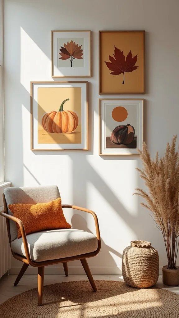
Final Thoughts
The “before” living room usually isn’t messy—it’s just out of season in a way you can’t quite name. The “after” isn’t louder or more decorated. It’s warmer, more grounded, and more consistent with the way you actually live once evenings get earlier.
If you remember one thing, make it this: keep the layout, edit the palette. Let frames and spacing do the heavy lifting, then rotate in a few earthy prints—dried florals, warm abstracts, and one meaningful map—so the wall reads like a collection, not a seasonal display.
Do one action today: pick your three early-fall tones (for example, clay + olive + cream), then swap just the center two frames on your main wall to match them. That single change will set the mood for the whole room before the weekend even starts.
What I’d Do Differently
When I first tried this, I treated my living room like a seasonal bulletin board and swapped in a bunch of small fall prints all at once—tiny pumpkins here, a quote there, a few random leaf illustrations. The mistake wasn’t the art; it was the lack of a plan. From the sofa, the wall looked busy but somehow still unfinished, because nothing anchored it. I ended up moving frames around three times and still couldn’t get that “collected” look I wanted.
What I wish I’d known: early fall works better as a temperature change than a theme change. Now I keep my frame layout, choose a tight palette (three tones plus a neutral), and swap only the center 2–3 pieces first. If the room still needs more, then I add one textured element like a linen panel or a canvas. Pick your palette today and change just one frame—you’ll feel the difference immediately, and momentum will carry you through the rest.