This post contains affiliate links. As an Amazon Associate, I earn from qualifying purchases at no extra cost to you.
Your living room can look “fall” in September and “messy” by October. The difference usually isn’t taste—it’s that warm colors get piled on top of a space that already has its own undertones, and suddenly everything competes.
This article solves that with one technique: build a calm neutral base, then layer warm autumn colors in a tight, repeatable formula (color + texture + shine). You’ll see how rust color decor and amber home accents add depth without turning your room into a craft store display.
This is perfect for homeowners who want a welcoming early fall refresh that still reads grown-up and works with real life—kids, pets, and weeknight clutter included.
Inside, you’ll find high-impact swaps (pillows, throws, art, lighting), smart placement (so color travels around the room), and a few “don’t do this” warnings that prevent the muddy, over-orange look.
Below are 25 Autumn Tone Living Room & Rust Color Decor that bring rust color decor, amber home accents, and a grounded fall color palette into your space—cleanly, quickly, and with staying power.
Products I Recommend for This Project
Here are some of my favourite products to help you bring these ideas to life:
- MIULEE Velvet Throw Pillow Covers (Rust, 20×20) — An easy way to add rust color decor with a tailored, matte-velvet finish.
- DEVI Amber Glass Vase (Bottle Style) — Adds that amber glow on a side table or mantel without needing extra clutter.
- Utopia Bedding Throw Blanket (Waffle Weave, Beige) — Layers in texture so warm autumn colors look rich rather than heavy.
- Philips LED Warm Glow Bulbs (warm white light 2700K–3000K) — The simplest upgrade to make amber and rust tones look better at night.
- Homall PU Leather Accent Chair (Cognac/Brown) — A budget-friendly way to get the cognac leather look that anchors the whole palette.
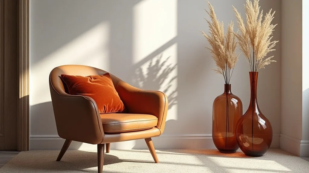
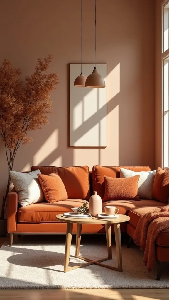
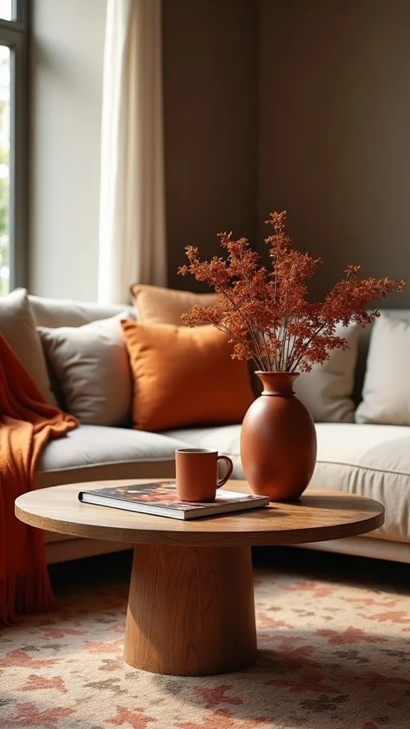
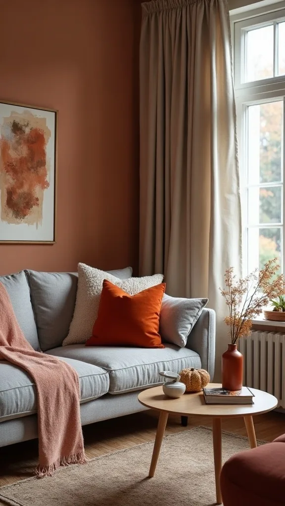
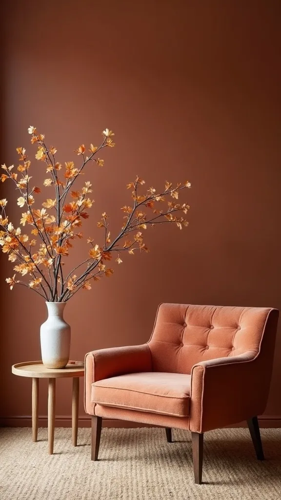
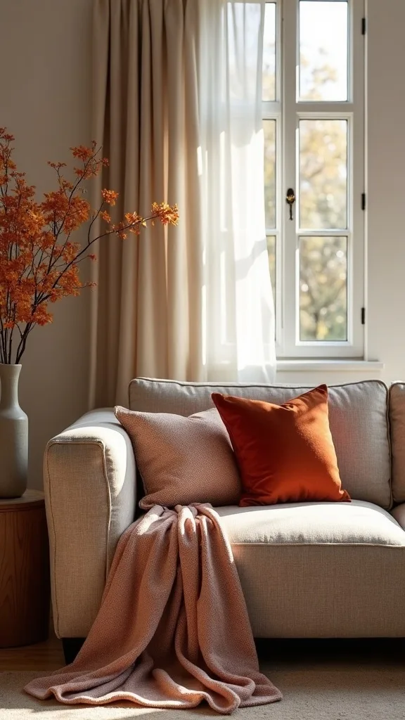
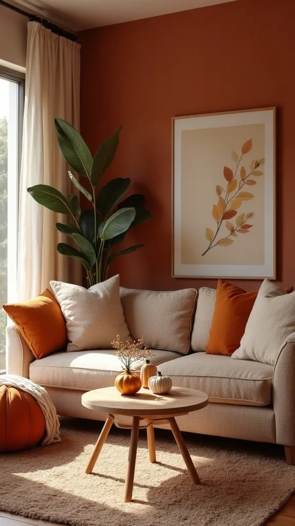
1. Anchor the look with amber glass, rust velvet, and cognac leather on a neutral base
This idea is the whole look in one sentence: amber glass vases, a rust velvet pillow, and a cognac leather side chair—set against a neutral sofa and rug—so the color feels curated, not scattered. It works because you’re mixing texture (velvet/leather) with shine (glass) while keeping the “background noise” quiet.
Start by clearing your coffee table and styling one tray. Add 1–2 amber glass vases (odd numbers look natural), then place a rust velvet pillow on the sofa closest to that vignette so the color reads as a pair. Angle the cognac chair slightly toward the sofa to create a conversation triangle.
Choose a neutral base in warm white, oatmeal, or greige; then let rust and amber be the only saturated notes. If you need a bridge color, add a small touch of olive in a book spine or stem.
Pro tip: repeat the amber once more across the room—one small candle holder is enough—so the glow feels intentional and quietly confident.
2. How do you pick warm autumn colors that don’t turn your room orange?
The quickest way to make fall decor look cheap is letting “orange” be the only story. This works when you treat rust as a brown-based neutral and use amber as your highlight, not your main wall of color.
Pick three tones: rust (soft, earthy), amber (golden glow), and one grounding neutral (cream, taupe, or warm gray). Then commit: no bright pumpkin, no neon marigold. If you’re shopping online, look for words like “terracotta,” “cinnamon,” “burnt,” and “cognac” instead of “orange.”
Materials help you control intensity: rust velvet reads deeper than rust cotton, and amber glass looks richer than amber plastic. Keep patterns minimal—solids and subtle weaves photograph better and age better.
Pro tip: if a color looks too loud in your cart, it will look twice as loud at home under lamps—choose one shade more muted than you think you need.
3. What’s the easiest before-and-after swap for an early fall living room?
The fastest “before” is a summer room: light throws, cool whites, and bare tabletops. The “after” is one layer more: a warmer throw, a deeper pillow, and a small amber accent that catches lamplight.
Swap one lightweight blanket for a textured throw (think chunky knit or brushed cotton) and drape it over the sofa arm closest to your entry path. Add one rust pillow (20″x20″ is the sweet spot for most sofas) and one smaller lumbar in a neutral to keep it tailored. Finish with an amber glass vase on a side table so the room gains a warm focal point at eye level.
Stick to a tight palette: cream + rust + amber + wood. That’s enough for a full fall color palette without buying a bin of seasonal decor.
Pro tip: fold the throw once before draping—clean lines make cozy look expensive.
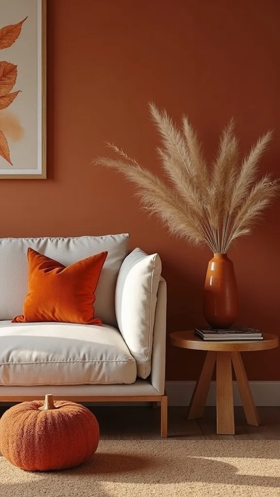
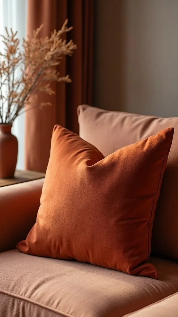
4. How do you use rust color decor without making it feel heavy?
Rust is powerful; it can warm a room or weigh it down. It works best when it’s used as a “punctuation mark” against light neutrals, not as a full paragraph.
Limit rust to 10–15% of what you see from your main seat: one pillow, one small art element, one vase filler, or a single ottoman. Place rust higher than you think—on the sofa back or in art—so it lifts the eye and doesn’t settle the room visually at floor level. If you already have a dark rug, keep rust up top and use amber and cream on tables.
Great rust materials: velvet pillows, boucle with rust flecks, terracotta planters, or a wool throw with a rust stripe. Avoid shiny rust satin—it can read costume-y.
Pro tip: pair rust with black only in tiny doses (a frame or lamp base) so it looks modern instead of Halloween.
5. Where should amber home accents go so they actually glow?
Amber looks best when light passes through it—otherwise it can disappear. The reason it works in early fall is that it mimics the low, golden light outside and makes your room feel softer.
Place amber glass near a lamp or window, not in a dark corner. On a side table, set an amber vase slightly off-center and keep the rest of the surface matte (a book stack, a ceramic coaster) so the glass reads as special. On a mantel, group amber with one tall neutral object so it doesn’t look like a collection.
Choose amber home accents in glass, not acrylic, and keep the shapes simple—cylinders, bottles, or a low bowl. If you want a budget-friendly version, thrift stores often have amber glass for $8–$20.
Pro tip: one amber piece per “zone” is plenty; the glow should feel like a whisper, not a spotlight.
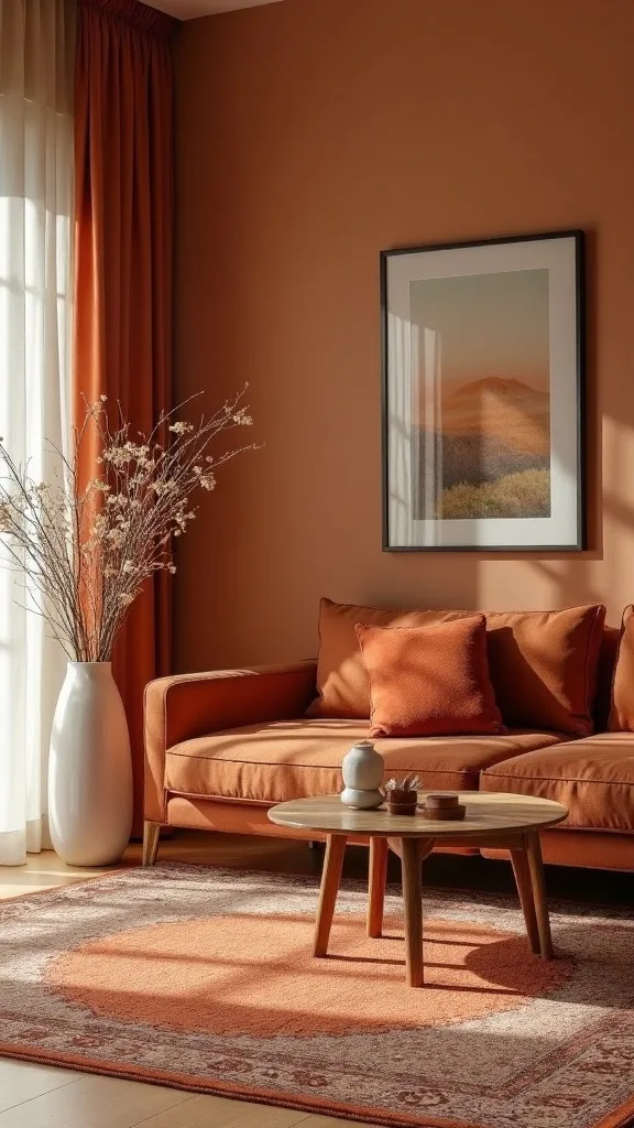
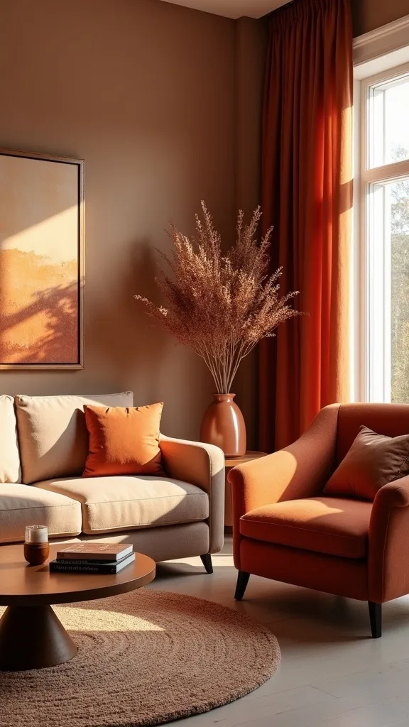
6. How do you build a fall color palette that still feels modern?
A modern fall palette is less about adding more colors and more about controlling contrast. It works when you keep your neutrals consistent and let rust/amber show up in varied finishes.
Start with two neutrals: one for big upholstery (cream or greige) and one for hard surfaces (warm wood, blackened metal, or soft brass). Then choose two autumn tones: rust and amber. The final “quiet” color can be olive or tobacco, but only if it already exists in your room—don’t force it.
Use matte for most items and reserve shine for glass or a metallic frame. That mix reads current and intentional. Avoid mixing too many woods at once; if you have cool oak floors, lean into cognac leather to warm them up.
Pro tip: take a photo of your room in black-and-white—if the contrast looks balanced, your color version will look polished.
7. What’s one thing to avoid when decorating an autumn living room?
Avoid the “everything is the same tone” trap—rust pillows, rust throw, rust candles, rust art—because it flattens the room. Depth comes from contrast: light vs. dark, matte vs. shiny, smooth vs. nubby.
Instead, choose one hero rust piece (usually a pillow or throw), then support it with neutrals and amber. If you crave more color, add it through pattern at a small scale: a pillow with a thin rust stripe or a vintage-style print with rust and cream. Keep seasonal signs and word art out of the mix; they age the room instantly.
Materials to lean on: linen, wool, leather, ceramic, and glass—textures that feel timeless. Skip plastic pumpkins unless you have a dedicated kid-friendly corner.
Pro tip: if you can’t describe an item without using the word “cute,” it probably doesn’t belong in the main living area.
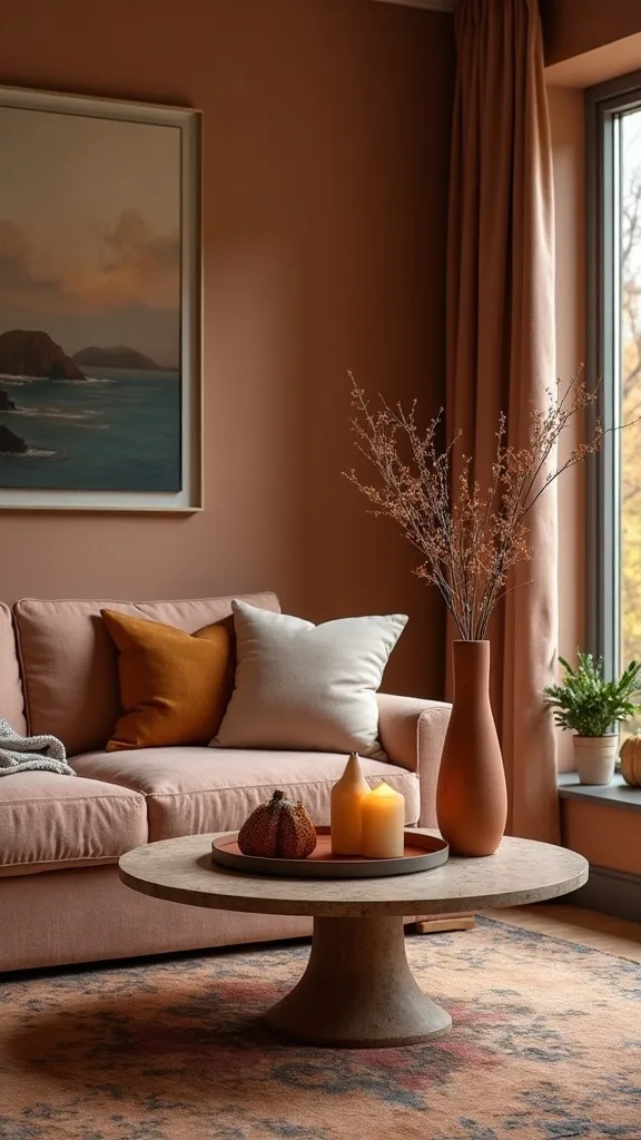
8. How do you style a coffee table with autumn tone decor without clutter?
Most coffee tables fail in fall because they collect too many small objects. This works when you give yourself one contained surface and two heights so the eye reads it as a single composition.
Use a tray (wood, black metal, or woven) to corral everything. Add one amber glass piece for shine, one low candle in a matte vessel, and one stack of two books to create height—done. Leave at least 40% of the tabletop clear so it still functions for real life.
For color, let rust show up in a matchbook, a small textile coaster, or a thin book spine—tiny is fine here. If you want botanicals, choose dried stems that won’t shed everywhere.
Pro tip: keep the tallest object under 12–14 inches so sightlines stay open when you’re talking across the room.
Cost & Materials Estimate
A practical early fall refresh with rust and amber accents typically lands between $90 and $320 depending on what you already own.
| Item | Estimated Cost | Where to Buy |
|---|---|---|
| Rust velvet pillow cover (20″x20″) + insert | $28–$55 | Amazon |
| Amber glass vase (medium) | $18–$45 | Wayfair |
| Textured neutral throw blanket | $25–$60 | IKEA |
| Warm white LED bulbs (2700K–3000K), pack | $12–$28 | Home Depot |
| Cognac accent chair (leather/faux leather) | $170–$320 | Wayfair |
Total estimated cost: $90–$320 Save by thrifting amber glass and buying pillow covers (not new pillows); splurge on the chair if you want one piece that carries the room year-round.
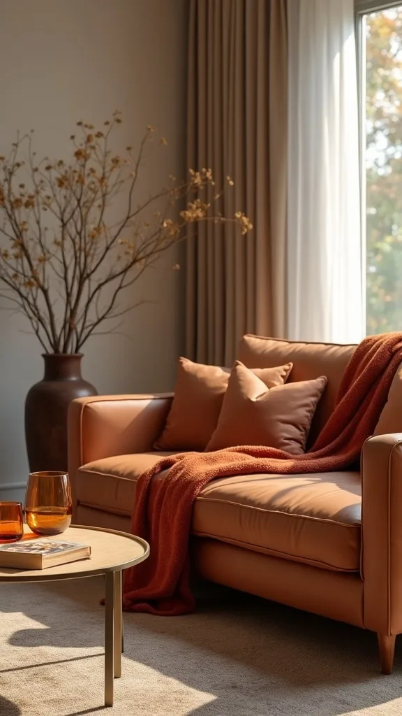
9. What pillow formula makes rust velvet look tailored, not themed?
Rust velvet can look luxe or like a holiday aisle, depending on what you pair it with. It works when you balance it with one light neutral and one subtle pattern so the velvet reads as a deliberate texture choice.
Try this set on a standard sofa: two 22″x22″ neutrals (cream, oatmeal, or warm gray) plus one 20″x20″ rust velvet pillow and one 12″x20″ lumbar with a small-scale stripe. Keep the stripe colors inside your palette—cream, rust, maybe a whisper of olive.
Look for pillow covers with hidden zippers and inserts that are full (down-alternative is a good mid-price choice). Avoid overly shiny velvet; a cotton-velvet blend tends to look richer.
Pro tip: “karate chop” is optional—what matters is that the pillows look plump and inviting, like the room is ready for company.
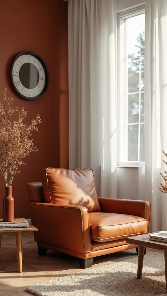
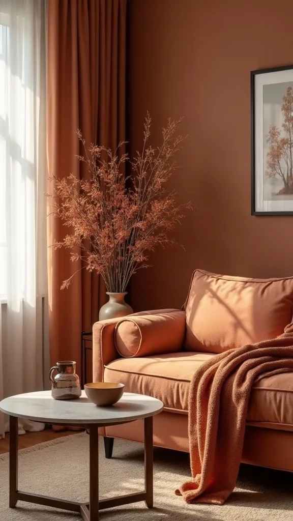
10. How can a cognac leather side chair warm up a neutral living room?
A cognac chair is a shortcut to warmth because it reads like a color and a neutral at the same time. It works especially well in early fall because it complements rust without matching it.
Place the chair where it can “catch” light—near a window or a floor lamp—and angle it slightly inward to make the seating feel intentional. Add a small pillow in a creamy boucle or a subtle rust stripe so it ties into the rest of the room without turning into a set. If your room is small, choose an armless or slim-profile chair to keep the visual weight light.
Leather alternatives that don’t feel like compromises: faux leather in cognac (look for matte finish) or a camel microfiber that cleans easily. Pair with a side table in warm wood or black metal.
Pro tip: one leather piece per room is enough—let it be the “grown-up” note that keeps everything else grounded.
11. What lighting change makes warm autumn colors look richer at night?
Warm colors can look dull under harsh bulbs. This works when your lamps use warm white light (2700K–3000K — the cosy, yellowish tone you see in most homes) so amber glows and rust looks deep instead of brown.
Swap bulbs in your main living room lamps first—two lamps usually change the entire mood more than one overhead fixture. If your room feels dim, increase brightness (measured in lumens) rather than choosing a cooler bulb; aim for a comfortable glow that still lets you read. Add one candle (real or flameless) near amber glass for a layered effect.
Choose lamp shades in off-white or linen; stark white can look blue next to warm tones. Avoid colored shades—they can tint everything orange.
Pro tip: lighting is the silent decorator; get it right and every other fall swap looks more expensive.
12. How do you add fall warmth if your sofa is cool gray?
Cool gray sofas can fight with autumn tones if you try to “cover” them. This works when you bridge the temperature gap with creamy neutrals and natural textures before adding rust.
Add an oatmeal throw and two cream pillows first; that’s your buffer. Then introduce rust in one pillow and amber on a table so the warm notes read as accents, not a correction. If your walls are also cool, bring in a warm wood tray or a cognac-toned basket to shift the overall feeling.
Choose rust that leans brown (cinnamon) rather than red (brick). For patterns, look for charcoal + cream + rust so the sofa feels included.
Pro tip: don’t replace everything—one “bridge” textile can make a cool base feel intentionally modern instead of accidentally chilly.
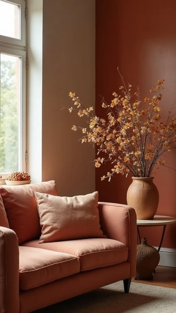
13. What rug colors support rust and amber without clashing?
The rug is the quiet stage; if it’s too busy, your fall accents look random. This works when the rug has a warm neutral base and a low-contrast pattern that can handle seasonal color shifts.
If you’re shopping new, choose cream, sand, taupe, or muted vintage-style rugs with tiny touches of rust already woven in. If you’re keeping your current rug, make sure your rust is either clearly darker than the rug’s warm notes or clearly lighter—middle-matching is where things get muddy. For small rooms, a lighter rug makes the amber glass and leather pop.
Materials: wool blends read cozy; washable rugs are great for pets but choose a design that doesn’t look flat. Avoid high-saturation reds—they fight amber.
Pro tip: if your rug already has strong cool blues, keep your fall palette more cognac and cream than rust and amber.
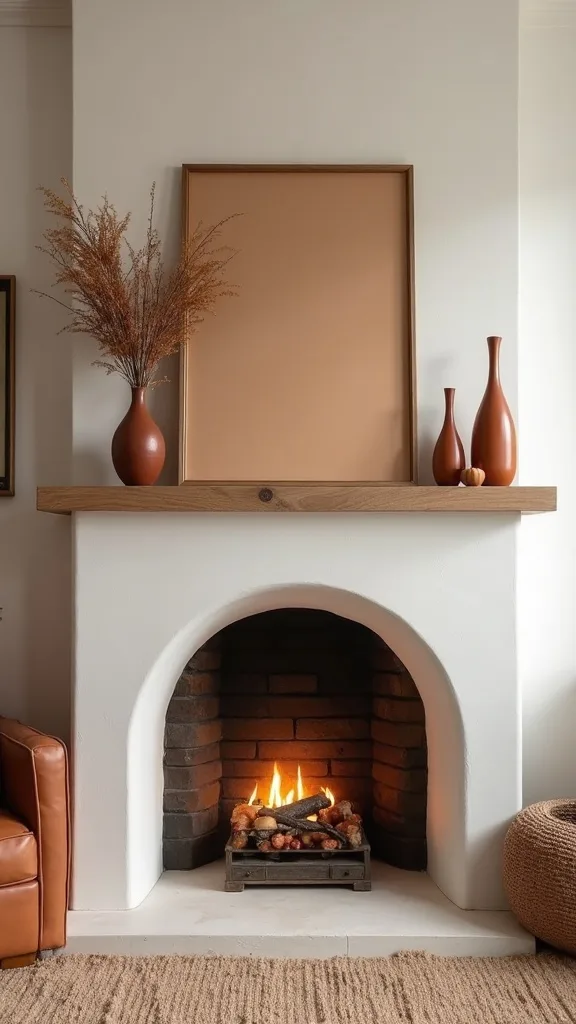
14. How do you decorate a mantel with amber accents and still keep it minimal?
Mantels get over-decorated fast because they’re a natural display shelf. This works when you use three objects with clear spacing and one repeating material—amber glass is perfect for that.
Start with a large anchor (a mirror or framed art) centered. Then add one tall neutral object (a matte ceramic vase in cream) and one amber piece (a bottle vase or candle holder). Finish with a low stack of books or a small bowl—keep it under 4 items total to avoid the “seasonal store shelf” look.
Bring in rust subtly here: a thin rust taper candle or a small framed print with rust tones. Skip garlands unless you have a very deep mantel; they can look droopy.
Pro tip: stand back from the doorway view—if the mantel reads in one glance, you’ve nailed the calm, modern fall look.
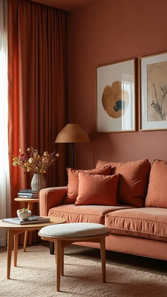
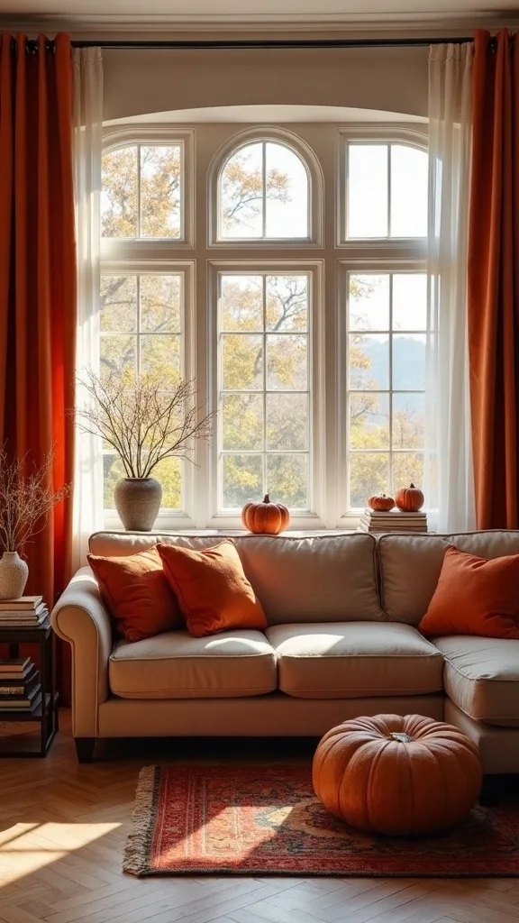
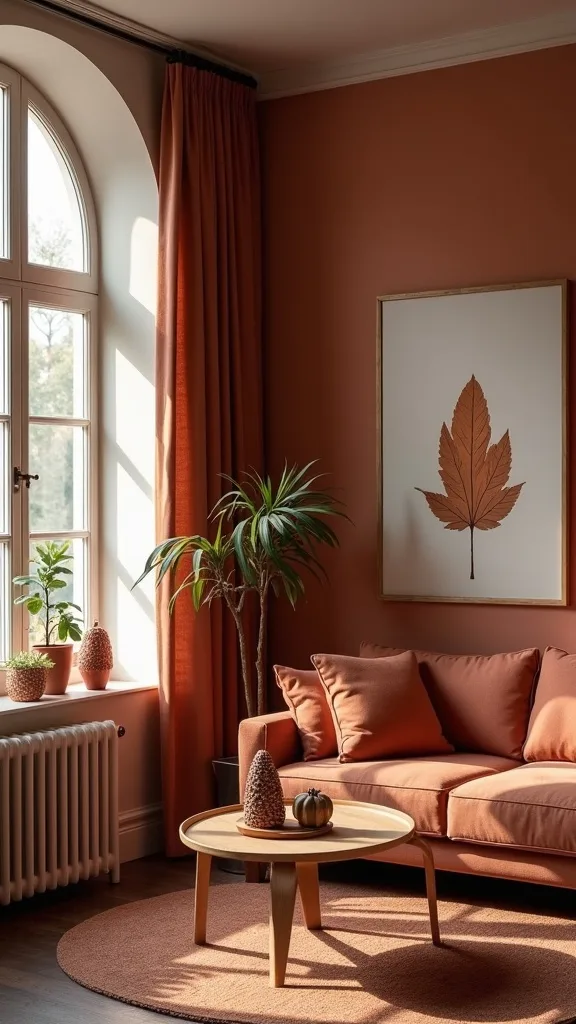
15. What window treatment tweak makes an autumn living room feel softer?
Fall light is lower and warmer, so crisp summer curtains can feel stark. This works when you add softness through fabric and tone—without blocking daylight.
If you have blinds, layer in simple linen-look panels in oatmeal or warm white. Hang the rod 4–6 inches above the window frame and extend it 6–10 inches past each side so the fabric stacks mostly off the glass; it makes the window feel bigger and the room calmer. If you already have curtains, swap only the curtain tiebacks to leather or woven ones for a subtle seasonal cue.
Keep patterns minimal. Texture is the point: slub linen, cotton, or a wool-blend panel in a light neutral supports rust and amber beautifully.
Pro tip: avoid heavy dark drapes in early fall—they can make the room feel like it’s already November.
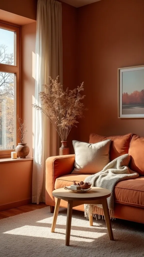
16. How do you use fall stems without making a mess or looking fake?
Realistic botanicals are about restraint. This works when you choose one stem type and one vase, letting the shape do the work instead of mixing five different “fall picks.”
Choose dried-looking branches, eucalyptus, or faux maple stems in muted tones—nothing shiny. Put them in an amber glass vase with a narrow neck so you need fewer stems; 5–7 stems usually fills a medium vase without looking like a bouquet from a craft aisle. Keep the arrangement airy with negative space.
To bring in rust, choose stems with brown-red undertones rather than bright red. Avoid glitter, berries that shed, and anything with obvious plastic seams.
Pro tip: trim stems to different heights and let one lean slightly—perfect symmetry is what makes faux florals look fake.
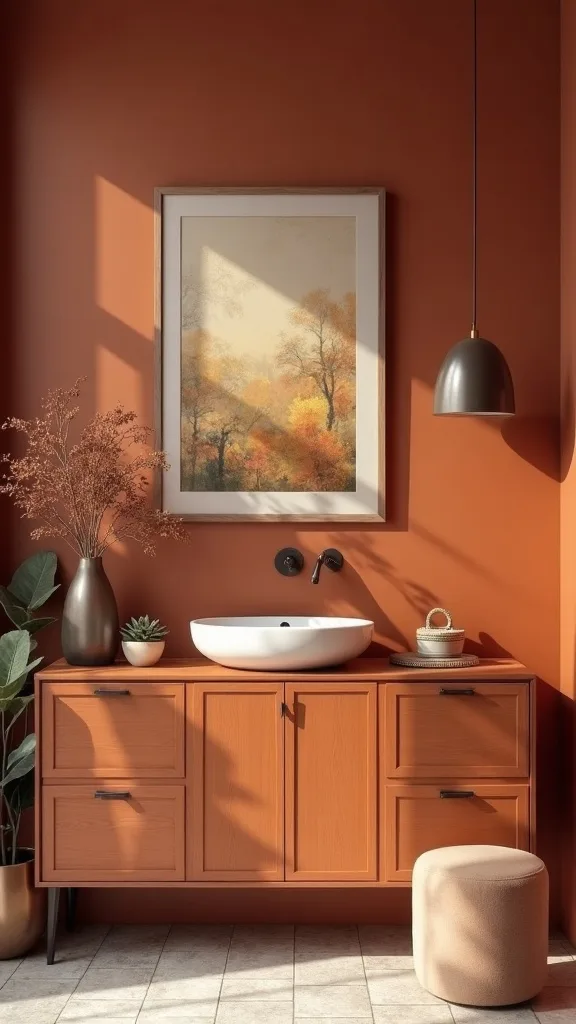
17. What wall art shift brings warm autumn colors in without repainting?
Walls are a huge surface; even a small art swap changes the room. This works when you introduce rust and amber through art that already includes neutrals, so it feels integrated.
Look for landscape prints, abstracts, or vintage-style still lifes that feature cream, brown, and a touch of rust. Replace one large piece or refresh a gallery wall by swapping just 1–2 prints—keep frames consistent (black, walnut, or brass) so the change reads intentional. If you’re cost-conscious, print downloadable art and use a standard 18″x24″ frame with a mat.
Choose art with soft transitions, not harsh blocks of orange. A little amber in the highlights is enough.
Pro tip: the best fall art doesn’t scream “fall”—it simply makes the room feel warmer when you walk in.
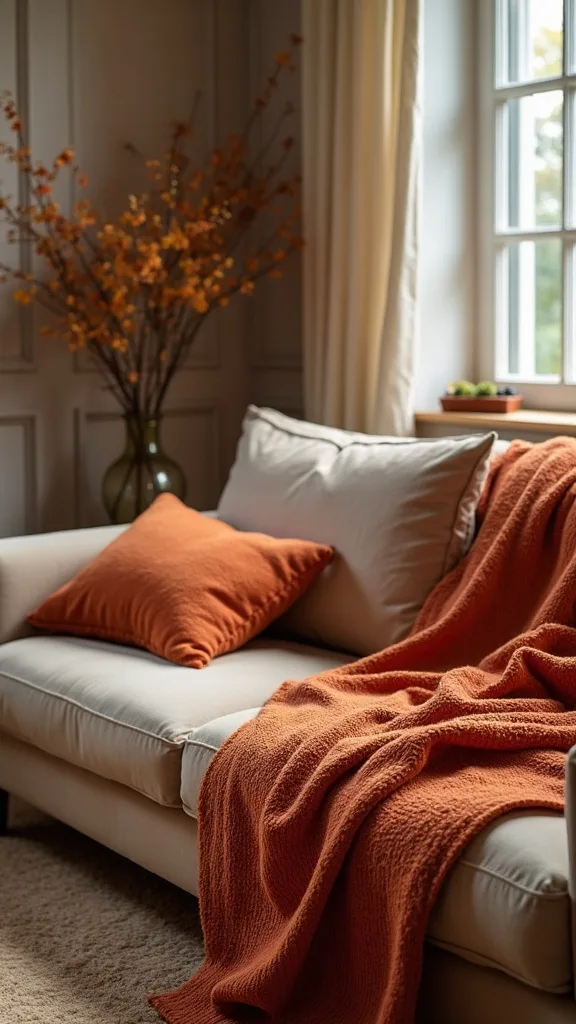
18. How do you layer throws for cozy without looking sloppy?
Cozy can turn into chaotic when every seat has a different blanket. This works when you use two throws max and give each a defined place.
Pick one hero throw in a warm neutral texture (chunky knit, waffle weave) for the sofa and one secondary throw in a subtle rust stripe for the chair. Fold each into a clean rectangle (about the width of the cushion) and place it the same way every time—either over the arm or along the back. Consistency is what makes it look styled, not abandoned.
Materials: brushed cotton for early fall, wool blend for later. Avoid fringe overload—one fringed edge per room is enough.
Pro tip: if you want that “effortless” look, make the effort once—then stick to the same fold so your room always resets in 10 seconds.
19. What’s a budget-friendly way to get the amber glass look?
Amber glass feels collected and elevated, but you don’t need designer pieces. This works when you mix one thrifted amber find with one simple new piece so it feels curated, not random.
Check thrift stores for small amber vases, candy dishes, or candle holders—bring a photo of your room so you don’t buy the wrong tone. Then add one new amber bud vase or ribbed vase online to create a “family” of shapes. Keep them in the same zone (mantel or side table) rather than scattering bargain finds everywhere.
If you can’t find amber, clear glass plus a warm-toned candle behind it creates a similar glow. Avoid tinted plastic; it reads flat.
Pro tip: buy fewer pieces, larger scale—one $18 vase looks more intentional than three $6 minis.
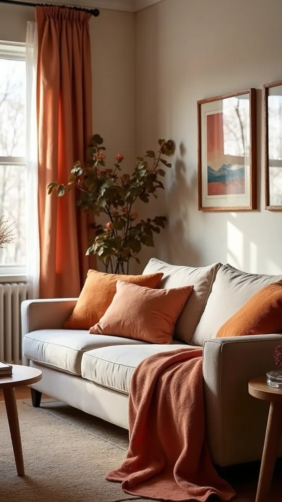
20. How do you make a neutral sofa feel fall-ready without new upholstery?
Neutral sofas are the best canvas for early fall. This works when you add color through removable textiles and keep the sofa itself visually calm.
Use a tight pillow palette: two neutrals + one rust velvet + one patterned lumbar. Add a throw in oatmeal or camel rather than rust-on-rust. If your sofa is white, choose rust that’s slightly dusty; high-saturation rust can look harsh against bright white.
Bring in amber on the side table and a cognac element nearby (chair, basket, or tray) so the warmth feels distributed. Avoid covering the entire sofa with a seasonal slipcover—it often looks bulky and shifts.
Pro tip: the sofa should read like it belongs year-round; fall should look like a thoughtful layer, not a costume change.
21. How do you style a side table vignette that feels like early fall, not Thanksgiving?
Early fall is about warmth, not harvest overload. This works when your side table has one practical item, one warm accent, and one natural texture.
Start with the practical: a coaster stack or a small dish for remotes. Add an amber glass vase or candle holder, then include texture with a small woven basket or a wood bead strand (keep it subtle). Leave breathing room—side tables should still hold a mug without rearranging the entire setup.
For rust color decor, use a single element: a rust taper candle or a small book with a rust spine. Avoid mini pumpkins on side tables; they read cluttered fast.
Pro tip: if your vignette can be moved in one trip to clean the table, you’ll keep it styled longer—function is what makes decor stick.
22. What’s the best way to mix metals with rust and amber tones?
Metals can either sharpen fall colors or make them feel brassy and dated. This works when you choose one dominant metal and let the others show up only in small repeats.
If you already have black hardware, keep it and use amber glass to soften it. If your room leans warm, soft brass looks great with rust—just avoid overly shiny gold that can fight the earthy palette. Repeat your chosen metal 2–3 times: lamp base, picture frame, small bowl.
Pairing rule: rust + black = modern edge; rust + brass = warm classic; rust + chrome = only if you add extra cream and wood to keep it from feeling cold. Don’t mix three metals evenly.
Pro tip: metals are like seasoning—measured amounts make the whole room taste better.
23. How do you keep your living room from feeling too dark as you add autumn tones?
Warm palettes can accidentally lower the room’s “brightness” if you add too many deep textiles. This works when you keep light neutrals dominant and place darker tones higher and in smaller doses.
Maintain at least one large light element: a cream rug, light curtains, or a pale throw. Then add rust in pillows and art rather than a dark slipcover or heavy drapes. Use mirrors or glass (hello, amber vases) to bounce light, and keep lamp shades light-colored.
Choose wood tones carefully: if your coffee table is dark, keep side tables lighter or vice versa. Avoid swapping every pillow to a deep color at once.
Pro tip: if your room feels dim at 4 p.m., add one more lamp—not more decor.
24. How do you make early fall decor work with kids and pets?
Real life is sticky hands, fur, and the occasional zoomie. This works when your fall updates live in washable textiles and sturdy accents instead of fragile clutter.
Use pillow covers you can remove and wash, and choose darker rust tones that hide wear better than pale pumpkin shades. Put amber glass on higher surfaces (mantel, bookshelf) and use a wood or ceramic option on the coffee table. If you love candles, choose flameless for the main living area and keep real flames in supervised spots only.
Leather (or good faux leather) is a smart fall material—it wipes clean and looks better with age. Avoid loose dried leaves or glittery picks that become floor confetti.
Pro tip: design your fall look so it can be “reset” in two minutes—because it will need to be.
25. What’s the simplest 15-minute styling routine to reset the room daily?
Even a well-decorated room looks off when the basics drift. This works because a small daily reset keeps your warm palette looking intentional instead of cluttered.
Do a quick loop: fluff and square the pillows (rust pillow back to its “home” corner), refold the throw, clear the coffee table to the tray, and straighten the cognac chair. Then check your amber glass—wipe fingerprints and rotate it slightly so it catches the lamp. Finally, turn on lamps with warm white light (2700K–3000K — the cosy, yellowish tone you see in most homes) to bring the whole scene to life.
Keep one small basket nearby for daily clutter; it’s the difference between styled and stressful. Avoid adding new objects during the week—edit instead.
Pro tip: your room should feel like a calm landing pad; a 15-minute reset is a tiny habit that pays you back every evening.
Final Thoughts
Early fall decor works when it looks like your home—just warmer, calmer, and a little more tactile. A neutral base gives you breathing room; rust and amber add the seasonal depth; leather and glass keep it from feeling crafty.
Remember the one thing to avoid: don’t stack all your rust in one spot or match every warm piece to the same exact tone. Spread warmth around the room, vary finishes, and let light do some of the work.
Rule of thumb: repeat a color three times (rust once, amber once, cognac once) and keep everything else neutral. Today, pick one surface—your coffee table or side table—remove everything, then restyle it with a tray, one amber glass piece, and one matte neutral object in under 15 minutes.
What I’d Do Differently
When I first tried this, I treated fall like a “swap everything” season—new pillows, new throws, extra candles, little pumpkins everywhere. The room looked warm for about ten minutes, and then it started feeling crowded and oddly flat, like all the color was shouting at the same volume. The specific mistake: I bought three rust items in the exact same tone and placed them all on the sofa, so the color clumped instead of moving around the room. The fix was simple but not obvious: I kept one rust hero (a velvet pillow), then repeated the warmth with amber glass on a table and a cognac tone across the room so the eye could travel.
I also wish I’d known sooner that lighting is half the battle. Once I switched my living room lamps to warm white light (2700K–3000K — the cosy, yellowish tone you see in most homes), the rust looked richer and the amber finally glowed instead of looking brown. If you’re on the fence, start with one pillow and one amber accent tonight—then let the room tell you what it needs next.