
This post contains affiliate links. As an Amazon Associate, I earn from qualifying purchases at no extra cost to you.
Summer does this thing where you suddenly can’t stand safe choices. The sun hits your bathroom mirror at 7 a.m., and that “nice” greige wall starts to feel like airport carpeting. A bold bathroom color isn’t just for design people with unlimited budgets—it’s for anyone who wants their daily routine to feel like stepping into a boutique hotel, even if your towel rack is from 2009.
This article covers how to pull off an emerald bathroom without it feeling heavy, dated, or like a themed restaurant. We’ll talk tile placement, metals that make green glow, how to keep a dark bathroom design from going gloomy, and the small details that make a colorful bathroom look intentional.
This is perfect for renters doing reversible upgrades, homeowners planning a full remodel, and anyone who’s been saving emerald inspiration screenshots since the first time they saw a green zellige wall.
Inside, you’ll get floor-to-ceiling tile moves, gold fixture pairings, floating vanity tricks, and the one thing to avoid if you don’t want your green to turn swampy. There are also a few vintage-sourcing shortcuts that make the whole room feel collected, not catalog.
Below are 25 Bold Color Bathroom Ideas & Emerald Design that weave green bathroom ideas, emerald bathroom energy, and dark bathroom design smarts into a space you’ll actually love using.
1. Go all-in on floor-to-ceiling emerald tile (and keep the floor calm)
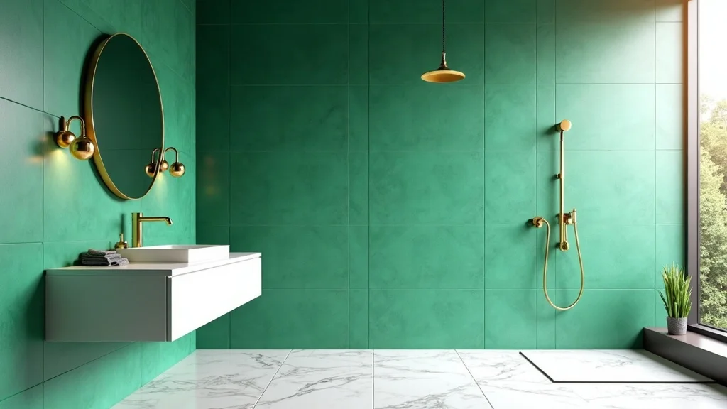
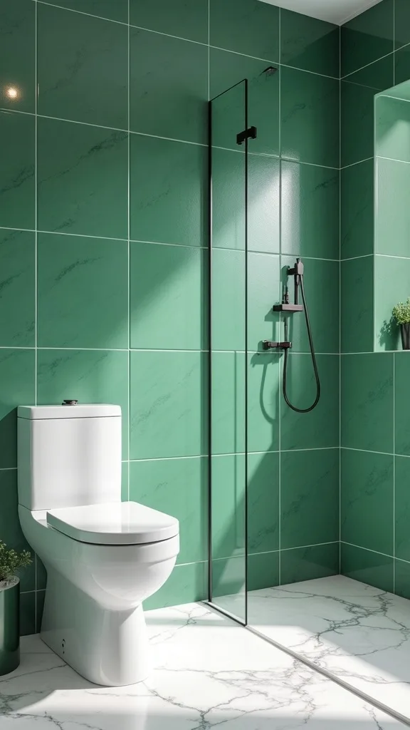
This is the hero look: floor-to-ceiling emerald green tile, gold fixtures, a floating vanity, and a white marble floor. It works because the walls do the talking while the floor stays quiet, like a crisp white tee with a leather jacket.
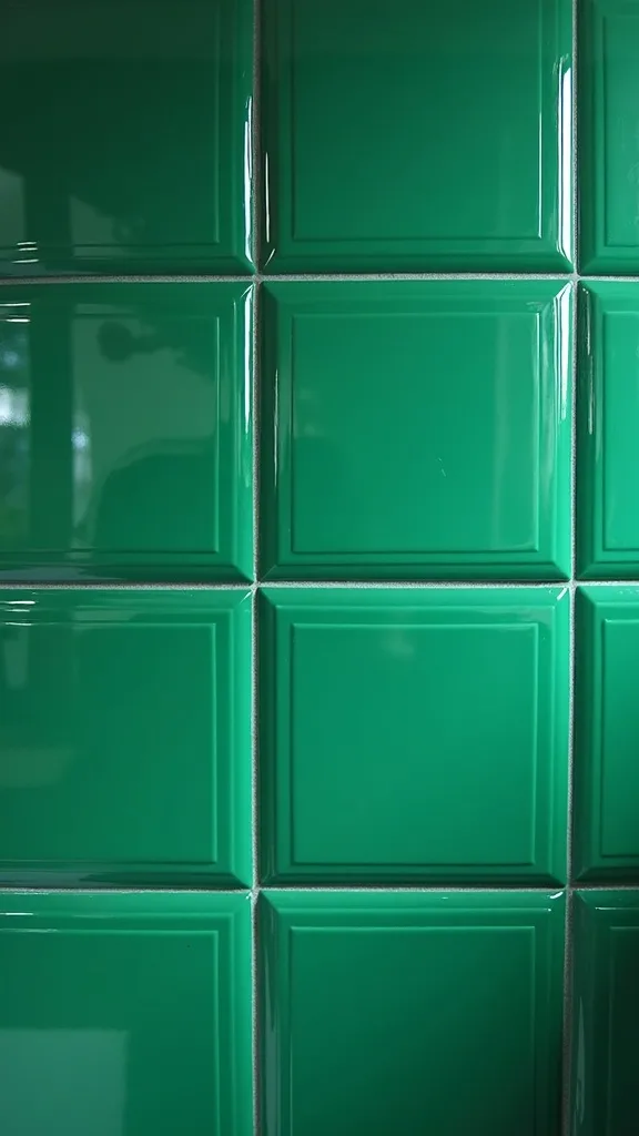
Start by choosing one emerald tile you love enough to see every day—then commit. Run it full height (typically 8 feet) on the shower walls and at least one adjacent wall so the room feels wrapped, not patched. Keep grout close in tone to the tile for a seamless, glossy “pool” effect.
For materials, think emerald zellige if you want shimmer and handmade edges, or glossy ceramic if you want a cleaner, more modern read. Pair with brushed gold fixtures and a floating vanity in pale oak or walnut to warm the green.
Pro tip: if you’re doing marble on the floor, pick a honed finish so it feels soft underfoot and doesn’t glare—your emerald will look deeper, like it’s lit from within.
2. Which shade of green won’t look dated in a bathroom?
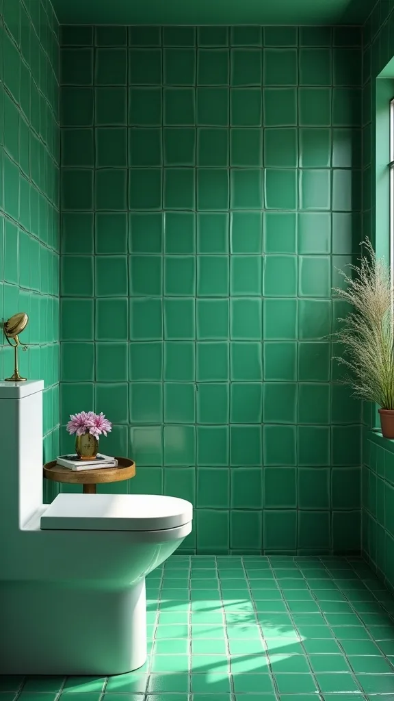
The green that ages best is the one with depth—something that can read classic at night and lively in daytime. Emerald works because it has that jewel-tone seriousness, but it still feels fresh in summer when the light is longer.
To implement, bring home paint chips and tile samples and look at them in three spots: near the vanity lights, inside the shower, and by the door where the room is dimmest. If the sample goes gray or looks “muddy” in the corner, it’ll only get worse once everything is installed.
Materials to consider: blue-leaning emerald for a crisp, modern vibe; forest green if you want it moodier and more traditional; or a slightly yellow-leaning green if your bathroom has a lot of north-facing light.
Pro tip: avoid pairing emerald with cool chrome unless you love a sharper look—warm metals make green feel expensive, like vintage glassware catching sun.
3. How do you keep a dark green bathroom from feeling like a cave?
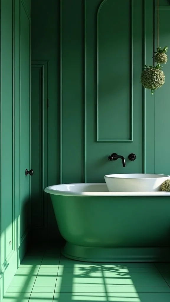
A dark bathroom design can feel luxe, not claustrophobic, when you give it bounce. The trick is contrast plus reflection—something pale, something shiny, something that moves light around.
Implement it by choosing one bright surface that’s uninterrupted: a white marble floor, a creamy ceiling, or even a large frameless mirror. Then layer lighting: a pair of sconces at eye level plus an overhead fixture so shadows don’t pool under your eyes.
Look for warm white light (2700K–3000K — the cosy, yellowish tone you see in most homes) so emerald stays rich instead of turning cold. Add reflective touches like glossy tile, glass shelves, or a gold-framed mirror.
Pro tip: don’t paint the ceiling green if the room is windowless. That’s the fastest way to make the space feel shorter. Keep the ceiling light and let the walls be the drama.
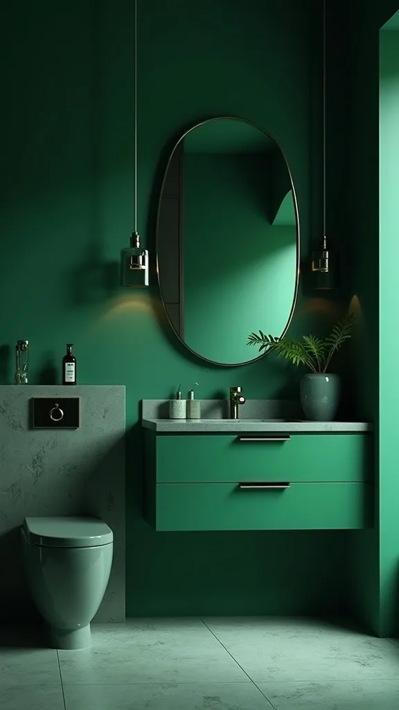
4. What tile finish makes emerald look most “alive”?
Emerald looks best when it has a little unpredictability—subtle variation that shifts as you move. That’s what keeps a colorful bathroom from feeling flat or overly “new-build perfect.”
To implement, choose either handmade-look tile (zellige-style) or a glossy ceramic with tonal variation. Lay it in a simple pattern—stacked vertical or classic subway—so the finish is the star, not a busy layout.
Materials: glossy emerald tile gives you that wet, lacquered depth; matte emerald reads more modern but can swallow light in smaller rooms. If you love texture, consider a lightly rippled surface that catches the sconce glow.
Pro tip: order 10% extra tile and mix boxes as you install. The best emerald walls look like they happened over time, like sea glass collected in a jar.
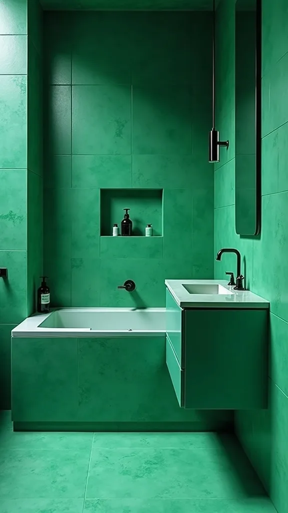
5. How do you pair gold fixtures with green without going glam-overload?
Gold and green is a classic combo, but the difference between “cool” and “casino” is restraint. You want warmth, not sparkle.
Implement it by choosing one gold finish and sticking with it across faucet, shower trim, and hardware. Go for brushed or satin—something that feels like it’ll patina gently, not scream for attention. Keep other metals minimal; if you need a second metal, make it quiet (like black on a vent cover).
Materials: brushed brass reads modern and soft; unlacquered brass ages beautifully with water spots and fingerprints (in a good way—lived-in, not grimy). Pair with white marble and a simple mirror to keep it grounded.
Pro tip: avoid matching gold to warm yellow lighting that’s too intense. With warm white light (2700K–3000K — the cosy, yellowish tone you see in most homes), brass looks like jewelry, not costume.
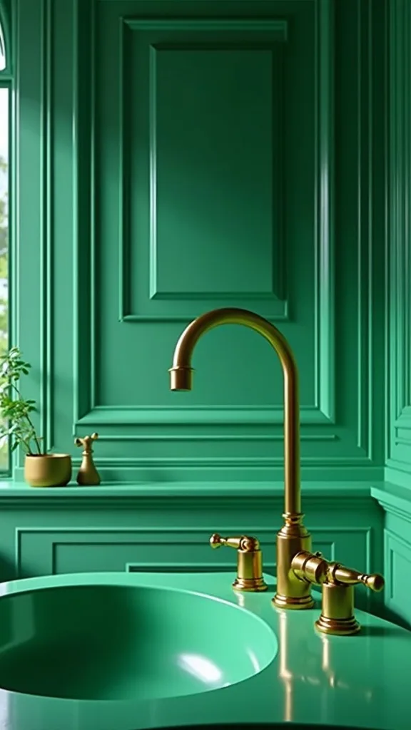
6. What’s the easiest renter-friendly way to get an emerald vibe?
If you can’t tile or paint, you can still get the emerald bathroom mood with surface swaps that feel intentional. The goal is “designed,” not “temporary.”
Start with textiles: a deep green shower curtain in a heavy linen-look fabric, plus plush white towels so the green reads crisp. Add peel-and-stick wallpaper on one wall (behind the toilet is a great low-risk spot) and choose a pattern with emerald in it.
Materials: peel-and-stick wallpaper with a subtle botanical or geometric print, a dark green bath mat, and a brass-toned mirror you can take with you. If your landlord allows, swap the cabinet pulls to brushed brass.
Pro tip: avoid tiny, busy prints in a small bathroom—they can feel jittery. One big emerald moment plus clean white accessories is what makes it feel like a real design decision.
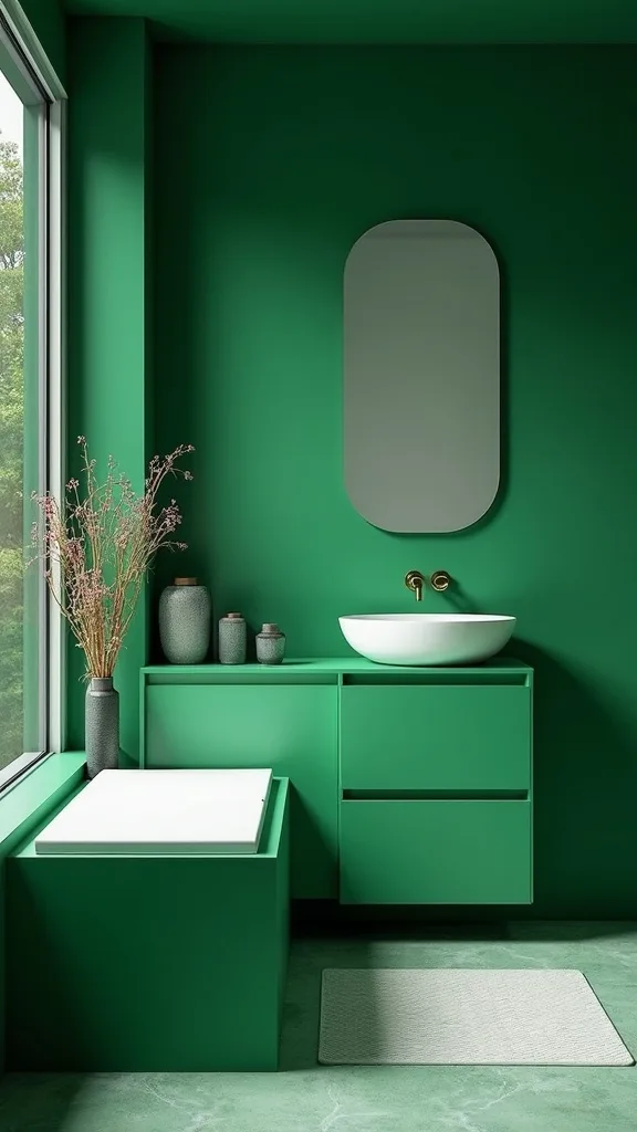
7. How do you choose grout for emerald tile?
Grout is the difference between “spa” and “grid.” With emerald, you usually want the tile to read like a continuous surface, not a checkerboard.
Implement by testing two grout shades: one that matches the tile closely and one slightly darker. Tape your samples to the wall and look at them under your actual bathroom lighting. In most cases, a deep green-gray grout hides daily life better than bright white.
Materials: color-matched grout for a seamless look, or charcoal grout if you want a more graphic edge. If you’re using handmade-look tile with uneven edges, expect grout lines to vary—that’s part of the charm.
Pro tip: avoid stark white grout with dark green in the shower unless you love cleaning. White grout can yellow over time, and that can make emerald look dull instead of jewel-toned.
8. Can you mix emerald tile with white marble without it feeling cold?
Yes—white marble is actually emerald’s best friend, as long as you add warmth somewhere. Marble brings that clean, coastal California lightness, even in a small interior bathroom.
Implement it by choosing marble with soft veining (not super high-contrast) and a honed finish so it feels velvety, not shiny. Then bring in warmth with wood: a floating vanity, a teak stool, or even a framed vintage print.
Materials: honed white marble (or a marble-look porcelain if you want less maintenance), natural oak or walnut, and brushed brass. Keep paint a creamy white instead of bright refrigerator white.
Pro tip: avoid mixing marble with icy blue lighting. Under warm white light (2700K–3000K — the cosy, yellowish tone you see in most homes), marble looks creamy and the emerald looks saturated—like a cocktail bar, not a lab.
Cost & Materials Estimate
A bold emerald bathroom refresh can land anywhere from a focused $500 upgrade to a $6,000+ mini remodel, depending on how much tile and plumbing you change.
| Item | Estimated Cost | Where to Buy |
|---|---|---|
| Emerald ceramic wall tile (80–120 sq ft) | $520–$1,560 | Home Depot |
| Thinset + grout + sealant | $140–$260 | Lowe’s |
| Brushed gold bathroom faucet | $90–$220 | Amazon |
| Floating vanity (24–36 in) | $280–$850 | Wayfair |
| Marble-look porcelain floor tile (30–50 sq ft) | $120–$350 | Home Depot |
| Pair of brass vanity sconces | $90–$240 | Amazon |
Total estimated cost: $1,240–$3,480 Save by using emerald tile on one feature wall instead of the whole room; splurge on the faucet and lighting because they’re what you touch and see every day.
9. What vanity style works with a bold green wall?
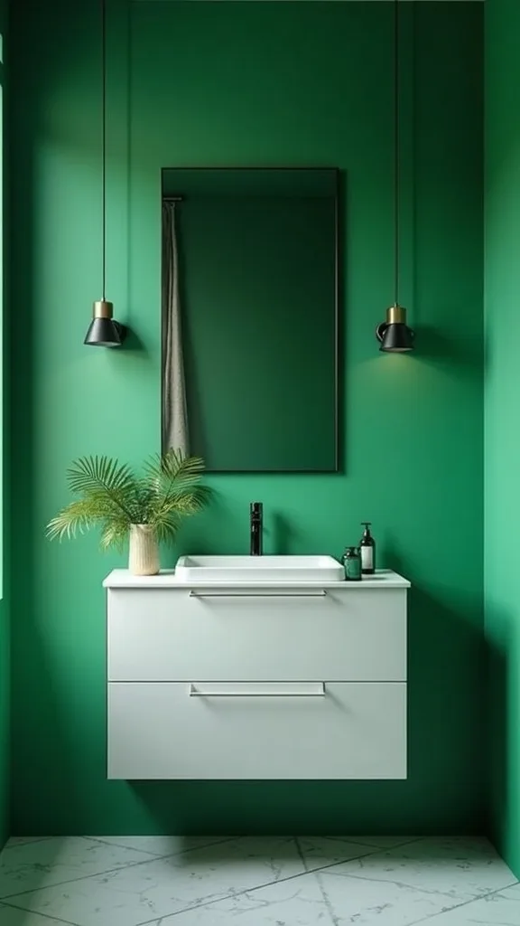
A floating vanity is the move when your walls are intense. It keeps the room visually light, and it shows off the floor—especially if you’re doing white marble.
To implement, choose a vanity that’s 24–36 inches wide for small baths and mount it so there’s breathing room underneath. If you’re remodeling, add a blocking board inside the wall so it’s anchored properly (translation: it won’t wobble when someone leans).
Materials: floating wood vanity in oak for a sun-warmed feel, or walnut for a moodier, vintage vibe. A simple white countertop keeps the emerald from competing with busy stone.
Pro tip: skip ornate cabinet fronts if your tile is glossy or textured. One strong texture at a time makes the whole space feel curated, like you know exactly what you’re doing.
10. How do you add color if you’re not ready for green tile?
You can still do a bold bathroom color without committing to a full tile job. Think of green as an accent that shows up in deliberate, repeatable places.
Implement with paint on the vanity, not the walls. A deep emerald vanity against white walls gives you the vibe with less risk, and it’s an easier weekend project. Then echo that green in one or two pieces—like a framed print or a glass soap dispenser.
Materials: emerald vanity paint in a satin finish (wipes clean easier), brass pulls, and white quartz or marble-look top. Add a vintage runner (yes, in a bathroom) if you can keep it dry.
Pro tip: avoid scattering green in ten tiny items. One statement piece plus two supporting accents reads designer; a bunch of small green objects reads “I panicked at Target.”
11. What lighting makes emerald tile look expensive?
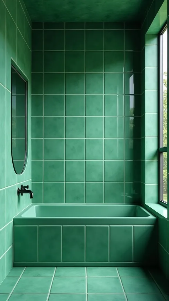
Emerald is dramatic, but it’s also picky about light. Good lighting makes it glow like a gemstone; bad lighting makes it look flat and a little sad.
Implement with two sconces placed roughly at eye level on either side of the mirror. Add an overhead fixture for general light so your bathroom doesn’t turn into a shadow experiment. Choose bulbs in warm white light (2700K–3000K — the cosy, yellowish tone you see in most homes) for flattering skin tones.
Materials: opal glass shades (they diffuse light softly), brass or aged gold finishes, and a dimmer switch so you can shift from morning bright to evening calm.
Pro tip: avoid clear glass shades with visible bulbs if you hate harsh glare. Emerald tile reflects points of light—soft diffusion makes it feel like a lounge, not a spotlight.
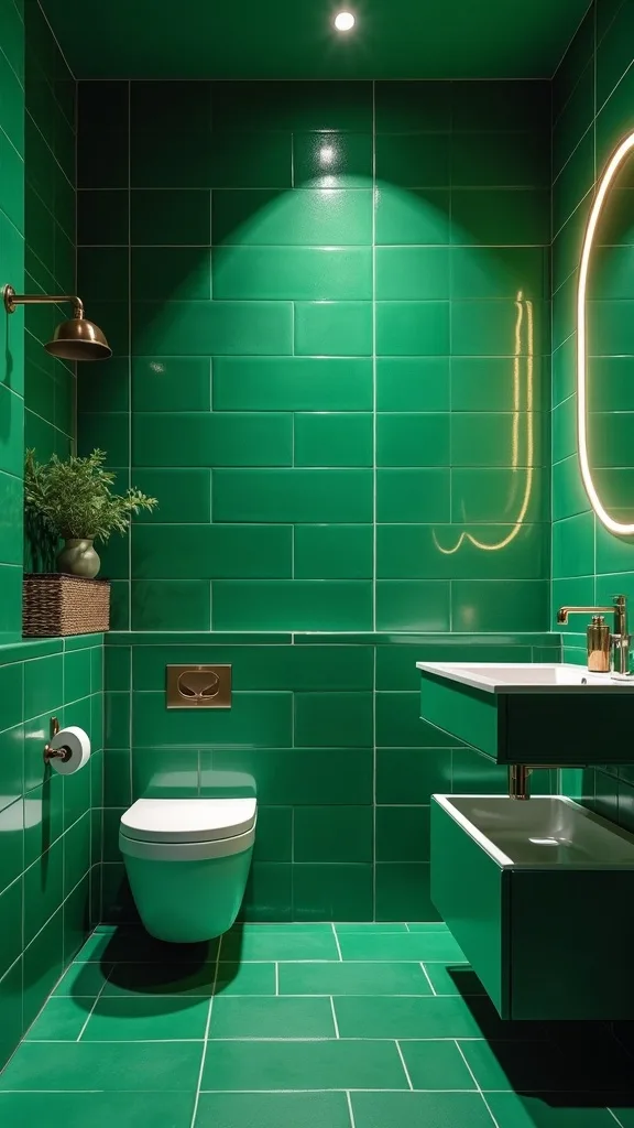
12. How do you style a colorful bathroom so it still feels calm?
Color doesn’t have to mean chaos. The calm comes from repetition and negative space—letting your bold choice breathe.
Implement by choosing a tight palette: emerald + white + brass + one wood tone. Keep counters almost empty, and store the daily mess behind doors or in a drawer organizer. Add one piece of art that nods to green (a vintage botanical print is an easy win) and stop there.
Materials: simple white accessories (soap pump, tray, tissue cover), one textured element like a waffle towel, and a small vase in clear glass. The textures do the work when the palette is controlled.
Pro tip: avoid mixing multiple loud patterns (busy tile + loud wallpaper + patterned floor). Pick your statement and let the rest feel like a quiet outfit around it.
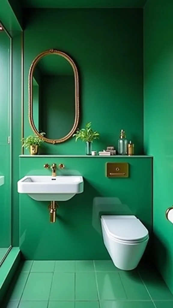
13. What’s the best way to use emerald in a small bathroom?
Small bathrooms can handle bold color better than big ones, because the impact is instant. The key is choosing placement that makes the room feel taller and cleaner.
Implement by tiling one wall floor-to-ceiling—behind the vanity or inside the shower—then keep the other walls light. Use a floating vanity and a large mirror to expand the feel. If you can, run the same floor tile into the shower floor for continuity.
Materials: vertical-stacked tile (it subtly pulls the eye up), a frameless shower panel, and a slim brass sconce. Keep storage minimal and sleek.
Pro tip: avoid chopping the walls with a chair rail or half-height tile line in a tiny room. Full height makes the space feel intentional, like a jewel box instead of a patchwork.
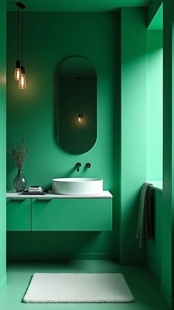
14. How can you bring in vintage without making emerald feel old-fashioned?
Vintage works with emerald when it’s a single soulful piece, not an entire theme. You want “collected,” like you found something special on a Saturday morning and built around it.
Implement by choosing one vintage anchor: a brass mirror with a slightly imperfect frame, a small antique stool, or a glass apothecary jar set. Keep the rest modern—clean vanity lines, simple tile layout, minimal hardware.
Materials: vintage brass mirror, a modern floating vanity, and crisp white towels. Look for vintage pieces with patina that feels honest, not distressed-on-purpose.
Pro tip: avoid overly ornate Victorian lighting with glossy emerald tile—it can tip into costume. A vintage mirror plus modern globe sconces is the sweet spot.
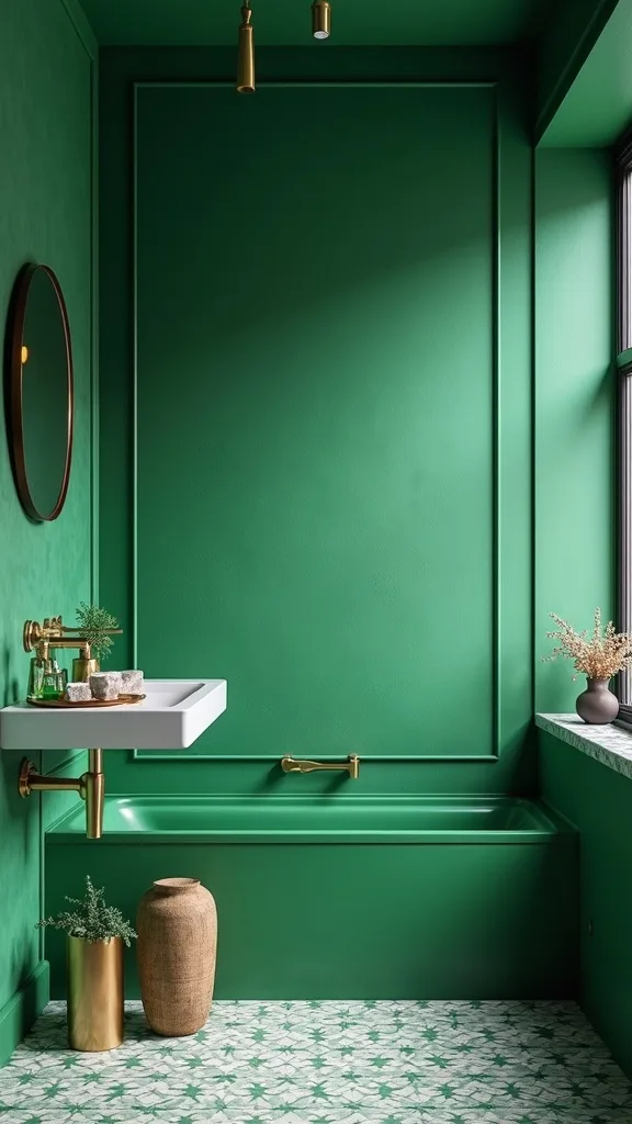
15. What paint colors pair well with emerald tile?
Emerald doesn’t want competition from bright whites or cool grays. It wants soft, creamy neutrals that feel like sun on plaster.
Implement by painting any non-tiled walls in a warm off-white or a very pale greige. If you’re doing a dark bathroom design with lots of green, keep the ceiling the lightest surface in the room so it feels lifted.
Materials: warm off-white paint, matte finish on walls (it hides bumps), and a satin finish on trim for wipeability. If you want contrast, a whisper of beige looks surprisingly modern next to emerald.
Pro tip: avoid pure bright white paint if your tile leans blue-green—it can make the green look colder. Creamy whites make the whole room feel like golden hour.
16. How do you pick a shower curtain for an emerald-and-gold bathroom?
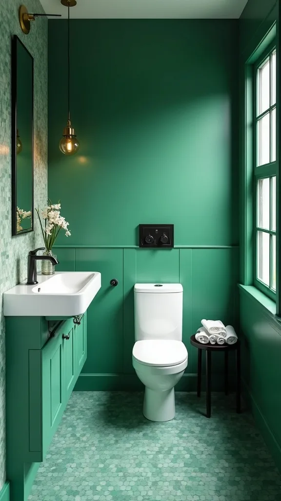
A shower curtain is basically a big fabric wall, so it matters. With emerald and gold, the best curtain feels tailored and weighty—more drape, less plastic.
Implement by choosing a curtain in white, cream, or a subtle stripe that won’t fight the tile. Hang it high and wide—closer to the ceiling and a few inches beyond the tub—so the room feels taller.
Materials: heavy cotton or linen-look curtain, brass curtain rings, and a simple rod in brushed gold or matte black. Add a clear liner behind it and replace the liner before it gets grim.
Pro tip: avoid bright patterned curtains with emerald tile. Let the tile be the art. The curtain should feel like a crisp button-down: clean, effortless, and quietly expensive.
17. What’s a smart way to add storage without interrupting bold tile?
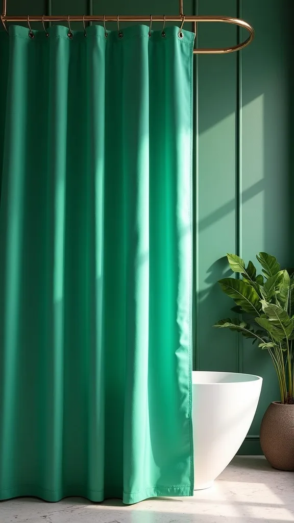
Storage can ruin a great wall if it looks like an afterthought. With emerald tile, you want storage that floats or disappears.
Implement with a recessed medicine cabinet (it sits inside the wall, so it doesn’t protrude) or a slim floating shelf in glass or brass. In the shower, build a niche the same tile as the wall so it blends in.
Materials: recessed medicine cabinet, a thin brass shelf, and matching tile inside niches. If you’re renting, swap bulky organizers for a single good-looking tray.
Pro tip: avoid sticking suction-cup caddies on your gorgeous tile. They always look temporary and they can damage grout. Build one niche or add one shelf and let it feel intentional.
18. How do you choose a mirror for a green bathroom?
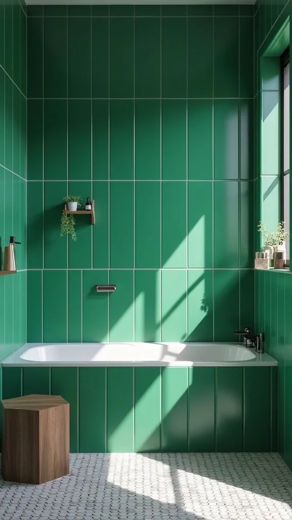
The mirror is your moment to either calm the room down or lean into the drama. With emerald walls, a mirror should feel like jewelry—clean lines, warm metal, good proportions.
Implement by going bigger than you think. A mirror that’s at least as wide as your vanity looks custom and makes the space feel more open. If you have double sinks, consider one long mirror instead of two small ones.
Materials: arched brass mirror for a soft vintage note, or a thin-framed rectangle for a modern look. If your tile is glossy and busy, keep the mirror frame simple.
Pro tip: avoid tiny mirrors that float awkwardly in a sea of tile. Scale is what makes a bold bathroom color feel designed rather than accidental.
19. What towels and linens look best with emerald tile?
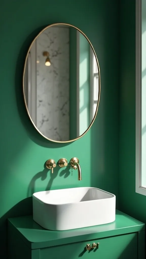
Textiles are where you can make emerald feel like summer instead of winter. Think fresh, crisp, and touchable—like a beach hotel that still feels grown-up.
Implement with mostly white towels for contrast, then add one accent color in a hand towel (sand, blush, or even a muted citron if you like a punch). Keep the bath mat plush so your feet get that soft landing against the cool tile.
Materials: white waffle towels (they dry fast and look spa-like), a thick cotton bath mat, and a small woven basket for extras. A vintage Turkish towel can add pattern without overwhelming the room.
Pro tip: avoid dark green towels against dark green walls—it’s too much of the same value and it can look heavy. White linens make emerald look cleaner and brighter.
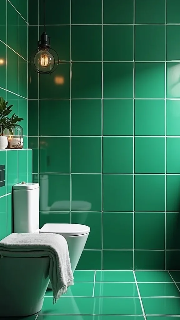
20. Can plants work in a bathroom with emerald walls?
Plants with green walls sound redundant, but it’s actually the secret sauce—layers of green look intentional, like you’re building a palette, not matching a paint chip.
Implement by choosing one plant that loves humidity. If you have a window, a pothos or fern will thrive; if you don’t, use a high-quality faux that doesn’t look shiny. Place it where it breaks up hard lines—on a shelf, a stool, or a windowsill.
Materials: pothos or bird’s nest fern, a simple ceramic pot in white or sand, and a small saucer to protect surfaces. Keep it minimal so it reads styled, not jungle.
Pro tip: avoid putting real plants in a windowless bathroom if you won’t move them out for light. A sad plant makes the whole room feel neglected. One healthy plant is better than three struggling ones.
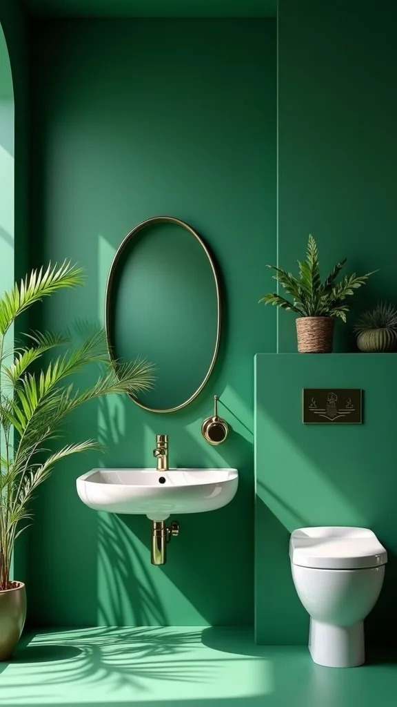
21. How do you add personality with art in a bold green bathroom?
Art is how you keep a colorful bathroom from feeling like a showroom. The best bathroom art feels a little unexpected, like you’d find it in a hallway, not a big-box aisle.
Implement by framing one piece and hanging it where it won’t get direct splash—above the toilet or on a wall outside the shower zone. Choose a frame that ties into your metals: brass if your fixtures are brass, black if you need a crisp outline.
Materials: vintage botanical print, a thin brass frame, and a mat that’s warm white. If you want modern, go for a simple abstract with cream and deep green.
Pro tip: avoid tiny clusters of small frames on busy tile. One strong piece with breathing room looks editorial—like a page torn from a magazine you actually keep.
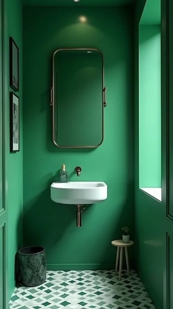
22. What’s the best hardware finish besides gold for emerald?
Gold is the obvious pairing, but it’s not the only one. Emerald also plays well with black and even nickel—if you do it thoughtfully.
Implement by deciding the vibe first. For a modern edge, go matte black on fixtures and keep the rest warm with wood and creamy paint. For a quieter look, polished nickel can feel classic, especially with marble, but you’ll want warmer lighting so it doesn’t go cold.
Materials: matte black fixtures for contrast, or polished nickel for a traditional feel. Keep your mirror frame and cabinet pulls in the same family so it doesn’t look like you ran out mid-project.
Pro tip: avoid mixing three metals in a small bathroom. Two is plenty. Emerald already brings personality—let the finishes support it, not compete.
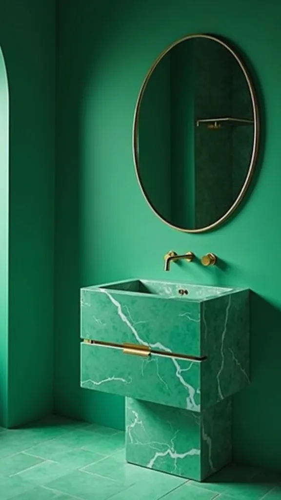
23. How do you make emerald tile look intentional with a simple layout?
Tile layout is where you can either amplify the emerald or distract from it. Simple layouts feel expensive because they let the material speak.
Implement with a straight stack (vertical or horizontal) or classic subway with a tight, even rhythm. If you’re using handmade-look tile, a straight stack shows off the variation without looking chaotic. Keep cuts clean around niches and corners—this is where good installers earn their money.
Materials: stacked tile layout, matching edge trim (or a clean mitered corner), and grout that blends. If you want a little extra, add a thin brass inlay strip sparingly.
Pro tip: avoid complicated patterns like chevron on glossy emerald unless the room is large and simple elsewhere. Too many angles can make the wall feel busy instead of bold.
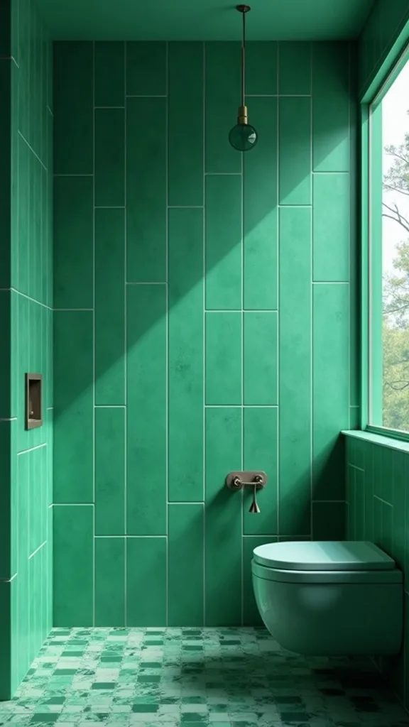
24. What should you avoid when doing bold green bathroom design?
The biggest mistake is treating emerald like a novelty color. It’s not a trend prop—it’s a foundational finish, and it needs a calm supporting cast.
Avoid pairing emerald with lots of competing undertones: cool gray floors, bright blue whites, and multiple warm woods can make the room feel visually noisy. Instead, pick one wood tone, one metal finish, and one light neutral.
Materials to skip: cool gray “cement” floors with emerald walls (they can make the green look dull), overly busy granite countertops, and harsh bright-white LEDs that flatten everything.
Pro tip: if you’re unsure, mock it up. Tape samples to the wall, place a brass object next to them, and look at it morning and night. When the palette feels steady in both lights, you’re ready to commit.
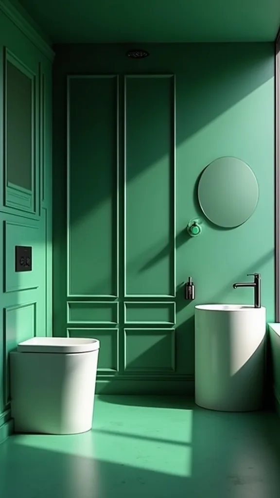
25. How do you make the whole emerald bathroom feel finished (not just installed)?
A finished bathroom has a rhythm: something soft, something reflective, something personal. That’s what takes it from “new tile” to “I want to stay in here for a minute.”
Implement by styling in layers. Add a small tray for daily items, a candle or a subtle diffuser, and one texture like a woven basket. Keep clutter off the counter—if you need more storage, add it inside the vanity or with a recessed cabinet.
Materials: stone or marble tray, a glass soap dispenser, and a simple linen hand towel. One vintage object—like a small brass box—adds that collected vibe without trying.
Pro tip: do a final edit with the door closed. If anything feels like it doesn’t belong, move it out. Emerald is confident; the room should feel the same, like you’re walking into your own private little hotel suite.
Final Thoughts
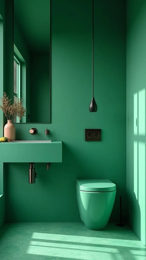
There’s a reason emerald keeps coming back around: it’s bold, but it’s not loud. It has that vintage depth—like old glass bottles in a windowsill—yet it still feels sharp with clean lines and a floating vanity. When you balance it with a calm floor and warm metal, the whole room settles into itself.
If you take nothing else from this: let one surface be the star, and make the rest feel like great basics. That’s how you get a colorful bathroom that doesn’t exhaust you. And please, test your green in your actual light—emerald is loyal, but only when you treat it right.
Do one thing today: order two emerald tile samples (or paint swatches) and tape them up tonight, then switch your bulbs to warm white light (2700K–3000K — the cosy, yellowish tone you see in most homes). When you walk in tomorrow morning and the green still feels like a yes, you’ll know exactly what to do next.
What I’d Do Differently
When I first tried this, I got seduced by a dark green tile sample under perfect showroom lighting and didn’t test it in my actual bathroom. At home—especially at night—the green went a little flat and cool, and suddenly my “moody jewel box” felt more like a shadowy hallway. The specific mistake: I paired that green with a bright, icy bulb and a chrome faucet I already had, thinking it would be “fine.” It wasn’t. The correct approach is to test the tile with your real lighting and then commit to warm metals (or at least warm light) so the green reads rich, not gray.
I also wish I’d known how much grout color changes everything. A too-light grout made the wall look busy, like graph paper. Next time, I’d pick a grout that blends and let the tile surface do the talking. If you’re on the fence, buy two grout sample boards and look at them morning and night—then choose and start this weekend.
Products I Recommend for This Project
Here are some of my favourite products to help you bring these ideas to life:
- Delta Faucet Trinsic Single-Hole Bathroom Faucet (Champagne Bronze) — A reliable brushed-gold finish that looks high-end and doesn’t feel fussy day to day.
- Moen Align 24-Inch Towel Bar (Brushed Gold) — Clean lines that keep an emerald wall looking modern instead of overly glam.
- KOHLER Verdera Recessed Medicine Cabinet with Mirror — Adds hidden storage without interrupting your tile with bulky shelving.
- GE Relax LED Light Bulbs (warm white light 2700K) — Makes emerald read rich and flattering, not cold or gray.
- Gatco Latitude II Round Frameless Mirror (or similar thin-frame brass mirror on Amazon) — A simple reflective upgrade that instantly makes a bold wall feel finished.