This post contains affiliate links. As an Amazon Associate, I earn from qualifying purchases at no extra cost to you.
Are you looking for dark living room ideas that feel cozy in summer instead of heavy and cave-like? Do you want a dramatic living room vibe that still looks polished in daylight?
I’m going to walk you through 25 practical ways I style a moody space—starting with paint and layout, then moving into lighting, textiles, and art. I’ll also share the exact kinds of materials I reach for (like velvet, brushed brass, and matte charcoal paint) and the measurements I use so the room feels intentional.
In my opinion, this is perfect for anyone who loves moody home decor but worries that dark color will shrink the room, show dust, or feel too “winter” for warm months.
I’ll show you how I make dark walls interior choices look fresh for a summer moody aesthetic—think deep teal velvet, warm white light (2700K–3000K — the cosy, yellowish tone you see in most homes), and a few gold accents that catch the sun. My favourite ideas inside include a charcoal feature wall, a deep teal velvet sofa, and an abstract art grouping that reads like a gallery.
If you’re ready to lean into depth and contrast without losing comfort, you’re in the right place. Below are 25 Moody Dark Aesthetic Living Room Ideas that…
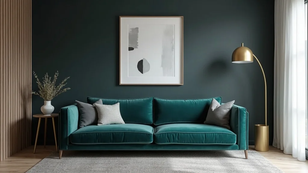
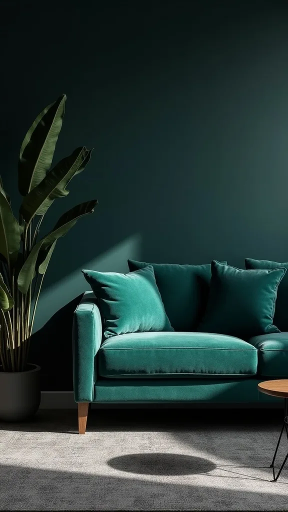
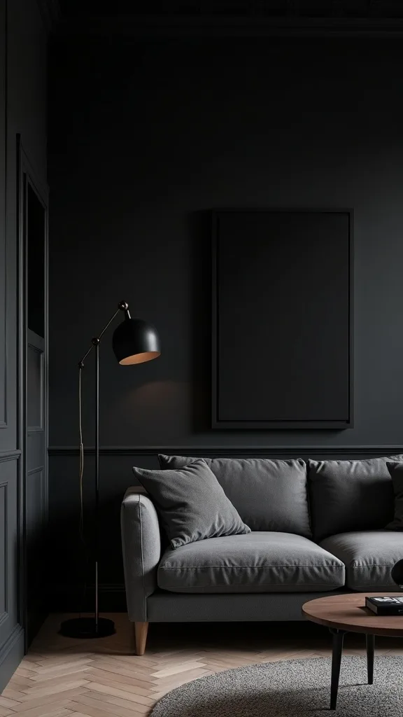
1. Build the Look: Charcoal Wall Paint + Deep Teal Velvet + Gold Arc Lamp + Abstract Art
I always start by anchoring the whole room with one clear “recipe,” and my go-to is charcoal wall paint behind a deep teal velvet sofa, then I layer in a gold arc floor lamp and an abstract art display to keep it from feeling flat. From my experience, this combo reads bold at night but still feels surprisingly fresh in summer daylight when the metals and art bounce light around.
When I design this look, I paint one main wall in a matte charcoal like Sherwin-Williams Iron Ore, then I keep the sofa 10–12 inches off that wall so the shadow line looks intentional. I like an arc lamp with a 72-inch reach so it can hover over a 36–42 inch coffee table without the base crowding the walkway, and I aim for at least 30 inches of clear path behind it.
I find that a 90-inch teal velvet sofa, brushed-brass lamp, and 3 abstract prints in 18×24-inch frames (matted to 16×20) hit the sweet spot. I usually add one 20×20-inch textured pillow in ivory bouclé to break up all the saturation.
Pro Tip: I’ve found the charcoal wall looks richer (not muddy) if I hang the art so the center sits at 57–60 inches from the floor and use a picture light with warm white light (2700K–3000K — the cosy, yellowish tone you see in most homes) aimed slightly downward.
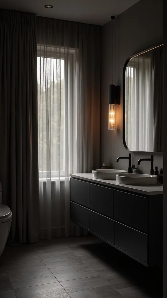
2. Choose a Charcoal Paint Finish That Hides Summer Glare
From my experience, the quickest way to make dark walls interior choices feel “off” in summer is picking a finish that reflects too much window glare. I find that a matte or velvet-sheen charcoal gives me depth without the shiny hotspots that can make a dramatic living room look patchy.
I always recommend testing at least 2 paint samples (I use 8 oz peel-and-stick or sample pots) and painting 12×12-inch squares on two different walls—one that gets morning light and one that gets late afternoon light. Typically, I live with those swatches for 48 hours so I can see how the color shifts under lamps and daylight.
In my opinion, Benjamin Moore Kendall Charcoal in matte works well in most spaces, while Sherwin-Williams Iron Ore in matte reads slightly warmer. I also keep a microfiber cloth and a small bottle of gentle wall cleaner on hand because matte paints can scuff more easily—this costs a bit more upfront, but it saves touch-up time later.
Pro Tip: I’ve found that rolling dark paint with a 3/8-inch nap microfiber roller and finishing each wall with one final “top-to-bottom” pass (without reloading) reduces lap marks that become obvious on charcoal once the sun hits at a low angle.
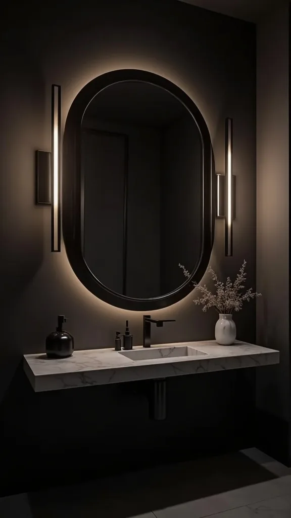
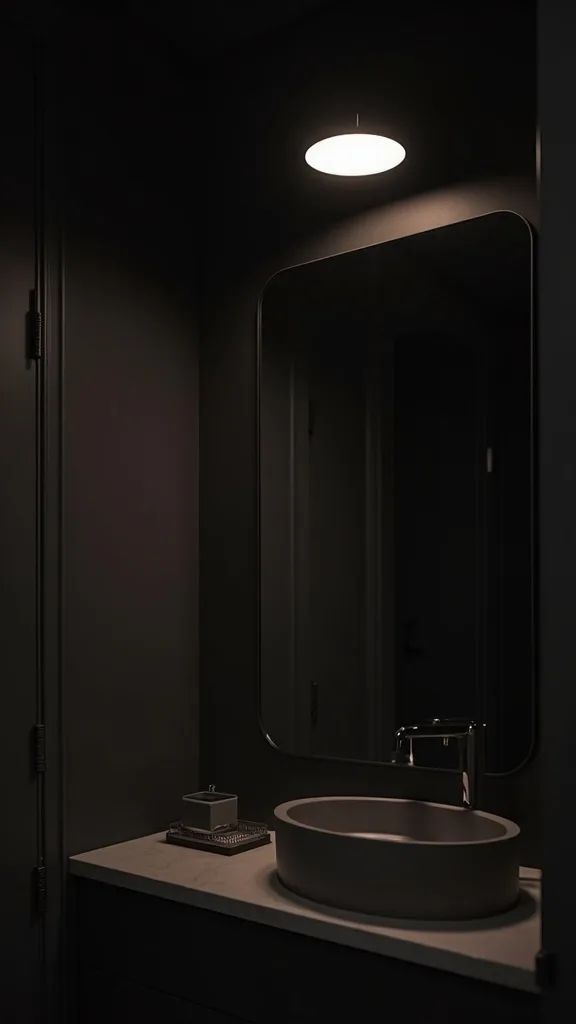
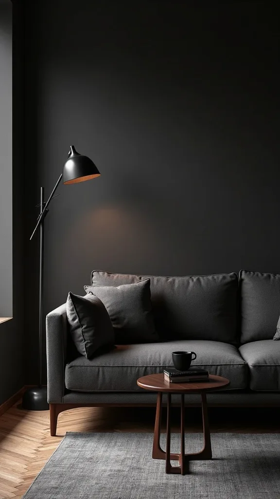
3. Layer Lighting in Three Heights for a Cozy Moody Glow
I find that dark living room ideas only feel welcoming when the lighting is layered, because one overhead fixture rarely gives enough dimension. From my experience, the magic happens when I use three heights—floor, table, and wall—so shadows look intentional instead of accidental.
I always start by planning 2–3 light sources for a standard 12×16-foot living room: a floor lamp near the sofa, a table lamp on a 24–30 inch side table, and either a plug-in sconce or picture light near art. I aim for warm white light (2700K–3000K — the cosy, yellowish tone you see in most homes) and I usually choose bulbs around 800–1100 brightness (measured in lumens) per lamp so the room feels bright enough without losing mood.
When I design this look, I mix finishes—brushed brass for the arc lamp, matte black for a sconce, and a linen shade to soften the glow. I’ve found dimmable LED bulbs cost a bit more, but typically they last years longer and make the room flexible for movie nights vs. hosting.
Pro Tip: I recommend putting the floor lamp on the opposite side of the room from your biggest window; from my experience, that counter-balances daylight and prevents the charcoal wall from reading like a dark “hole” by late afternoon.
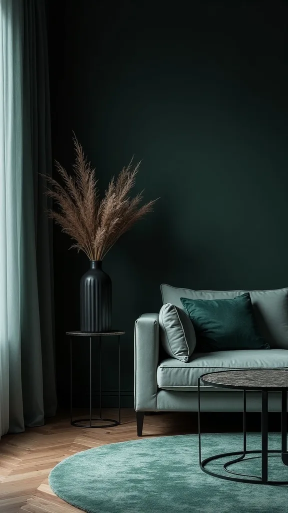
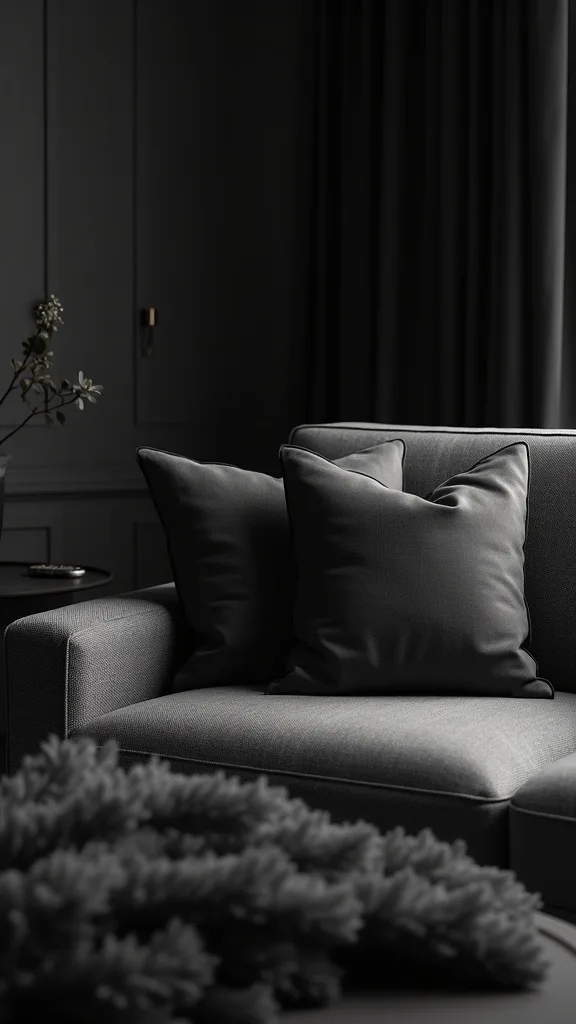
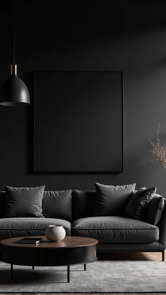
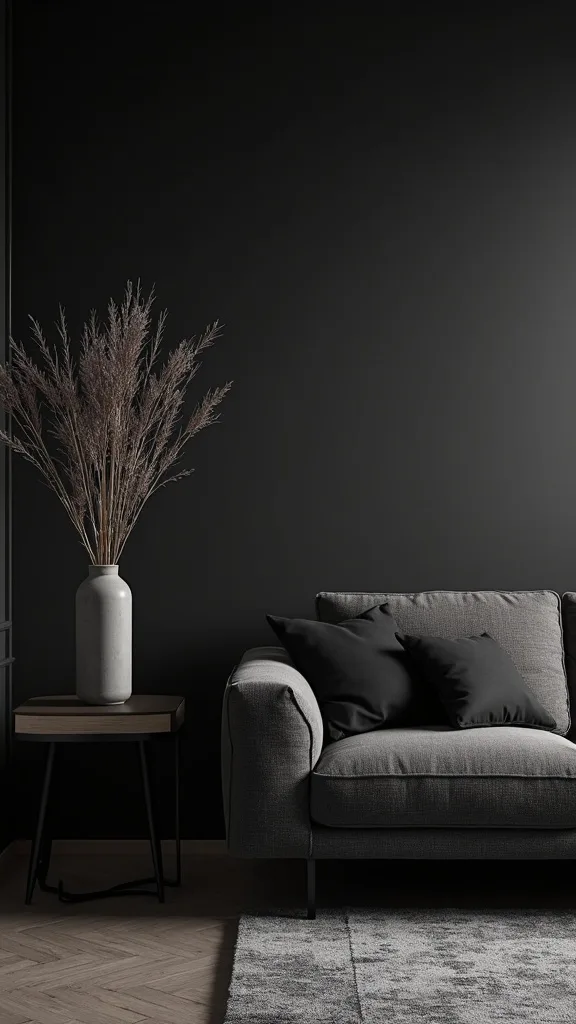
4. Use a Deep Teal Velvet Sofa as the Color Anchor
In my opinion, a deep teal velvet sofa is one of the easiest ways to add richness without making the whole room feel blacked-out. I’ve found teal plays nicely with charcoal because it’s saturated but still cool enough for a summer moody aesthetic.
I always start by choosing the sofa size based on the wall: for most rooms, a 84–96 inch sofa looks balanced, and I leave at least 18 inches between the sofa arm and the nearest doorway trim for comfortable flow. When I tried this in a smaller 10×12-foot space, I went with an 80–84 inch apartment sofa and used armless accent chairs to keep sightlines open.
I find that performance velvet (often labeled “easy clean”) is worth considering if you have pets; it costs more upfront, but typically it resists crushing and spot-cleaning better than cheaper velvet blends. For styling, I like 2 lumbar pillows (about 14×36 inches) plus 1 throw in a lightweight linen to keep it seasonally breathable.
Pro Tip: I recommend vacuuming velvet with a soft brush attachment every 2 weeks and brushing the nap in one direction; from my experience, that prevents “handprint shading” that shows up dramatically under warm lamp light against teal.
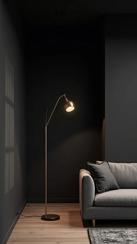
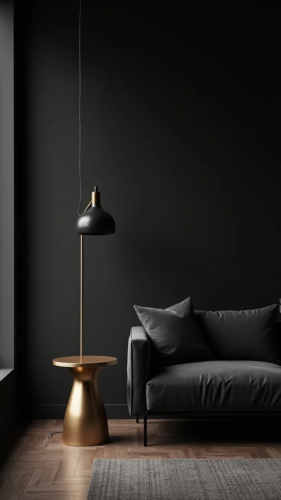
5. Add a Gold Arc Floor Lamp Without Crowding the Walkway
I find that a gold arc floor lamp instantly signals “intentional” in moody home decor because it adds height and a warm metallic curve against all the straight lines. From my experience, the key is placement—otherwise the base becomes a toe-stubber in a dark room.
I always start by measuring the clearance: I leave 30–36 inches for the main walkway and keep the lamp base at least 8 inches behind the front edge of the sofa. When I design this look over a coffee table, I aim for the shade to hover about 18–24 inches above the tabletop so the light pools nicely without blinding anyone seated.
I recommend a lamp with a weighted marble base (typically 35–45 lb) because it’s more stable than hollow bases, especially if you have kids or a playful dog. I’ve found that a brushed brass or satin gold finish looks less “yellow” next to charcoal than shiny polished brass, but it can cost $40–$120 more depending on the brand.
Pro Tip: I always use a black or charcoal cord cover (about 6 feet) and run it along the baseboard; from my experience, hiding the cord matters more in dark rooms because stray lines catch lamp glow and look messier than they would in a white space.
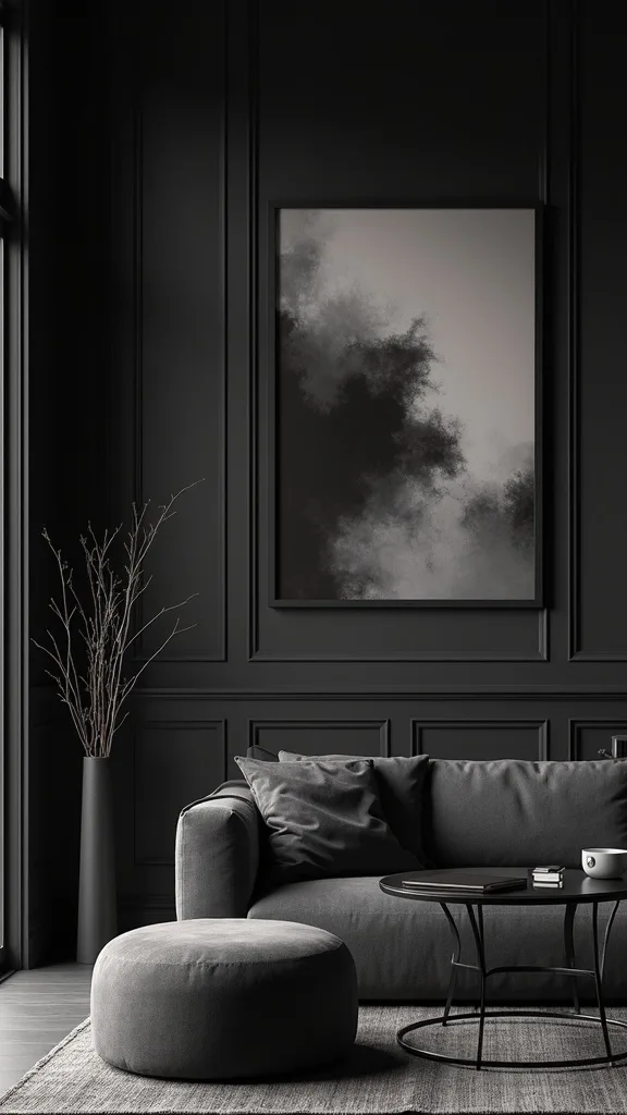
6. Create an Abstract Art Display That Reads Like a Gallery
When I design a dramatic living room, I find that abstract art is what keeps dark walls interior choices from feeling too literal or themed. From my experience, a small “gallery moment” adds movement and gives your eye a place to land besides the TV.
I always start by mapping the layout on the floor: I like 3–5 pieces, with the largest at 24×36 inches and the others at 18×24 or 16×20 inches. I keep spacing consistent at 2–3 inches between frames, and I hang the group so the center sits around 58 inches from the floor (most people find that comfortable to view while standing).
I recommend matte black frames with white mats for crisp contrast, or thin brass frames if you want to echo the gold arc lamp. I’ve found that using acrylic glazing instead of glass costs a bit more, but it’s lighter and typically safer if the wall gets bumped.
Pro Tip: I always choose at least one artwork with a warm tone (rust, sand, or blush) that’s repeated in a pillow or vase; from my experience, that tiny echo stops the charcoal wall from feeling cold in summer evening light.
7. Balance Dark Walls With a Light, Textured Area Rug
I find that the easiest “reset button” for moody home decor is a lighter rug, because it lifts the whole room without undoing the dark palette. From my experience, this is especially important in summer when you want the space to feel airy even with charcoal paint.
I always start by sizing the rug correctly: in most living rooms, an 8×10-foot rug lets the front legs of a 90-inch sofa sit on it by 6–10 inches, which makes the layout feel anchored. If the room is larger, I step up to a 9×12-foot rug and keep at least 12 inches of bare floor around the perimeter so the rug doesn’t look wall-to-wall.
I recommend a low-pile wool or wool-blend rug in ivory, greige, or a subtle geometric; I’ve found jute can look great but typically feels scratchier under bare feet and doesn’t love spills. For a teal velvet sofa, I like rugs with tiny flecks of blue-gray so the sofa looks integrated rather than floating.
Pro Tip: I always use a 1/4-inch thick rug pad and choose one labeled “non-staining”; from my experience, some cheaper pads can react with dark-stained floors and leave a cloudy outline that’s hard to remove.
8. Use Sheer Curtains to Keep Summer Light While Staying Moody
In my opinion, the biggest misconception about dark living room ideas is that you need blackout curtains to match the mood. I find that in summer, sheers are often the smarter choice because they soften sunlight and keep the room from feeling like a cave.
I always start by hanging curtains high: I mount the rod 4–6 inches above the window frame and extend it 8–12 inches past each side so the panels stack off the glass. For length, I typically choose 96-inch panels for standard 8-foot ceilings, or 108-inch panels if the rod is higher—either way, I aim for the hem to “kiss” the floor within 1/2 inch.
I recommend ivory or warm gray linen-blend sheers, plus a second layer of heavier charcoal drapes if you truly need privacy at night. This costs more upfront (two rods or a double rod), but from my experience it saves you from sacrificing daylight just to keep the palette consistent.
Pro Tip: I’ve found that adding a thin black-out roller shade inside the window frame (usually 1–2 inches deep) gives you nighttime privacy without visually competing with your dark walls the way bulky drapery can.
Cost & Materials Estimate
For most living rooms, I typically see a moody dark refresh land between $450 and $3,200 depending on whether you’re painting, upgrading lighting, and investing in a velvet sofa.
| Item | Estimated Cost | Where to Buy |
|---|---|---|
| Interior paint (2 gallons charcoal) + primer | $110–$190 | Home Depot |
| Deep teal velvet sofa (84–96 in) | $650–$1,800 | Wayfair |
| Gold arc floor lamp (dimmable compatible) | $90–$260 | Amazon |
| Area rug (8×10 ft, light neutral) | $180–$650 | IKEA |
| Abstract art set (3 frames + prints) | $80–$280 | Amazon |
Total estimated cost: $450–$3,200 I find you can save the most by DIY painting and starting with thrifted frames, but I’d splurge on the sofa fabric and dimmable lighting for daily comfort.
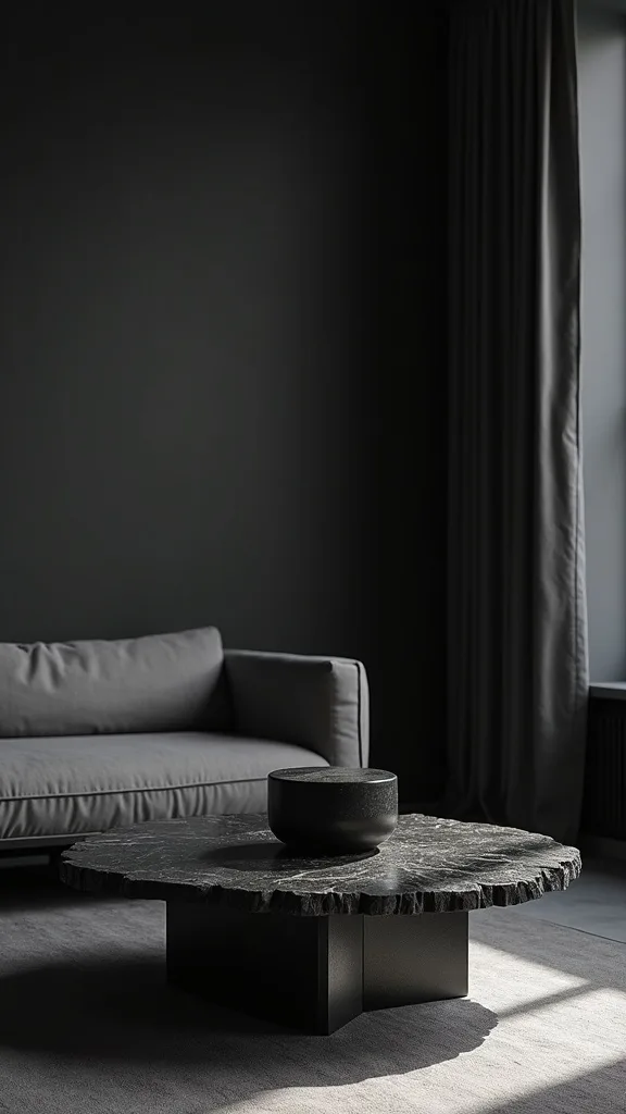
9. Style a Coffee Table With Dark Stone and One Reflective Piece
I find that a moody room feels sophisticated when the coffee table styling mixes matte and shine. From my experience, one reflective object is enough to keep the tabletop from disappearing against a charcoal backdrop.
I always start by choosing a tray that’s proportional: a 16–18 inch round tray works well on a 36–42 inch coffee table, or a 24-inch rectangular tray on a 48-inch table. Then I keep the stack low—usually 2 books plus one object—so it doesn’t block conversation when people sit 16–18 inches away on the sofa.
I recommend a black marble or faux-marble tray, a small brass catchall, and a smoked-glass vase that’s about 8–10 inches tall. I’ve found fresh greenery can fight the mood if it’s too bright, so I typically use eucalyptus or olive stems and keep it to 3–5 stems for a restrained look.
Pro Tip: I always add a tiny “sparkle” item like a brass snuffer or a mirrored coaster under a candle; from my experience, that micro-reflection makes the whole seating area feel brighter at night without adding another lamp.
10. Mix Matte Black and Brushed Brass Metals (Without Overdoing It)
From my experience, mixing metals is what makes moody home decor feel collected instead of matchy. I find that matte black plus brushed brass is the easiest pairing because both look intentional against charcoal paint.
I always start by choosing a “main” metal and a “supporting” metal: typically I keep it 70/30, like 70% matte black (frames, curtain rod, side table legs) and 30% brushed brass (lamp, small decor). In a standard living room, I aim for 4–6 metal touchpoints total so the room doesn’t start to look like a hardware aisle.
I recommend brushed brass over polished because it shows fewer fingerprints and looks softer under warm white light (2700K–3000K — the cosy, yellowish tone you see in most homes). The trade-off is that brushed finishes can vary by brand, so I usually bring one brass item to the store (or keep it nearby at home) to compare tones.
Pro Tip: I’ve found that repeating brass at eye level (like a picture light or frame) matters more than repeating it on the floor; that’s what keeps the gold arc lamp from looking random next to a teal velvet sofa.
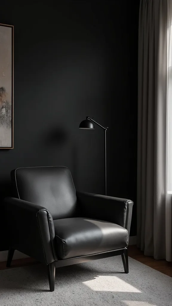
11. Add a Dark Accent Chair in Leather for Summer-Friendly Texture
I find that velvet is gorgeous, but in summer it can feel visually “heavy” if every seat is plush. From my experience, adding one dark leather accent chair brings in a cooler, sleeker texture that still fits dark living room ideas.
I always start by checking scale: for most spaces, a chair that’s 28–32 inches wide and about 30–34 inches deep tucks in nicely without crowding the sofa. I keep at least 18 inches between the chair and the coffee table, and I aim for a 24–30 inch gap between the chair and any side table so it’s usable.
I recommend a cognac or espresso leather chair with black metal legs, or a sling-style chair if you want a lighter silhouette. I’ve found genuine leather costs more ($400–$1,200 typically), but it usually ages better than bonded leather, which can peel within 2–4 years in dry climates.
Pro Tip: I always place a small 12–14 inch round drink table beside a leather chair; from my experience, that prevents water rings on leather armrests and keeps the seating zone feeling “host-ready” even in a dark palette.
12. Use a Mirror Strategically to Double Lamp Glow (Not Window Glare)
In my opinion, mirrors are underrated in a dramatic living room because they can brighten without changing your color palette. I find that the trick is reflecting lamps and art—not blasting the room with direct window glare.
I always start by placing a mirror where it can “see” a light source: typically 36–48 inches wide over a console, or a 30×40-inch mirror leaned on a low cabinet. I keep the bottom edge about 6–10 inches above the furniture surface so it looks anchored, and I angle leaned mirrors slightly back (1–2 inches) for a cleaner reflection line.
I recommend a thin black frame for a modern feel or a brass frame to echo your arc lamp. The trade-off is that mirrors show dust and fingerprints more than matte art, so I usually plan a quick wipe-down every 1–2 weeks with a microfiber cloth.
Pro Tip: I’ve found that placing the mirror perpendicular to the window (instead of opposite it) captures soft side-light and lamp glow, which keeps your charcoal wall paint looking deep rather than washed out.
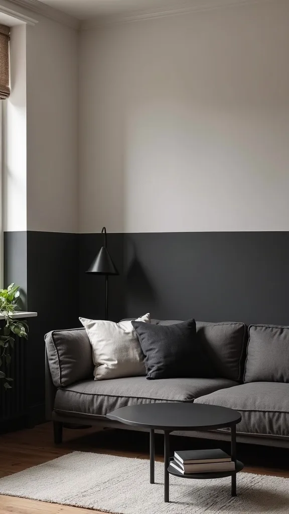
13. Try a Two-Tone Wall: Charcoal Bottom, Warm White Top
When I tried this in a living room that felt a little short, I found a two-tone wall gave me moody depth without visually lowering the ceiling. From my experience, it’s one of the most forgiving dark walls interior approaches because the lighter top half keeps the room breathable in summer.
I always start by choosing the split height: typically 42–48 inches from the floor (around chair-rail height) looks classic, while 54 inches feels more modern. I mark the line with a laser level and painter’s tape, and I plan on 2 coats of charcoal plus 1–2 coats of warm white depending on coverage.
I recommend using a durable washable matte for the charcoal lower half (it gets bumped) and a standard matte for the top. I’ve found adding a slim 1×2-inch trim strip at the seam costs a bit more in materials, but it hides tiny paint wobbles and looks intentional.
Pro Tip: I always paint the trim strip the same charcoal as the bottom portion; from my experience, a white strip can look like an afterthought and it visually “cuts” the room in half more harshly.
14. Go Monochrome Charcoal—Then Add Teal in Small, Repeatable Hits
I find that monochrome charcoal rooms can look incredibly refined, but they need one repeated color to feel styled rather than gloomy. From my experience, teal is ideal because it ties back to a velvet sofa and feels cooler for a summer moody aesthetic.
I always start by keeping the base tight: charcoal walls, a black or espresso coffee table, and a gray-black rug pattern. Then I add teal in 3 places—typically a 20×20-inch pillow, a 50×60-inch throw, and one piece of art with teal brushstrokes—so the color looks intentional.
I recommend choosing teal items in the same undertone (either more blue-leaning or more green-leaning) because mixed teals can clash under warm white light (2700K–3000K — the cosy, yellowish tone you see in most homes). The trade-off is that limiting your palette can feel strict, but I’ve found it makes shopping easier and reduces “almost matching” mistakes.
Pro Tip: I always take a photo of the teal sofa fabric in natural daylight and use it as my reference when ordering textiles online; from my experience, teal shifts wildly between screens, and that one step prevents expensive returns.
15. Use a Statement Ceiling Light That Doesn’t Flatten Dark Walls
From my experience, a single overhead light can make charcoal paint look dull if it’s too cool or too bright. I find that a statement semi-flush or chandelier with a diffuser keeps the ceiling light useful without ruining the moody vibe.
I always start by matching scale to the room: for a 12×16-foot living room, a fixture around 18–24 inches wide typically looks balanced. I also aim for a fixture that hangs at least 7 feet above the floor (or a semi-flush that sits close) so it doesn’t feel intrusive in the seating zone.
I recommend warm white bulbs (2700K–3000K — the cosy, yellowish tone you see in most homes) and a dimmer switch so you can drop brightness (measured in lumens) during evenings. The trade-off is that dimmer-compatible LEDs can cost $10–$20 more per pack, but I’ve found they prevent flicker and make the room feel higher-end.
Pro Tip: I always choose a fixture with shades or globes that hide the bulb; from my experience, exposed bulbs create harsh pinpoints that reflect in frames and mirrors, which can make a dramatic living room feel visually noisy.
16. Create Depth With Tone-on-Tone Throw Pillows (Not More Colors)
I find that in dark living room ideas, adding more colors isn’t always the answer—often it’s more texture and slightly different tones. From my experience, tone-on-tone pillows make a velvet sofa look layered without turning the room into a rainbow.
I always start with a simple formula on a 90-inch sofa: 2 pillows at 22×22 inches, 2 pillows at 20×20 inches, and 1 lumbar at 14×36 inches. Then I keep the palette tight—teal, charcoal, and a warm neutral—so the sofa looks curated rather than cluttered.
I recommend mixing materials like velvet, bouclé, and linen, and I usually add one pillow with a subtle metallic thread to echo a brass lamp. The trade-off is that specialty textiles can snag, so I’ve found it’s smart to keep the most delicate pillow on the “display” corner and use sturdier covers where people actually lean.
Pro Tip: I always buy pillow inserts 2 inches larger than the cover (like a 24×24 insert for a 22×22 cover); from my experience, that “full” look reads more luxurious against dark walls and prevents pillows from looking limp in photos.
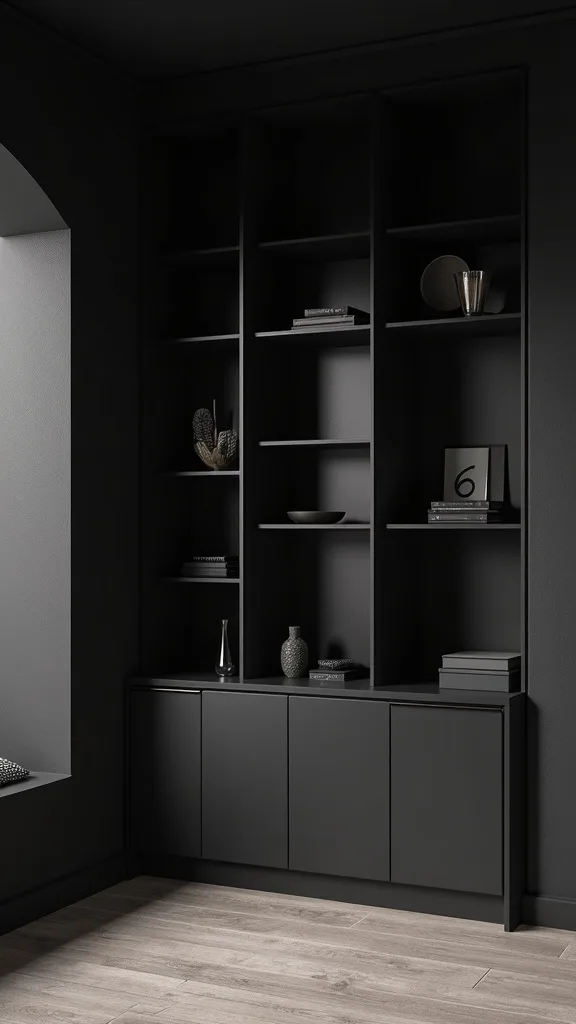
17. Style Built-In Shelves in Dark Paint for a Seamless Look
In my opinion, built-ins are one of the easiest places to go dark because they already have structure and shadow lines. I’ve found painting shelves charcoal makes decor look intentional and helps the TV area feel less like a black rectangle floating on a wall.
I always start by removing shelves and labeling them, then I sand lightly with 220-grit sandpaper and use a bonding primer before 2 coats of durable cabinet paint. For spacing, I typically style in thirds: one shelf with books stacked 6–8 inches high, one shelf with a 10–14 inch vase, and one shelf with a framed photo around 8×10 inches.
I recommend mixing matte ceramics, a small brass object, and a few paperbacks with neutral spines. The trade-off is dust—dark shelves show it faster—so I plan a quick dusting every 7–10 days with a microfiber duster.
Pro Tip: I’ve found that painting the back panel of the built-in 1 shade darker than the shelf face creates subtle depth; it’s a small detail, but it makes decor silhouettes pop without needing extra lighting.
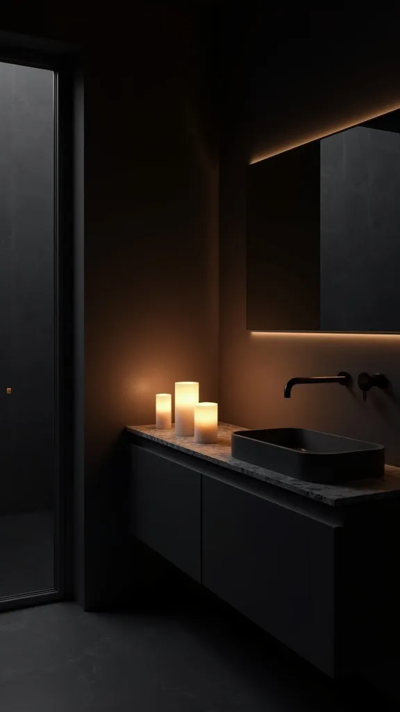
18. Use Candlelight Safely for Instant Mood (Even in Summer)
I find that candlelight is the fastest way to make a dramatic living room feel intimate, especially against charcoal walls. From my experience, it works year-round if you keep the scent light and the setup safe.
I always start by grouping candles in odd numbers—usually 3—on a heat-safe tray that’s at least 10–12 inches wide. I keep flames at least 12 inches away from curtains and 6 inches away from books or dried stems, and I typically burn them for 1–2 hours at a time to avoid soot buildup on dark paint.
I recommend unscented taper candles in matte black holders or a single amber-glass jar candle for a soft glow. The trade-off is maintenance: candles can drip and smoke, so I’ve found LED flameless candles (with a timer) are worth it if you want the look nightly without the cleanup.
Pro Tip: I always trim the wick to about 1/4 inch before lighting; from my experience, that reduces flicker shadows on charcoal walls and keeps the glow smoother—almost like a low dimmer setting.
19. Make a Dark Room Feel Bigger With Negative Space
From my experience, the rooms that pull off moody home decor the best aren’t packed with stuff—they’re edited. I find that negative space is what makes dark walls feel intentional and “gallery-like,” not cramped.
I always start by clearing at least 20–30% of surfaces: one side table gets a lamp and one small object, not five. For layout, I keep the coffee table about 16–18 inches from the sofa and leave 30–36 inches for the main walkway so movement feels easy even when the palette is dark.
I recommend choosing fewer, larger decor pieces—like one 24×36-inch artwork instead of four tiny prints—because small clutter can visually “buzz” against charcoal. The trade-off is that minimal styling can feel stark if you love collections, so I’ve found it helps to rotate items seasonally instead of displaying everything at once.
Pro Tip: I always take a quick phone photo from the doorway; from my experience, if I can’t immediately identify the 2–3 focal points, the room needs more negative space, not more decor.
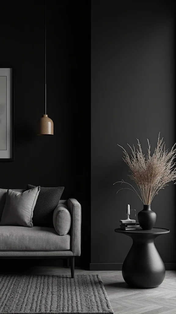
20. Choose Summer-Friendly Dark Florals and Botanicals (Muted, Not Neon)
I find that florals can absolutely work in dark living room ideas, but the wrong colors scream “spring country” instead of moody. From my experience, muted botanicals keep the vibe dramatic while still feeling seasonal for summer.
I always start with one botanical moment: either a 22×22-inch pillow, a 24×36-inch print, or a single vase with stems—never all three at once. Typically, I keep the palette to charcoal, deep teal, and dusty rose or ochre, and I limit the pattern scale so it doesn’t fight the abstract art display.
I recommend faux stems like eucalyptus, olive, or dark burgundy foliage in a 10–12 inch matte ceramic vase, especially if your room gets strong sun that can wilt fresh flowers fast. The trade-off is faux can look plasticky up close, so I’ve found spending $20–$40 on higher-quality stems makes a noticeable difference.
Pro Tip: I always “dirty up” faux stems with a tiny bit of matte craft spray in gray-brown; from my experience, that removes the factory sheen that looks extra obvious against charcoal walls.
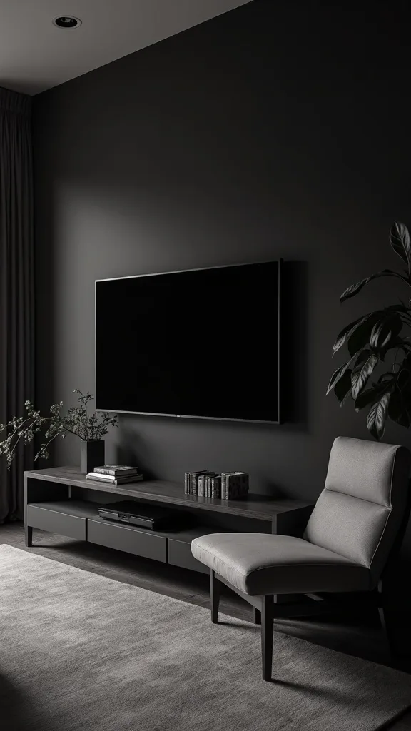
21. Upgrade Your TV Wall So It Doesn’t Dominate the Moody Palette
I’ve found that the TV is the biggest mood-killer in a dramatic living room if it looks like a giant black sticker on a dark wall. From my experience, a few small upgrades can make it blend in while still being practical.
I always start by mounting the TV so the center sits around 42–48 inches from the floor (close to seated eye level) to avoid that “waiting room” height. Then I add a 72-inch floating media console or a low 70–80 inch cabinet underneath, leaving about 6–8 inches of breathing room below the screen for visual balance.
I recommend a matte black frame-style TV option if it fits your budget, or at least a slim bezel TV paired with a dark wood console. The trade-off is cable management: it takes extra time (usually 1–2 hours) to run a cord cover or in-wall kit, but I find it’s essential in dark rooms where cords catch highlights.
Pro Tip: I always place one small lamp or LED bias light behind the TV; from my experience, that soft back-glow reduces the harsh contrast of the screen at night and makes charcoal paint look richer.
22. Use Dark Wood Tones to Warm Up Charcoal Walls
In my opinion, charcoal can feel a bit cool on its own, so I like to warm it with dark wood. I find that walnut, smoked oak, and espresso finishes make moody home decor feel grounded rather than icy.
I always start by adding one substantial wood piece, like a 48–60 inch coffee table or a 60–72 inch media console. Then I repeat the wood tone once more—maybe a picture frame or a small side table—so it looks cohesive. Typically, I keep wood undertones consistent: if the wood leans red, I avoid mixing in gray-washed pieces.
I recommend using coasters and a wipeable finish because dark wood shows water rings more than people expect. The trade-off is that real solid wood costs more, but I’ve found veneer options from reputable brands can look great if the edge banding is clean.
Pro Tip: I always add a tiny amount of black (like a matte black bowl) on top of dark wood; from my experience, that creates contrast so the wood grain reads clearly instead of blending into the charcoal surroundings.
23. Make a Small Dark Living Room Work With Slim Profiles
I find that small spaces can absolutely handle dark walls interior color—sometimes they even feel cozier and more intentional. From my experience, the win comes from choosing furniture with slimmer profiles so the room doesn’t feel physically crowded.
I always start by checking depth: I prefer a sofa around 34–38 inches deep in a small room, and I choose a coffee table that’s 18–22 inches deep so you keep a 30–36 inch walkway. If you need extra seating, I recommend two 18–20 inch wide poufs that can tuck under a console when not in use.
I’ve found leggy furniture (visible legs 6–8 inches tall) helps because you can see more floor, which makes the room feel larger. The trade-off is comfort: slimmer arms and tighter seats can feel less loungey, so I usually add a plush 50×60-inch throw to bring back softness.
Pro Tip: I always choose a coffee table with an open lower shelf or a glass top in small dark rooms; from my experience, that reduces the “visual block” effect that can make charcoal walls feel like they’re closing in.
24. Add One High-Contrast Element to Keep the Mood Crisp
From my experience, a room can go from moody to murky if everything sits in the same mid-dark range. I find that one high-contrast element—done deliberately—keeps dark living room ideas looking crisp and designed.
I always start by choosing just one: a pair of ivory boucle chairs, a white plaster table lamp, or a large 30×40-inch black-and-white abstract print. Then I repeat that contrast one more time in a smaller way, like a 20×20-inch pillow or a ceramic bowl, so it doesn’t look random.
I recommend keeping the contrast piece matte (not glossy) so it doesn’t glare in summer sun. The trade-off is that light items show stains faster, so I’ve found washable slipcovers or performance fabrics are worth considering if the chair is in a high-traffic spot.
Pro Tip: I always place the high-contrast item closest to the darkest wall; from my experience, that’s where it has the most impact, and it prevents the center of the room from feeling like a “gray blob.”
25. Finish With Scent and Sound: The Invisible Layers of Moody Comfort
I find that the final 10% of a dramatic living room isn’t visual—it’s how the room feels when you walk in. From my experience, a subtle scent and soft sound make moody home decor feel like an experience, not just a look.
I always start by keeping fragrance light in summer: I use 1 reed diffuser or 1 candle, not both, and I place it 3–5 feet from seating so it doesn’t overwhelm. Typically, I choose notes like bergamot, cedar, or fig, and I refresh reeds every 4–6 weeks so the scent stays consistent.
For sound, I recommend a small Bluetooth speaker or soundbar and a “low” playlist for evenings; I’ve found even 20–30 minutes of background jazz or lo-fi makes the room feel calmer. The trade-off is clutter—extra devices add visual noise—so I tuck them into a 60–72 inch media console and keep cords managed.
Pro Tip: I always avoid overly sweet scents in a charcoal room; from my experience, vanilla-heavy fragrances can make dark spaces feel stuffy, while wood-and-citrus blends keep the mood sophisticated and summer-appropriate.
Final Thoughts
I’ve found that the most successful dark living room ideas aren’t about making everything darker—they’re about balancing depth with comfort. When I design a summer moody aesthetic, I lean on charcoal walls for drama, then I bring in breathable textures, warm metals, and lighting that flatters skin tones and art.
From my experience, your room will look “done” faster if you commit to one anchor (like a deep teal velvet sofa) and then repeat just 2–3 finishes throughout—matte black, brushed brass, and a warm wood tone are my usual trio. I also think it’s worth taking your time with lighting, because even one extra lamp can change how dark walls interior color reads at night.
If you try even a handful of these ideas, you’ll end up with a dramatic living room that still feels livable—cool enough for summer evenings, cozy enough for late-night movies, and personal enough to feel like home.
What I’d Do Differently
When I first tried this, I made one very specific mistake: I painted the room charcoal and relied on a single overhead light with cool bulbs, thinking the darkness alone would create “mood.” From my experience, it did the opposite—my charcoal wall paint looked dusty, my teal accents looked dull, and the whole space felt like a waiting room at night. The correct approach (for the majority of homes) is to plan lighting before you commit to the darkest paint: I now build in at least 2–3 light sources and I choose warm white light (2700K–3000K — the cosy, yellowish tone you see in most homes) so skin tones and artwork look natural. I also wish I’d left my sofa 10–12 inches off the charcoal wall from day one; pushing it flush made the wall look heavier and the sofa look cramped.
What I wish I knew earlier is that “moody” needs contrast and texture, not just darkness—one light rug, one reflective brass detail, and one piece of abstract art can do more than adding more black decor. I also learned to test paint for 48 hours in real daylight because charcoal shifts a lot from morning to evening. Pick one anchor item (like the velvet sofa), choose your lighting, and then start with a single charcoal feature wall this weekend.
Products I Recommend for This Project
Here are some of my favourite products to help you bring these ideas to life:
- Philips LED Dimmable A19 Bulbs (2700K Soft White) — I use these to keep dark rooms warm and flattering while still having dimmer control.
- Rust-Oleum Zinsser Bulls Eye 1-2-3 Water-Based Primer — I reach for this when I’m going from light walls to charcoal so coverage is more even in 2 coats.
- DEKOPRAGE Velvet Throw Pillow Covers (20×20) — I like these for tone-on-tone layering on a teal velvet sofa without spending a fortune.
- Command Picture Hanging Strips (Large) — I use these for lighter frames in gallery walls so I can tweak spacing by 2–3 inches without patching holes.
- Govee TV Backlight 3 Lite — I recommend this for a soft glow behind the TV, which reduces harsh contrast in a dramatic living room at night.